Big bold type makes a statement. I’ve always been fascinated with minimalistic, typography-focused design. Especially when the composition is proportionally aligned with a grid and when it includes big, even huge titles.
This is part one of a two-part blog post series. In this one, I explore huge type in print, look for similar examples on the web, and try to find out what is it that works well about these designs. In part two, I explore how to make huge type on the web work.
I’ve been trying to achieve this type of design often when I worked on my personal projects. I’ve mostly been looking for inspiration in print and graphic design and tried to translate that to the web. I think I’ve been partially successful at doing that, but something I learned through the process is that websites still prefer to stick with safer approaches when it comes to typography. In fact, I noticed that years ago and it was why I started the Better Web Type project. There, you can already see my initial explorations into big, bold, and sometimes condensed type on the web (Fig 1).
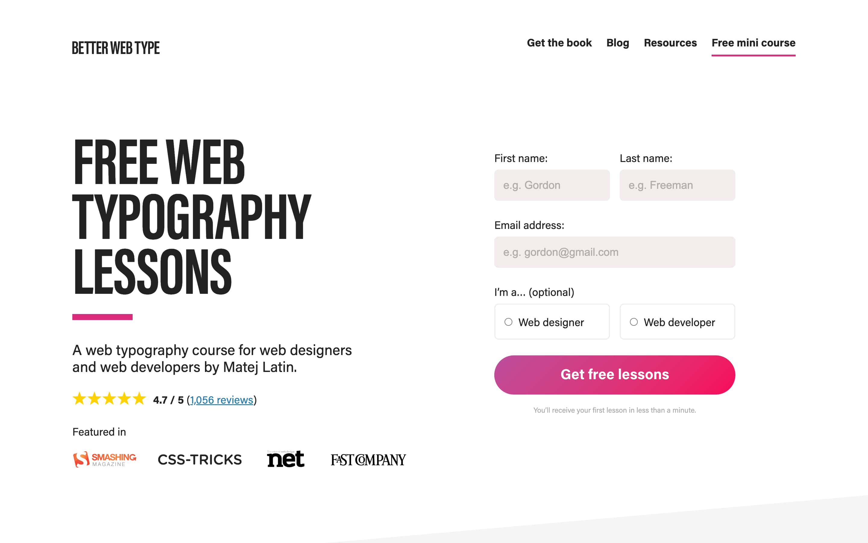
That design is a couple of years old now, and looking at it now, I’d call that type large, not huge. I remember how I wanted to make it larger but just couldn’t find a way to do it. Page layout composition was the hardest part because I had to make it work with all the other elements on it. The sign up form which allows visitors to sign up for free lessons is the most obvious one. I wanted to make it very clear to visitors that they can sign up for lessons so I had to place it “above the fold.” This means that it has to live side-by-side with the page title. So there’s not a lot of freedom when it comes to composing the page. But then I noticed something different when I worked on designing the cover of my book. Let’s take a look at a few examples of huge type in print.
Huge type in print
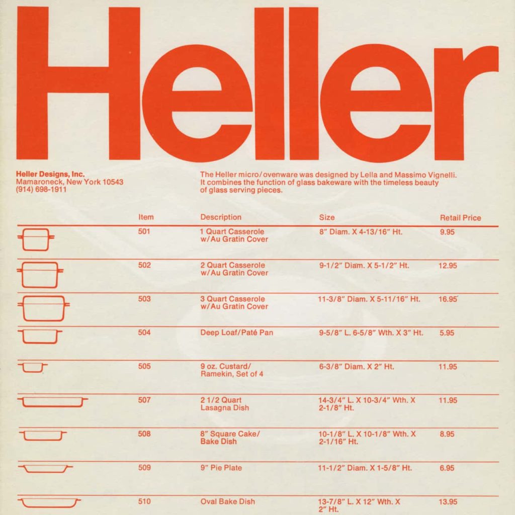
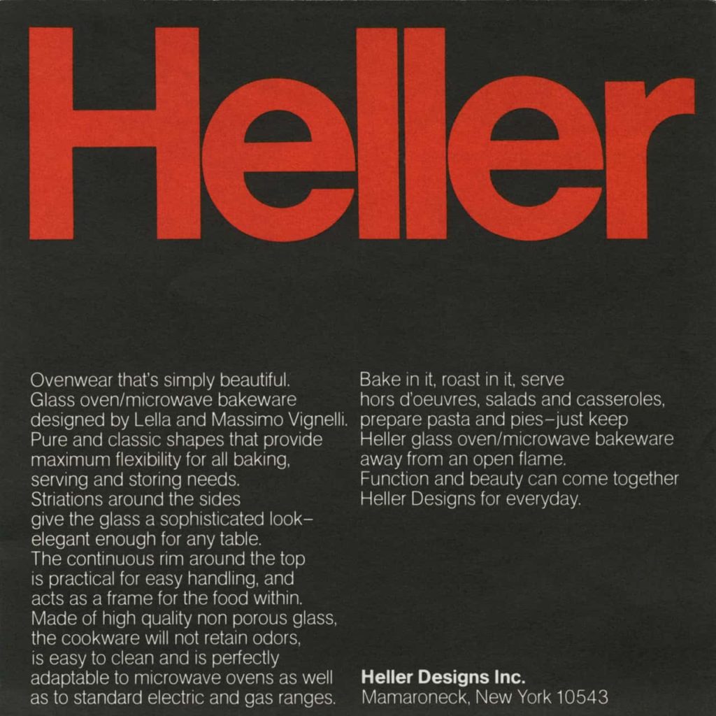
My fascination with huge type came from print and graphic design. Being a fan of Massimo Vignelli’s work, it made a lot of sense that I developed this fascination. Huge type was common in Massimo and Lella’s designs, it was always combined with grid layouts. That’s what makes their work stand out. Here’s an example. The catalog that they designed for Heller uses the name “Heller” repeatedly in huge type set in Helvetica. Combined with a grid, generous spacing between elements, tight line-height, makes for a very dynamic but functional design.
Studying designs like these established a baseline that I was trying to achieve in my own projects. So when I was working on the cover for my book, I wanted to use the same typeface that I used on the website, Acumin Pro, and make a statement with huge type.
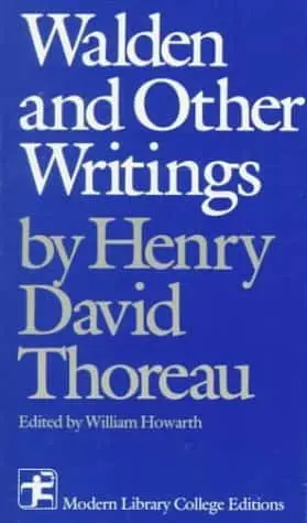
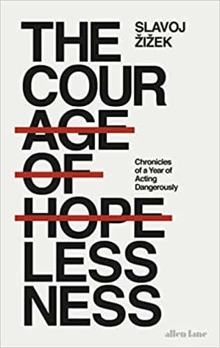
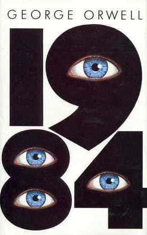
After looking for inspiration in existing book covers like Walden and Other Writings,The courage of hopelessness and the Swedish edition of 1984, I explored different ways of placing the title Better Web Typography for a Better Web on a book cover. Eventually, I came up with a design I was happy with (Fig 5).
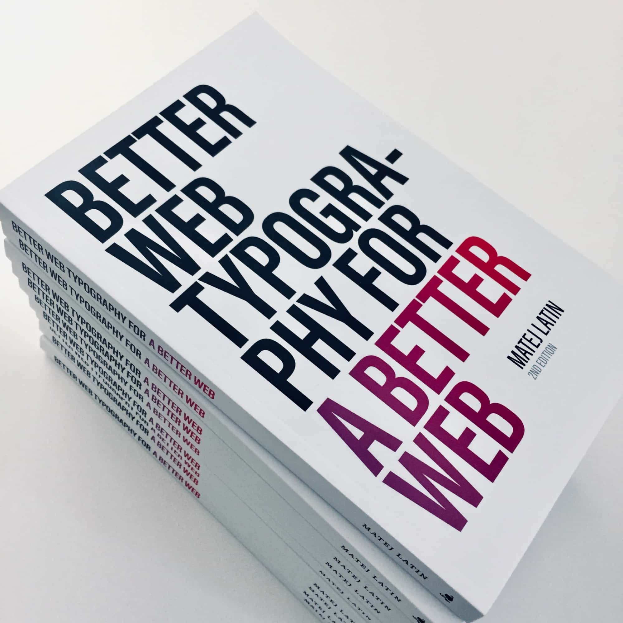
I learned that designing a book cover using huge type was easier. The fixed canvas helped because I didn’t have to worry about how the title would break into new lines on different screen sizes. I could place my type on the canvas and the white space around it provided a beautiful contrast. The book cover was very simple so I didn’t need to use a grid. The white space around the title provided nice pockets where I could add additional information, like the author’s name and edition number.
So using huge type is easier in print and graphic design for various reasons. The fixed nature of the canvas is probably the biggest factor. But lately I started noticing examples of huge type on the web so it looks like typography on the web is finally getting more exciting. Let’s take a look at a few examples.
Huge type on websites
One of the first examples that I found was the careers page on the InVision website (Fig 6). They used Aktiv Grotesq as their main typeface and sized the title to 150px! The most interesting part to me is that they used the Medium (500) weight and it looks so good at this size.
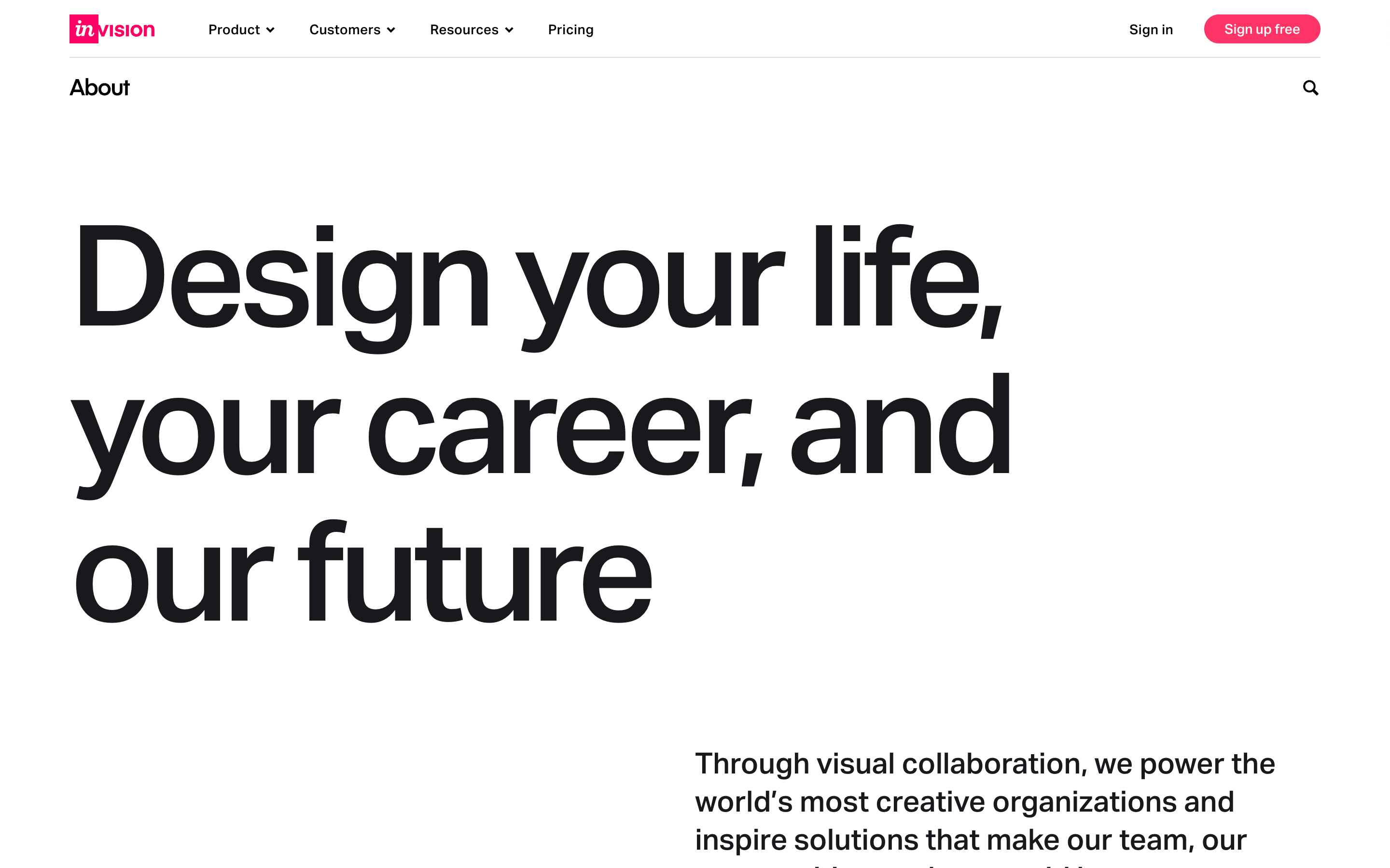
There has to be some grid used for aligning the elements of this page because it looks dynamic but well composed at the same time. It’s interesting that they placed the paragraph that follows the title and the CTA aligned to the right of the title. The obvious solution here would be to left align all these three elements.
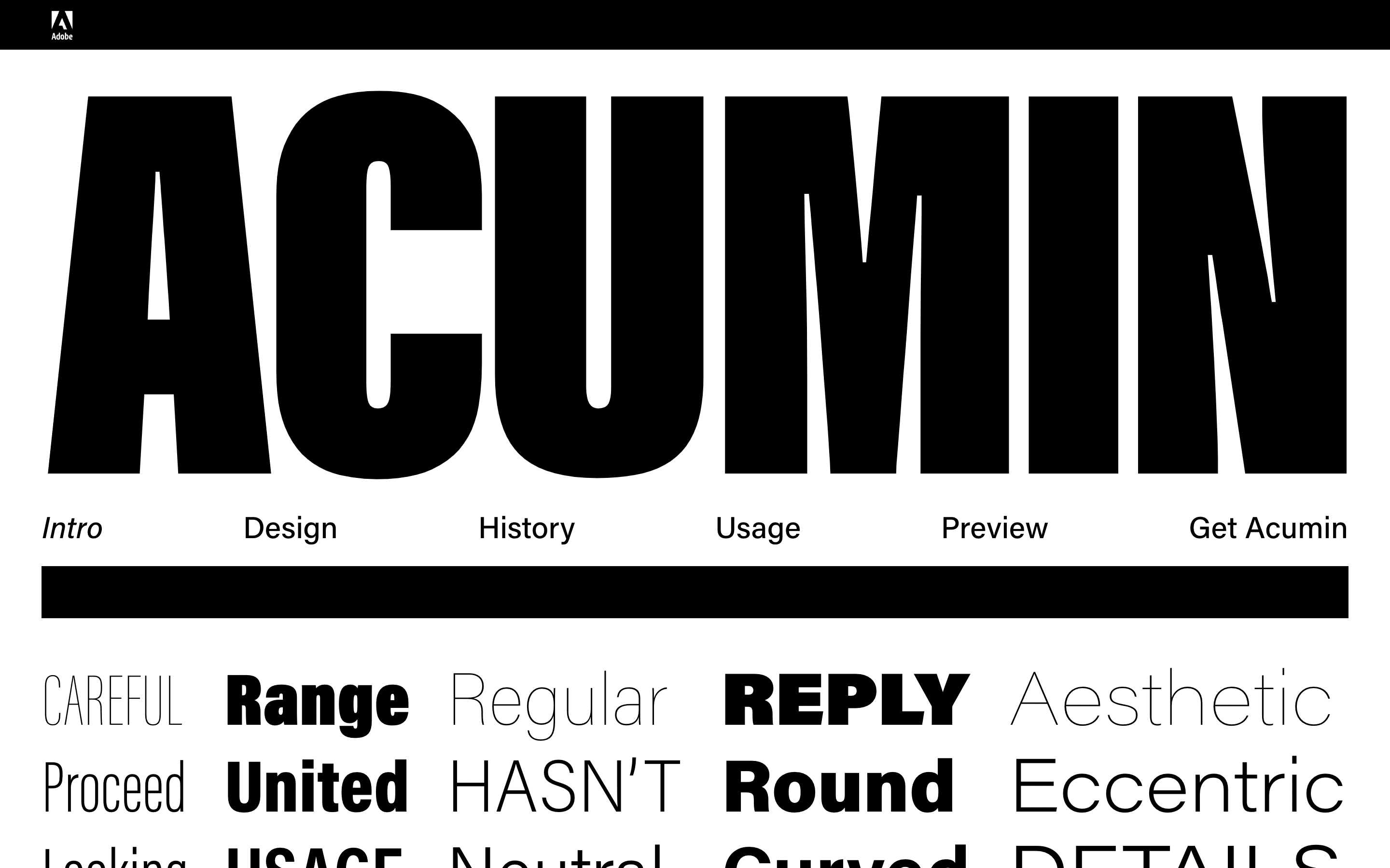
The next example that I stumbled upon is the presentation website for the Acumin Pro typeface. It’s the exact typeface that I used for the Better Web Type project. It’s a typeface that comes in many weights and condensed variants which makes it extremely flexible. This example uses the extra condensed, black (heavy) weight, at a size of 606 pixels! 🤯 The rest of the website doesn’t use titles this large, but is very well composed.
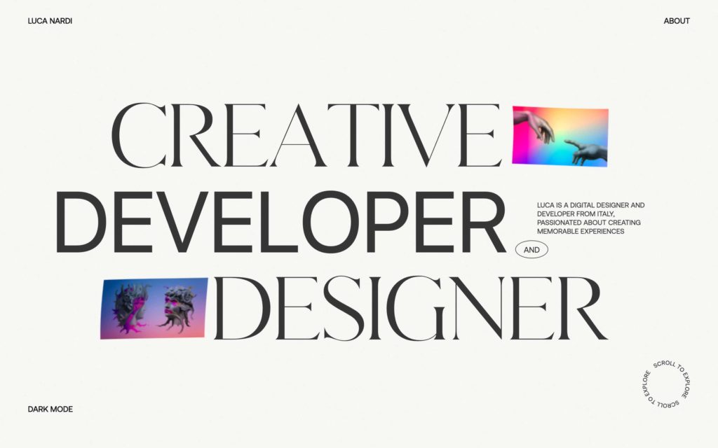
The extra condensed variant of Acumin makes it easier to use such huge type on the web, but what about using regular typefaces at huge sizes? Luca Nardi’s website combines two different typefaces at huge sizes: Gallient and the default system font. Gallient is sized at 164 pixels, and the system font at 179 pixels. Luca probably sized them differently to balance them out. If he didn’t one would optically look larger than the other. They both use the normal (400) weight.
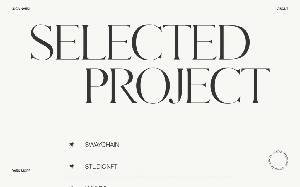
When I scroll further down the page I notice that the Selected Project title is larger. It’s Gallient at 216 pixels. Here, Luca breaks the general rules of web design: same-level titles should be set in the same size, so a heading 2 level is always sized at 120 pixels for example. But I would argue that it works well on his website. Notice the placement of the two words “Selected” and “Project.” They’re not left-aligned, not right-aligned. The positioning is purposeful misalignment to make the design more dynamic. Something that could be tricky on Luca’s website is the fact that he uses the system font and sizes it differently to match the size of Gallient. It seems to work well on Mac OS, with San Francisco being the system font, but how does it work with other operating systems? Each has their own default system font so each would need to be additionally styled to match in size.
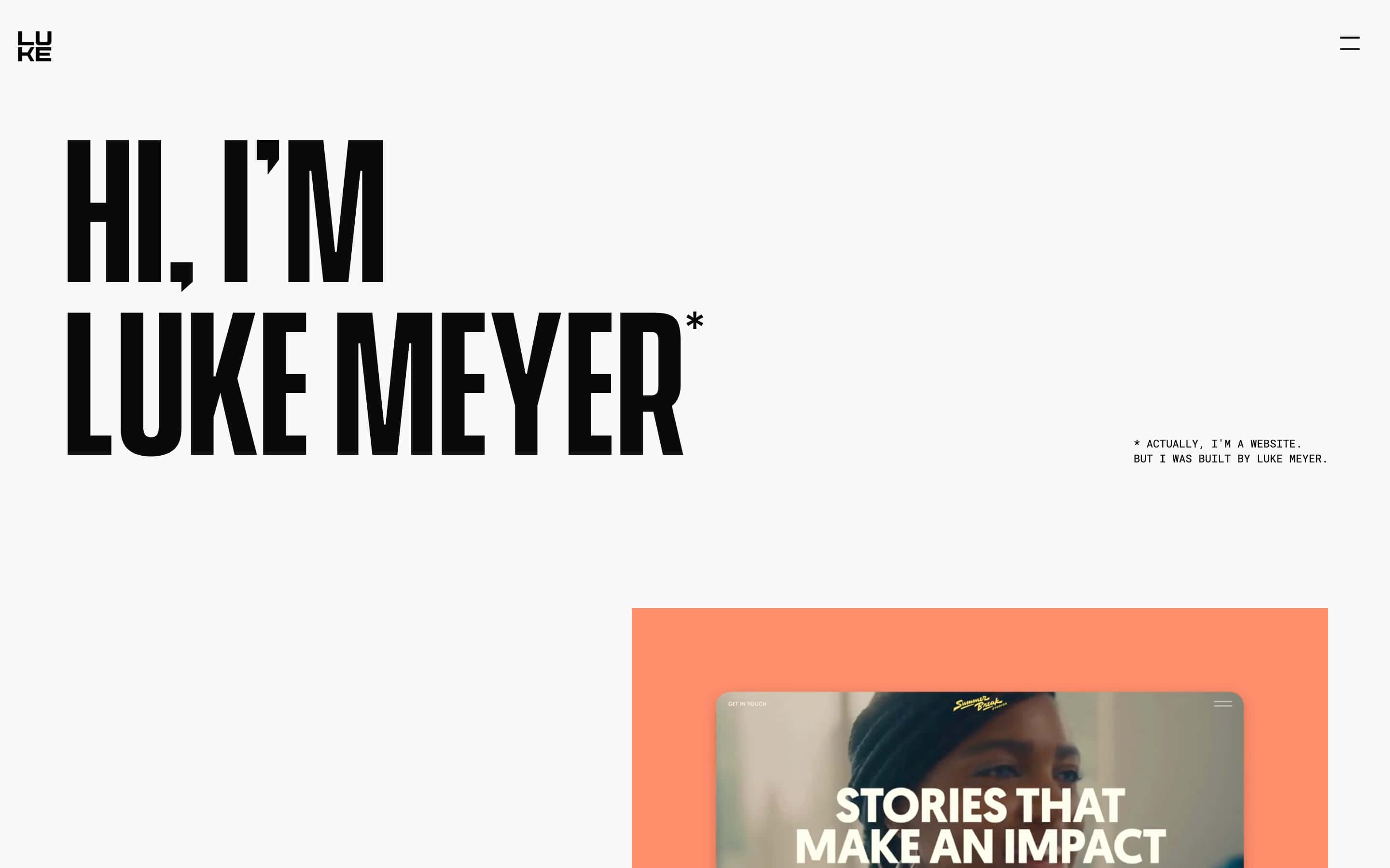
The last website I want to quickly look at is Luke Meyer’s portfolio (Fig 10). He used the semi bold (600) weight of Vanguard typeface, sized at 194 pixels. The interesting part here is how well the title combines with the tiny type just to the right. A perfect example of using contrast in typography to create interesting and dynamic website designs. Also notice the similar layout to the InVision example from the start of this exploration. Again, the obvious thing would be to left align all the elements but Luke did the opposite. It feels like the content on his website flows from the top left to the bottom right. It completely guides the visitor towards his latest case study.
Conclusions
Okay, let’s recap our conclusions about huge type so far. The fixed canvas and fewer elements to work with help when using huge type in print and graphic design. Unlike books, websites have other elements, often interactive, that need to be placed on the pages. Huge type always comes with tight line-heights. Perhaps it’s because huge type uses up more space and tightening the line-height is a way to getting around that. But I would also argue that it looks better like that. Grids make the layouts that use huge type dynamic and prevent them from becoming chaotic. There has to be some sort of alignment between the elements that makes sense. Sometimes it emphasises the contrast on the website like we saw in the InVision and Luke Meyer examples.
Dynamic designs and type positioning are common in most cases when huge type is used. I think it’s probably because the huge sizes of type basically enforce that. If you use a huge title on a website you need to get more creative about placement of other elements. And the last thing I noticed by going through these examples is that they all use generous spacing between elements. This is similar to the tight line-height but kinda the opposite. The tight line-height ties the title into one element nicely. Then, other elements around it are further away so that the separation between them is clear. It also helps create well-composed, harmonious website layouts.
Want to learn how to design websites with awesome typography that other designers will envy? Join my free web typography course and get seven lessons straight to your inbox! More than 30,000 designers already joined and its rating is 4.7 out of 5 after 1,056 reviews!
That’s it for this post, what do you think about huge type on the web? Have you ever used it? Why not? What do you like or dislike about the examples I explored here? Let me know your thoughts bellow in the comments section 👇 As usual, one randomly picked commenter will receive a signed copy of my book Better Web Typography for a Better Web. I’ll pick the winner by the November 21 and announce it here in the comments.
You can read part two of this blog post series here: How to use huge type on the web.

I’ve tried to get clients to go with huge type on several projects, but they always say “I really like it, but …” and in the end go with something much ‘safer’. So it feels to me that it’s quite hard to sell, but maybe will get easier if/as it becomes more common. That Invision page is *really* nice, so I’ll keep that as an example to show potential clients.
I agree, with time it should become easier to sell it to customers because they’ll see it elsewhere more often.
These “clean design and huge lettering pages” are becoming the new bold. And rightfully so, since the content and not graphics is king. Great article.
Thanks Gal!
Hey Gal, you’re the lucky winner of the signed book. Can you message me on [email protected] and let me know your address?
I’ve always found it hard to apply huge type and I still do. Definitely best used on very short sentences or 2-3 words 🙂
What?
Yup, I will look into this more in the next blog post but shorter titles definitely work better!
I’ve recently started trying to incorporate huge type into my design too.
That Vignelli example is so aesthetically pleasing to look at, I just love it.
Unfortunately I usually work with larger amounts of text and find it tricky to get the opportunity to experiment with making the text huge.
I think that’s a general problem when working with type on the web. Dynamic content and the changing of the “canvas” because of responsiveness. It’s almost impossible to make huge type look great in those situations.
I really enjoyed the examples you shared in this article. I am curious about how to make it work for responsive webpages though. Seems like one would have to go from “huge” to “large” to make the layout work.
Yeah, either breakpoints or fluid typography. I’ll explore that more in the next post!
Teaching an intro to web course, I love to show students stuff like this to get them inspired for their own designs. Going to incorporate some supersized typography in one of their labs. Thank you for sharing.
Thanks Marissa! I’m glad this post was helpful 👍