Last week’s post looked at websites that dared to use huge type and did it well. With this week’s post I’ll explore what it is that works well about the huge type on these websites and establish guidelines and recommendations for using huge type on the web.
This is part two of the Huge Type blog post series. Here you can read the part one: Huge type on the web.
I’ve been advocating more daring and bolder use of typography on the web ever since I started the Better Web Type project. Picking a sans-serif font for titles and a serif one for the content is boring. So is placing the title at the top of the post and centre-aligning it. We’ve now had the tools required to design and build more interesting websites with exciting typography but most websites still go for a safer option.
Lately I’ve been noticing a trend that will help move away from type boredom on the web — the use of huge type. Last week’s post Huge type on the web explored cool websites that masterfully used huge type. Now when I say “huge type” I mean type that is larger than usual. I’m looking for titles that absolutely dominate the websites. Sometimes they’re combined with graphics, but most often they’re not. They’re so imposing that they often don’t need graphic sidekicks. They alone make the website stand out. Let’s take a look at a few more such examples and analyse them.
Cool websites with huge type
The first website that stood out to me was Connor Murphy’s portfolio (Fig 1). On top of a light grey background, Connor used Haas Grotesk for the main title I’m Connor, a digital designer based in Denver 🏔 The most striking thing is that he used the regular weight. I think this typeface, used in that weight, would look boring at a “normal” title size. But Connor dared to use huge type and it makes his website look great.
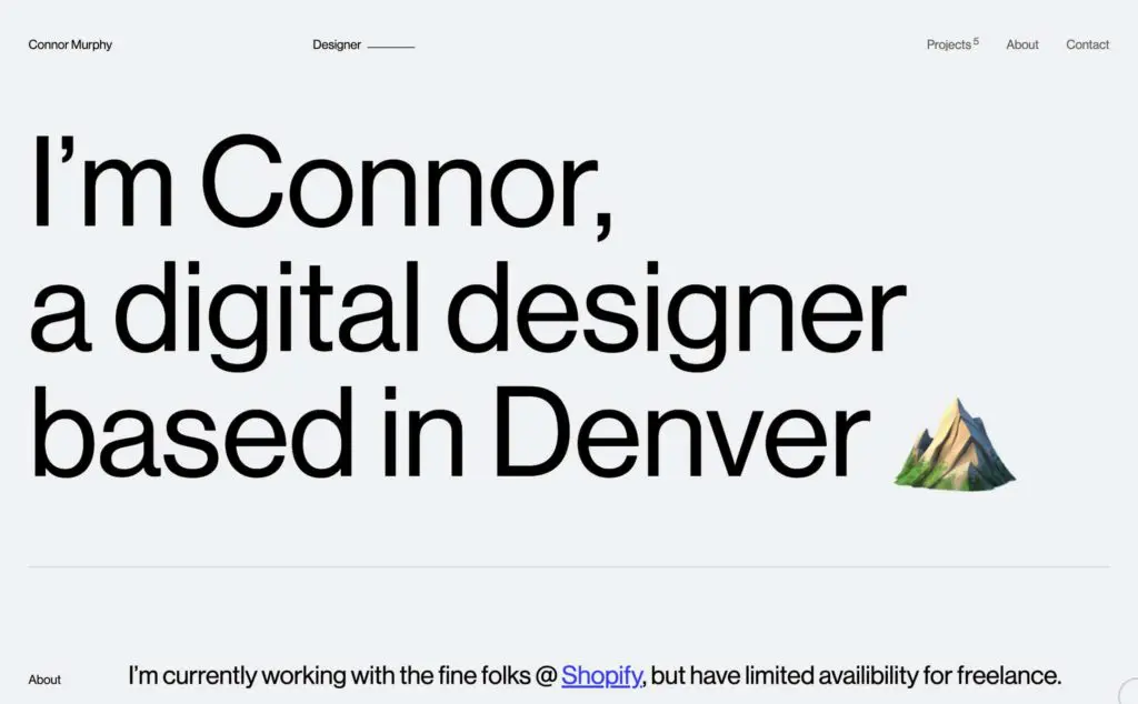
The main title is sized to 176 pixels on a Macbook Pro screen. It uses two breakpoints to scale the type to make sure it looks good on all screen sizes. One breakpoint is for the smaller screens, the other one is for the very large screens. It actually switches between units to size the type as well, it uses em for the smallest and largest screens and the vw for all the sizes in between. So Connor’s website uses both fluid and responsive typography. To inspect the website from the accessibility point of view, I changed my default browser font size to the largest and the type size did change. The website still looked good.
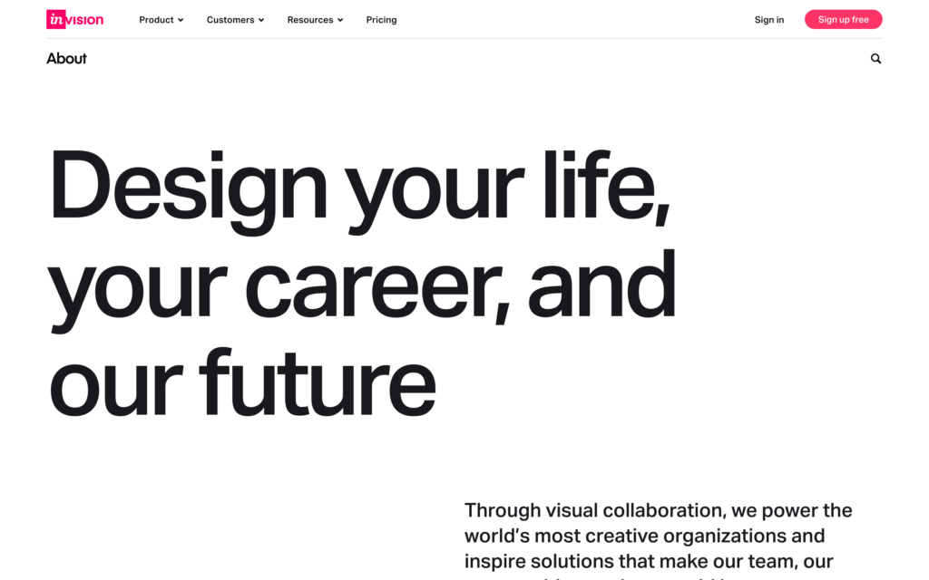
The InVision Careers page (Fig 2) is the next website I want to take a look at. It uses the Activ Grotesk typeface for the title and it’s sized at 156 pixels on my MacBook screen. It uses one breakpoint to make sure the font size of the main title doesn’t go beyond 160 pixels on very large screens. The font size is completely fluid until that point. It uses a formula (calc(88px + (72 * (100vw - 800px)) / 800))to define the size of the title which includes pixels and vw units. There has to be something about this formula that prevents the font size from increasing when I change the default browser font size. This way they make sure their website looks great on all screen sizes, but does it introduce accessibility problems? We’ll come back to this later.
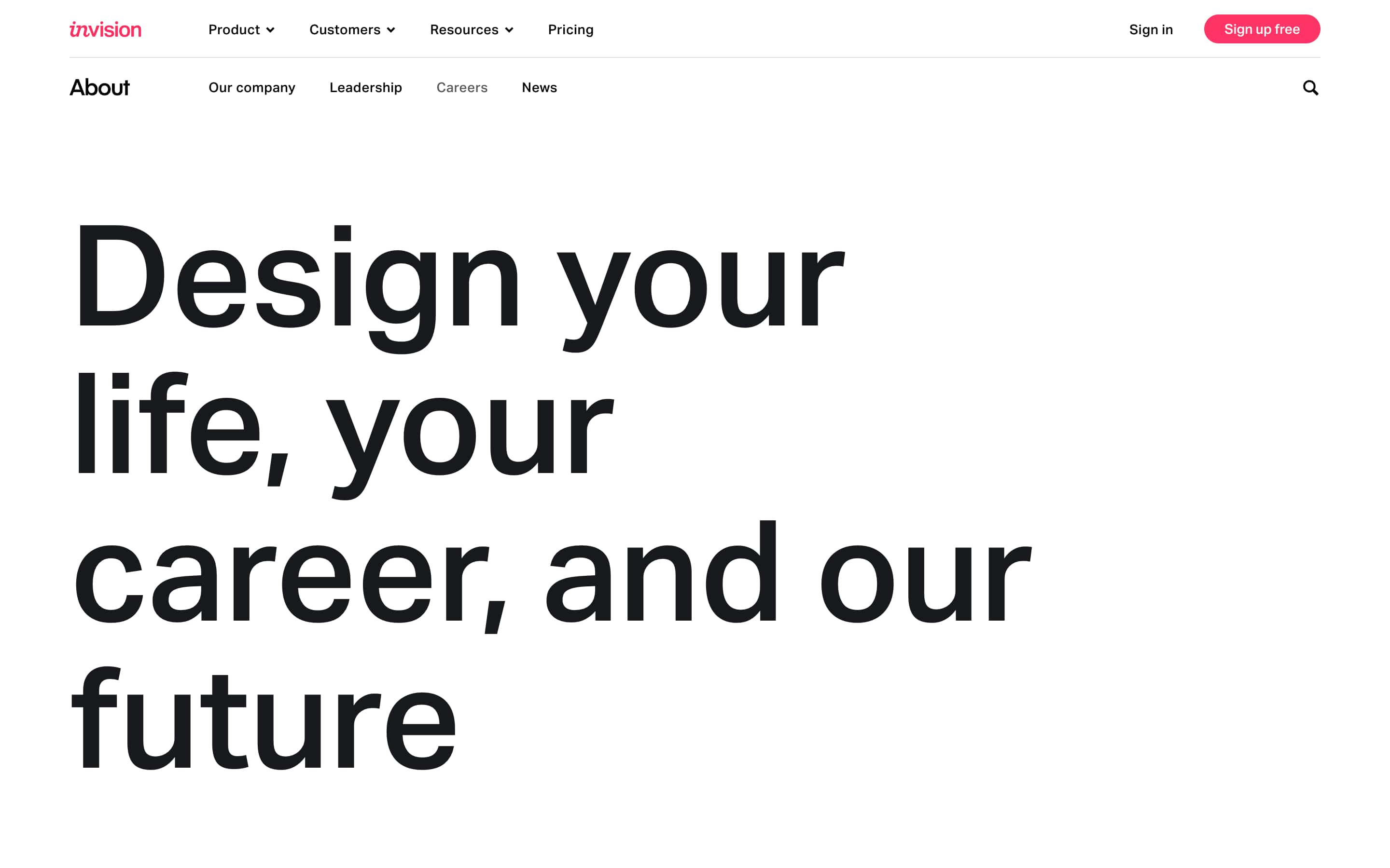
The font they use doesn’t seem to be a display font but they did condense the letter-spacing a bit. They use a formula for it and it makes the title look really nice 👌 For comparison, take a look at the screenshot below (Fig 3) to see what it looks like without reduced letter spacing.
Next is another designer’s portfolio. This time it’s Isabel Moranta’s website (Fig 4 and 5). The top part is minimalistic and simple, just a huge title “Digital Designer” in black and set in Antiqua Roman at 319 pixels on my MacBook, placed on a light background. It exudes sophistication. This website doesn’t seem to be using breakpoints, only fluid web typography. This means that it doesn’t look as good on really small or on very large screens. It uses the vw units for setting the base font size and then rem units to size different parts of text. I have to say I’ve never encountered such approach to font sizing in CSS. It looks like this approach also prevents the default browser font size to have a say in the actual font size. Nothing changes when I try to increase the browser’s default font size. The font doesn’t seem to be a display font and it doesn’t tighten the letter spacing. I would say it doesn’t need to as the letter spacing already looks good.
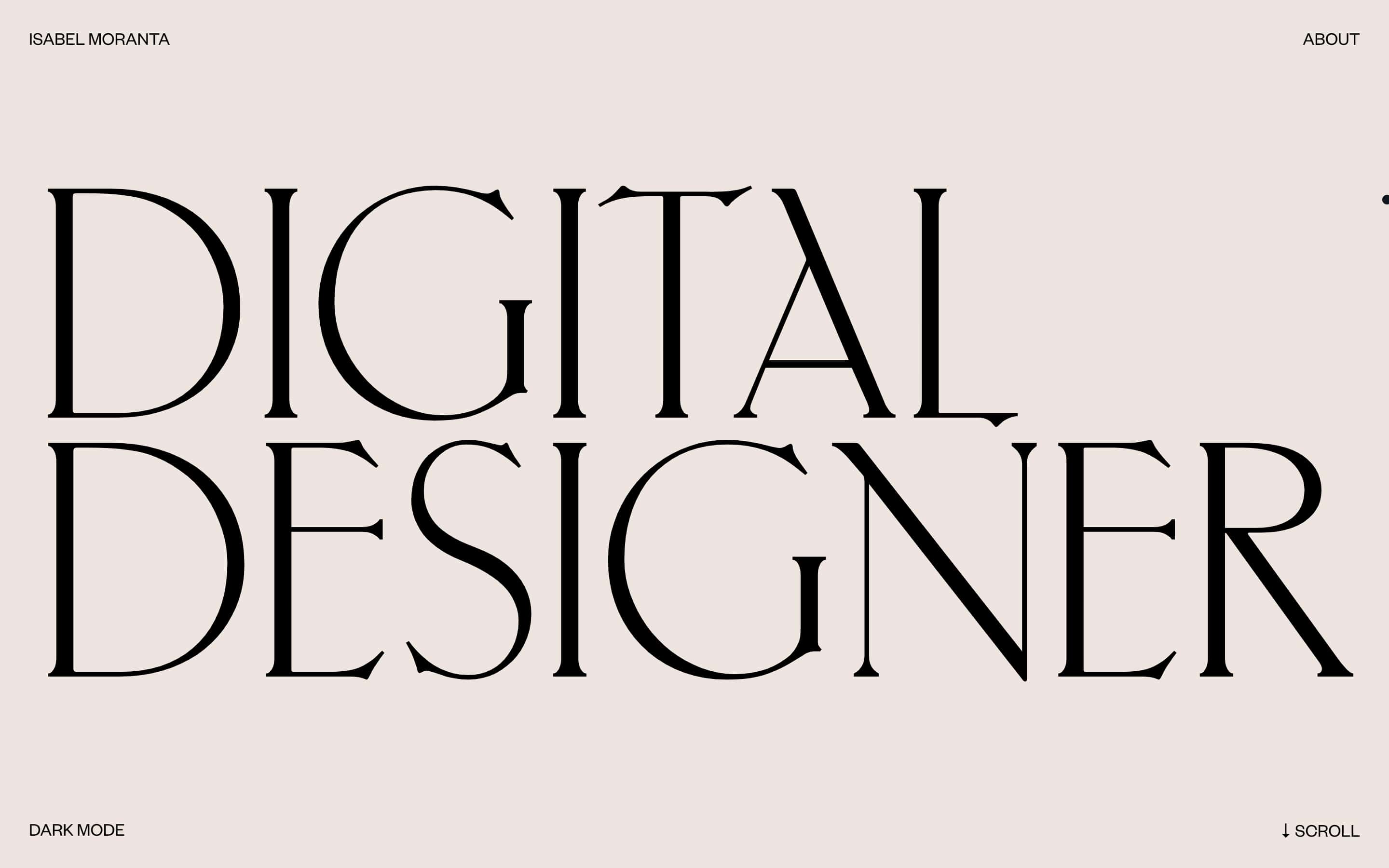
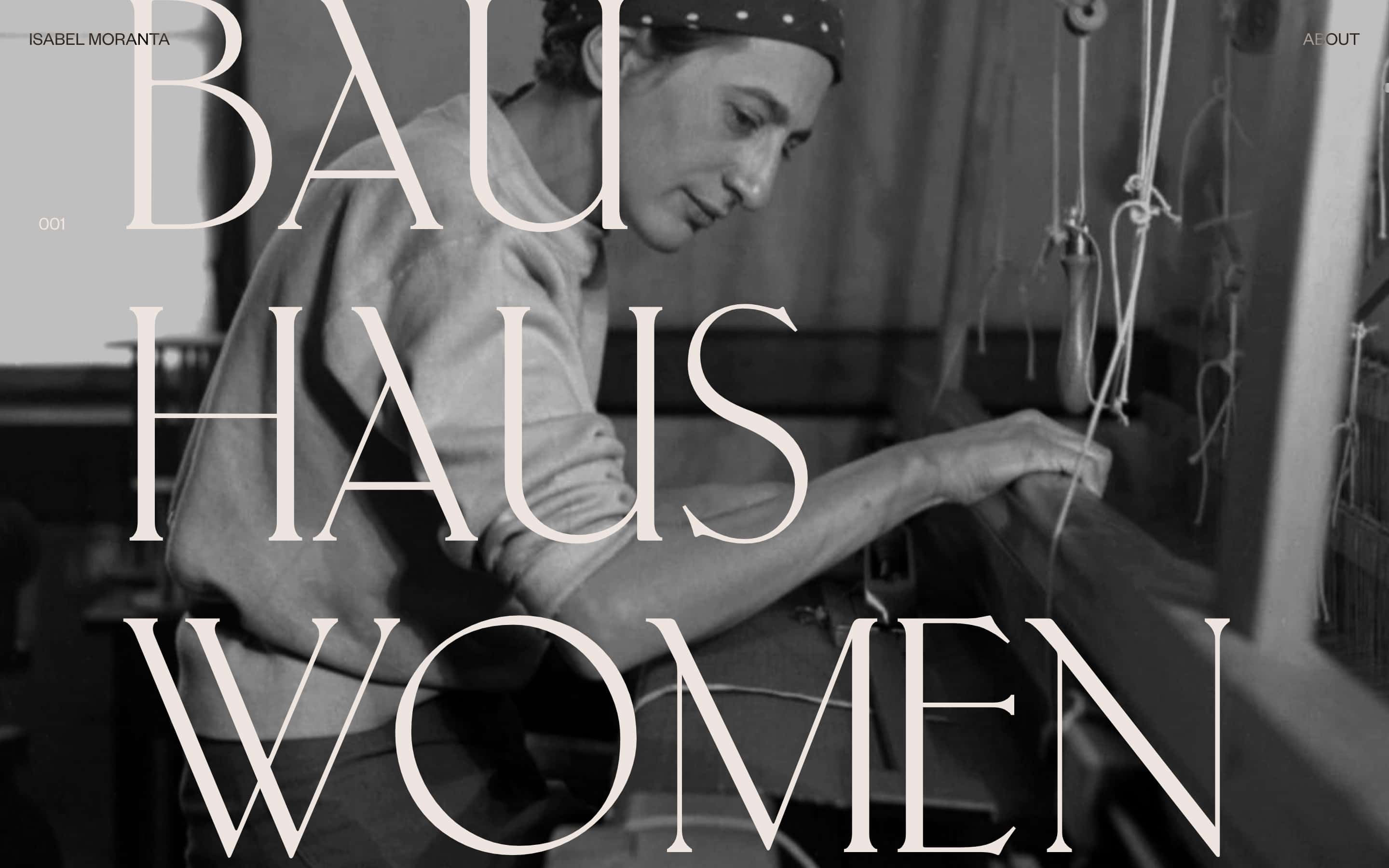
Interestingly, it sizes the font of the two words differently. If you take a closer look, the word “Digital” is set at a smaller font size compared to “Designer” so that the two of them align optically. The second “I” in the first word aligns perfectly with the “I” in the second one. Isabel is breaking some rules here but she does it masterfully. First of all, it’s hard to even notice the difference in sizing, and secondly, she does it for a good reason.
The last website I want to analyse is the presentation of GitHub’s Mona and Hubot Sans typefaces (Fig 6). They released these two variable typefaces this week and I was blown away by the awesome huge type right on the top of the website. Of course, the title is set in Mona and Hubot Sans, at different sizes to match them optically. This time, the authors wanted to match the width of the two words “Mona” and “Hubot”. On my MacBook the two words are sized at 245 pixels and 327 pixels respectively. The fonts are variable so it makes it so much easier to adjust their weight and width so that everything matches nicely. The Mona word’s font-stretch property is set to 83%, the Hubot is set to 75%.
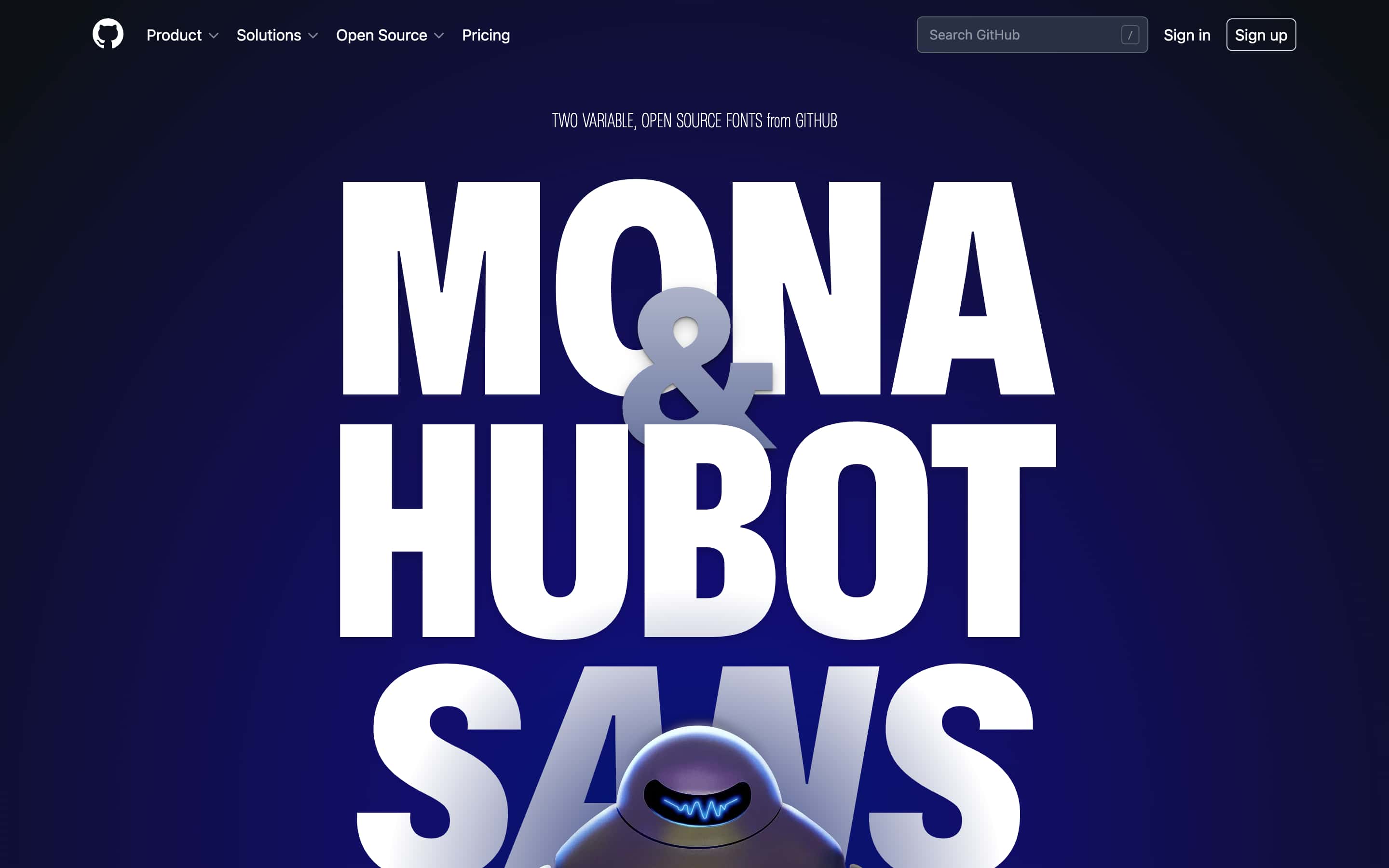
The website uses only one breakpoint to make sure the fonts don’t get too large on very large screens. It uses the relatively new min function to set a size in vw units and a minimum size in pixels. Something about this function prevents the browser’s default font size to have an impact on the actual text size. The authors of the website slightly tightened the letter spacing by -0.01em which results in 1% reduction.
Recommendations for using huge type on the web
Short titles
All the websites I explored were marketing websites. So these websites present a product or a person and their work and their content is static. They’re not blogs where the content would change on a regular basis. I think this is the main factor that makes the huge type work on these websites. I experimented with using huge type on dynamic websites in the past but I kept coming to the same problem: some titles are short, others are long. Most are quite long on blogs but huge type tends to work well with short ones. To give you an example based on blog posts from my own website: how could I make sure that the following two titles look good set in huge type?
- Why designers quit
- Open-plan offices are the sweatshops of the West
It would be quite easy to make the first one look good but the second one would just take way too much space. The compromise? Use large type instead of huge. That’s exactly what I did in the recent redesign.
So the first recommendation is to use huge type with short titles. That probably limits its usage for static and marketing websites, rather than dynamic blogs and similar. The former offer the web designer a lot more control over the content than the latter. This is also the main reason why a lot of websites can’t use huge type.
Scaling huge type
I would recommend a combination of responsive and fluid web typography when using huge type. At least two breakpoints should be used to make sure the large titles look great on all screen sizes. One for the smallest screens and one for the largest. If no breakpoints are used, and with them limits set, then the titles will scale infinitely which will result in odd looking websites on large screens.
Accessibility
In most other cases I’d be rigid with recommendations when it comes to accessibility. But this one lies in the grey zone. Some of the title sizes didn’t change when I increased the browser’s default font size but does it really impact accessibility? The titles are already huge so I’d say that in cases like these, aesthetics can be prioritised. The changing of the text sizes based on browser’s default font size depends on which units are used in the CSS. I’d go with units that change according to the browser setting for the smaller screen sizes (vw, em, rem) and I’d use units that prevent this setting having an impact on really large screen sizes (pixels). The min and max functions can also work really well here as we saw in the GitHub’s example.
Optical alignment and size matching
Out of the four examples that we analysed, two used optical alignment. Tread carefully here though as this is a way of breaking the rules. So if you decide to mix and match font sizes, make sure it looks good and that it isn’t noticeable. Isabel’s portfolio from before is a great example of this.
Use display font variants
Display fonts are defined as:
A display typeface is a typeface that is intended for use at large sizes for headings, rather than for extended passages of body text.
(Source)
So whenever you can, you really should use the display font version instead of the regular one. They’re meant to be used this way and they’ll look perfect!
Adjust letter spacing
Two out of four examples we inspected also altered the default letter spacing of the fonts they used. This goes along with the recommendation for using display fonts. Display fonts will look better balanced when set at large sizes, so if you can’t use one, try adjusting the letter spacing a bit. Usually it needs to be slightly tightened, one percent reduction tends to be enough.
Use grids
I started this blog series with describing how I always admired Massimo and Lella Vignelli because of their common use of huge type. Something that always accompanied huge type in their work were grids. It’s a bit harder to use grids on the web because of it’s dynamic nature, but we should still try. This doesn’t mean that we need to use a CSS grid framework and stick to it religiously. But when you‘re designing the website in your digital design tool, think about alignment and the relationships between the elements on the page. The InVision careers page is a great example of this.
Conclusion
I end this blog series where I began. Using huge type is easier in print than it is on the web. The main reason is the dynamic nature of the web—the content keeps changing on most websites, and so does the screen size through which they’re viewed. This alone is the biggest hurdle preventing broader usage of huge type on the web. But if you’re designing a website where you have a lot of control over its content, consider breaking away from the safe but boring web typography. Consider using huge type. It’ll make your work stand out.
Want to learn how to design websites with awesome typography that other designers will envy? Join my free web typography course and get seven lessons straight to your inbox! More than 30,000 designers already joined and its rating is 4.7 out of 5 after 1,056 reviews!
That’s it for this post, what do you think about huge type on the web? Have you ever used it? Why not? What do you like or dislike about the examples I explored here? Let me know your thoughts below in the comments section 👇 As usual, one randomly picked commenter will receive a signed copy of my book Better Web Typography for a Better Web. I’ll pick the winner by the December 5 and announce it here in the comments.

Great article it hit home. I’m about 90% done with my own portfolio and large typography was my focus.
Looking forward to reading more of your future articles and your book is my stocking stuffer.
Thanks Ivan!
Hey Ivan, you were picked for to receive the signed printed book! 🎉 If you can send me your address to [email protected] I’ll send it your way!
Good short-read! We re-shared this on our FB graphics link-sharing page: https://www.facebook.com/creativeinterfaces/
Thanks for sharing Ben!
Great read and an excellent guiding tool for digital designers. I landed on your piece while my own portfolio and found the examples to be gems.
I’m glad the timing was perfect, Ashita!
Hello,
Thank you for sharing idea. The concept looks great.
I have a few questions —
What are the advantages of using a huge type face for a website?
Have you noticed any any web page performance improvements ?
By ‘marketing website promoting product or a person’, did you mean this type of design is popular among graphic designers/agencies? (Follow up to this) Do you see any other industry benefit with this type of web design?
Hey Farhad,
I think the main advantage is standing out with a bold design. It’s a bit of a trend but I would say it’s still quite rare for the reasons I mention in the blog post.
Yes, this approach to design is very popular with designers when they create their portfolios, or agencies as well. But I’m starting to notice it elsewhere on marketing websites that are promoting products. I guess the GitHub website from the post could be an example of this. I think anyone can benefit from this but they need to keep the recommendations from this blog post in their mind.
Great article, thank you. One addition – css has a great min-max function called clamp. With it you can set a min, flexibile and max value, eg. clamp(3rem, 10vw, 9rem). This would make the text 10vw but stop scaling when the value reach 9rem (144px), the text will also never become smaller than 3rem (64px). I’ve found that this can often remove the need of breakpoints for font sizes altogether.
Thanks for that tip Olle! I did notice the clamp function in some of these websites which I noted in this blog post series. I agree, it’s a great way to handle web typography sizing without the need for breakpoints.