Welcome to the 16th edition of Designer’s Digest. Today I want to discuss a relatively new UI design trend that is becoming popular. Recycled, like all design trends (we learned that in the 14th edition of this newsletter), it has its origins in the 1950s. Interestingly I found a quirky sans-serif font to go along nicely with this trend. Let’s dive right in!
Do you enjoy this newsletter? Please forward it to a friend or tell them to subscribe here. I’ll be forever grateful! 🙏
In this edition:
- Uncut Sans (a quirky variable sans serif font)
- The Neubrutalism or Neo Brutalism UI Design Trend (3 min read)
- Everything New in Figma (9 min read)
How was your weekend? Yesterday I spent three hours solving a problem on betterwebtype.com. I’m renovating and preparing the website so that I can start publishing new content (I’m almost there btw). This problem came out of nowhere, it caught me completely off guard. I was concerned about it because two of my learning games the Typography Quiz and the Font Memory Game weren’t working anymore. So the problem was already live on the website.
So there I was, spending the afternoon wracking my brain to figure out what caused the problem. It pissed me off because afternoons are reserved for spending time with our kiddos. Then came the time to feed them and I had to step away. I closed the laptop and went to help my wife feed the twins. I disconnected from the problem for just a moment but it was enough for my brain to finally crack it! I only returned to the problem this morning and the solution was exactly what I thought of while feeding the kiddos.
So I spent 3 hours trying to solve a problem I thought was really complex, that turned out to be really simple. So simple, in fact, that my brain just couldn’t make the connection. I had to take a break. It’s like you’re updating a file but the website doesn’t change. In the end, you find out you’re either updating the wrong file or exporting it to the wrong folder, or something like that.
Anyway, the lessons here are:
Is the problem you’re solving really complex or is it actually very simple but you haven’t thought about it yet?
Sometimes, to see a problem with new eyes, or solve a tough problem you need to step away from it for a while. Disconnect and come back when you have fresh ideas.
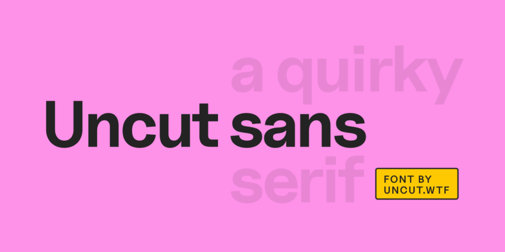
Uncut Sans
I found this font a while ago but was waiting for the right time to feature it in this newsletter. It’s a quirky sans-serif, not trying to copy any historic font or style. That’s why I think it’s perfect to match with today’s featured article about Neo Brutalism. It’s variable and has a wide range of OpenType options. Download it on GitHub.
The Neubrutalism or Neo Brutalism UI Design Trend
As already mentioned in the intro, this design trend has its origins in the 1950s and is characterised by vivid colours, no gradients, bold and modern futuristic typography, outlines, and hard shadows. It’s a trend that is becoming popular but isn’t widespread yet. Elvis Hsiao explores this trend and what it means for the design industry in his article.
I find it intriguing, and I actually already borrowed (unwittingly) from this trend when I recently updated my website. Yes, if you follow the design trend strictly you end up using a lot of vivid colours and unusual layouts. It’s a bold design trend. But you can borrow certain aspects of it and combine them with other trends. This is exactly what I did when I took the hard shadows and thick outlines and matched them with the minimalistic style of my website. Take a look at the Bio section at the bottom of this post for an example.
Everything New in Figma
Are you overwhelmed by everything new in Figma? I can’t keep up with everything that’s happening so articles like this one by Joey Banks are really helpful. It’s only a 9 min read and you get to see the most important new things in Figma.
In short, the coolest new things are:
- Variables: 4 variables are available — color, string, boolean, and number
- Dev Mode: this is a completely new mode that can be switched on and off. It works beautifully with integrations for VS Code, GitHub, and Storybook. This is great for bridging the gap between designers and developers.
- Advanced prototyping: Imagine you need a prototype that feels like a real website where users can input text into text fields. In the past I had to use Framer to do that, no we can do it in Figma too!
- Auto layout wrapping: this is the one that I’m most excited about. Items that don’t fit into auto layouts will be pushed into new lines. We can finally do responsive design in Figma!
When you’re ready, there are two ways I can help you right now:
- Join my Slack community to interact with 270+ designers that have similar problems as you (Still free at the moment)
- Find and get your dream UX/Product Design job — my UX portfolio course to help designers progress in their careers
That’s it for this Monday, have a great week! 👋
Cheers,
Matej