Welcome to the 14th edition of Designer’s Digest. There’s a lot to unpack, exciting and really cool stuff, so I’ll get right to it!
Do you enjoy this newsletter? Forward it to a friend or tell them to subscribe here. I’ll be forever grateful! 🙏
In this edition:
🅰 Frank Ruhl Libre (a modern transitional style serif font
♻️ Design trends and cycles in UI/UX, the history of art, and typography (15 min read)
🎭 What feelings evokes a font? (a thread in the DESIGNR Slack community)
📝 Help me out with the designer layoff survey
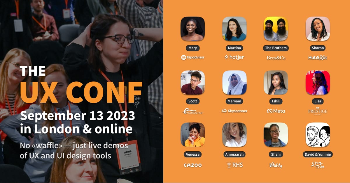
How was your weekend? Today, I’m proud to say that I have a sponsor for the very first time. It’s TheUXConf, a London-based conference, which I already had the privilege to attend and enjoy in the past. I can’t go to London this year with our newborn twins keeping me busy, but I’ll attend online. The in-person tickets are now on early bird sale, but if you can’t go to London you can still get the Online or the video recordings-only ticket.
And here’s something extra, if you use the promo code MATEJ10 you get an extra 10% discount! 🎉
They have an awesome lineup of speakers this year and they’re doing something different — no presentations but demos. To me, that sounds like lots of practical learning. 🙌
TheUXConf on September 13th 2023 online and in London
No “waffle” — just live demos of UX and UI tools, design quiz, and “Designer vs AI” battlefield. The most diverse crew of speakers from Eurostar, Tripadvisor, HubSpot, Skyscanner and others.
MATEJ10 for extra 10% discount
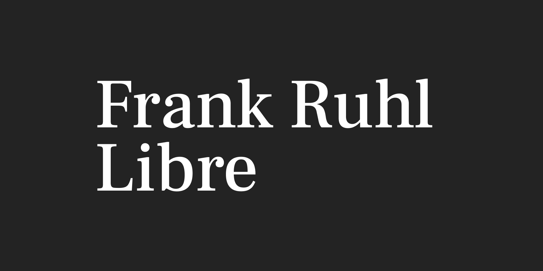
🅰 Frank Ruhl Libre
I worked on a design recently where I felt a modern-looking serif font was required for the titles, combined with a sans-serif for the body text. I know Google Fonts is a strong platform for such fonts so I went looking for it there. After a while, I found it — Frank Ruhl Libre. What I love about it is the Baskerville feel to it, but a bit more modern. It’s a beautiful transitional style font that works so well for the titles but could also be used for body text. Just be careful, it might look a bit formal when used like that. Did I mention it’s a variable font? It is, so you could adjust its weight depending on whether it’s on a dark or a light background. Get Frank Ruhl Libre on Google Fonts.
♻️ Design trends and cycles in UI/UX, the history of art, and typography
Have you ever noticed how everything repeats? When I was starting out as a designer Skeuomorphism was all the rage. The iPhone had just come out and its UI mimicked things in real life so that people could get used to its most revolutionary feature — the touch screen. Then it was all flat design, then minimalism and geometry (remember the geometric fonts trend just a couple of years ago?), brutalism, and now it seems we’re almost ready for a slightly adapted version of skeuomorphism again. Is that a coincidence? Is there really nothing new that we can come up with? Is every new trend a recycled one from the past? Why are we cycling through these trends faster and faster?
This is a beautiful piece by Hrvoje Bielén in which he tries to answer all these questions. I highly recommend you read this fascinating article.
🎭 What feelings evokes a font?
Miviene started a really interesting thread in the DESIGNR Slack community by asking: What feelings evokes Volkorn?
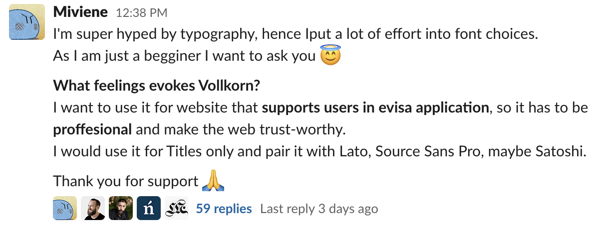
The requirement was that the design had to look professional, and trustworthy, but modern because it’s a website for visa applications. Volkorn is a serif font that would look great when used for titles, combined with a sans-serif font for body text would make it stand out nicely. Here’s the initial design where Volkorn was paired with Satoshi:

Other designers in the community jumped in and gave feedback. It was a fascinating discussion to follow as we could all see how the design evolved based on the feedback provided by designers in the community. Here’s the final result, a combination of Noto Serif for the title and Noto Sans for the body text:

Beautiful! 👌 If you need feedback on your designs, font choices, font combinations,… join the DESIGNR Slack community (still free for now).
📝 Help me out with the designer layoff survey
I spoke to other designers who also got laid off recently and decided to write a post about their stories. Before that, I want to gather more information based on what they had already told me so I created a survey. Fill it in if you’re a designer that got laid off in 2022-23 layoffs. If not, share it with others on LinkedIn so that we get as many responses as possible.
👉 Link to the survey
👉 Link to the post on LinkedIn (share please)
When you’re ready, there are two ways I can help you right now:
- Join my Slack community to interact with 260+ designers that have similar problems as you (Still free at the moment)
- Find and get your dream UX/Product Design job — my UX portfolio course to help designers progress in their careers
That’s it for this Monday, have a great week! 👋
Cheers,
Matej