Common mistakes designers should avoid to make the first cut in UX hiring
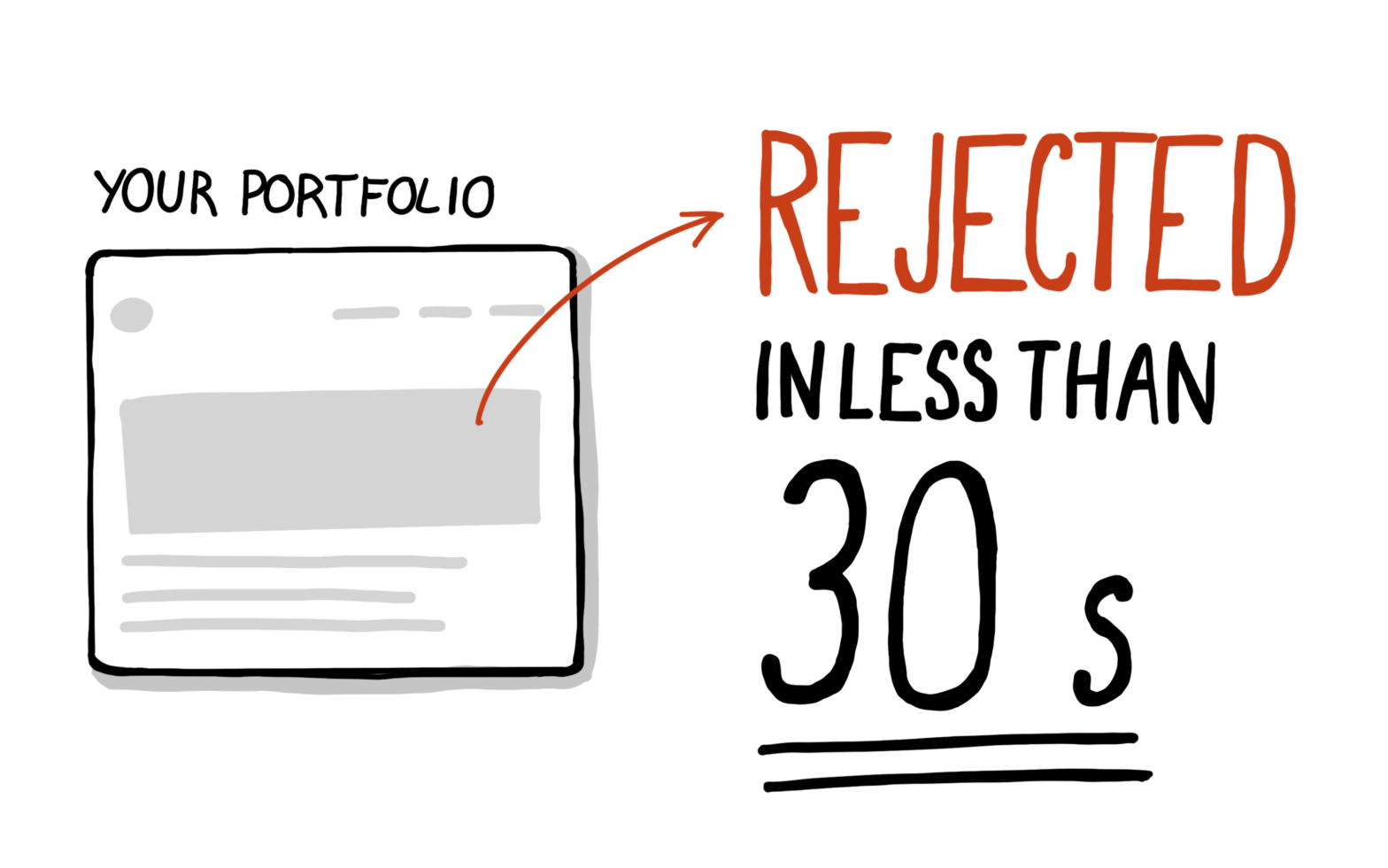
I didn’t make that number up. I was probably too generous, it’s even lower. Some sources suggest that recruiters and hiring managers spend around six seconds reviewing job applications from candidates. After hours you invested in writing and polishing your case studies, you get dismissed in mere seconds.
That’s harsh. But it’s the reality. When reviewing designers’ job applications, portfolios are equally important to resumés. That’s why the number of seconds until the first cut is higher. Still, a design manager can only dedicate a small amount of time to reviewing a candidate and their portfolio.
🤫 Psst! My new online course UX Buddy helps designers create their UX portfolio, find, and get an awesome UX design job with a UX/design-mature company. It’s now live and enrolment is open for a couple more days. Check it out!
Try to put yourself in their shoes. They’re busy running strategic design initiatives, managing stakeholders and their designers, and have their calendars filled with meetings. On top of that, they have to dedicate some of their time to reviewing thousands of portfolios. That number isn’t exaggerated, when I worked at a Big Tech company, we received a couple of hundred applications per week. It was mostly the design managers who were tasked to comb through them.
To be efficient, these design managers start to recognise patterns of “rejectable” portfolios. They don’t have other options but to eliminate the worst in seconds.
But here’s the main problem I want to discuss today: your current portfolio isn’t a real depiction of you as a designer. You make mistakes because you don’t know better, or even because you were taught wrong. Or maybe you don’t recognise the importance of what impression your portfolio makes.
And the higher your seniority, the quicker your portfolio will be rejected when encountering some of these mistakes. You don’t make that 30-second cut. It’s simple — the higher the seniority, the higher the expectations and the heavier the weight of these mistakes.
Common UX portfolio and case study mistakes that’ll get you rejected immediately
I write these comments and recommendations in the first person so it’s easier to imagine they’re coming from a design manager reviewing your portfolio.
Quality issues
I’ll get straight to the point. Quality issues for designer’s portfolios are small images (that can’t be zoomed in), pixelated images, and grammatical mistakes. Here’s an example from a case study I recently reviewed (Fig 1).
I didn’t zoom in on a small image or alter it in any way. That’s exactly how it was in the case study. Is it a lack of care or no attention to detail that led the designer to include this image? I don’t know, and frankly, I don’t care. When you have 98 other portfolios to review, this alone can be enough to reject a candidate.
The same goes for spelling and grammatical mistakes. There are so many tools available these days to improve your writing. Before you hit the publish button, check it with a spell-checker or Grammarly. A single spelling mistake won’t get you rejected (it happens to all of us) but many mistakes indicate a lack of attention to detail which is a huge turn-off for designers.
Generic and boring titles
The title of your case study is the best chance to grab my attention. But what do most of the designers do? They use the project name or company name for the title. At best, they’ll include one specific thing they worked on, like Company name onboarding.
This is a huge missed opportunity. Your title should be descriptive and tell the story in a single sentence. Most importantly, it should captivate the reader and get their attention.
You can use the following format to do that:
How I (describe your action) to (describe the result) and (describe a better outcome).
Here are two examples:
Metric-focused: How I ran a design sprint to redesign a chat feature and improved the customer satisfaction score by 20%.
Outcome-focused: How a design sprint I facilitated at Company X communicated the value of UX and established a more collaborative and holistic design process.
Fail to capture the reader’s attention
Imagine the first sentence of a case study is the following: The goal of this project was to help reduce errors made during the manual configuration of leasing products. Interested in what the case study is about? No, neither am I.
Now imagine this is the first sentence: UX research insights can undermine designers. It’s a simple fact statement but it makes you wonder — how can research undermine designers? Isn’t UX research good? This is why you’d read this case study but not the one before.
Here’s how you can do this in your case studies — you use a hook.
A hook (or narrative hook) is the literary technique of creating an enticing beginning—the very first line or opening of a story—designed to capture readers’ interest (Source).
All captivating articles use hooks, can you spot it in this article? It’s the title. And the first sentence “I didn’t make that number up” is another hook, in the form of a statement, that reinforces it. I won’t go into details on this, there’s a lot of good advice in the article I linked above. The point I want to get across here is that you need to pay extra attention to the first sentence of your case study. Don’t just write something, think hard about what that sentence should be to captivate the reader.
If you show that you can captivate an audience in a written report about your work (like a case study), it shows that you can do that in real life when you have to communicate design decisions.
Fail to establish context
Most designers make this mistake — they fail to explain what situation they were in when writing about their work. They fail to explain the problem that they were solving in a way an outsider would understand. Look at the image below (Fig 2) and compare the introduction paragraphs. Which case study would you continue to read?
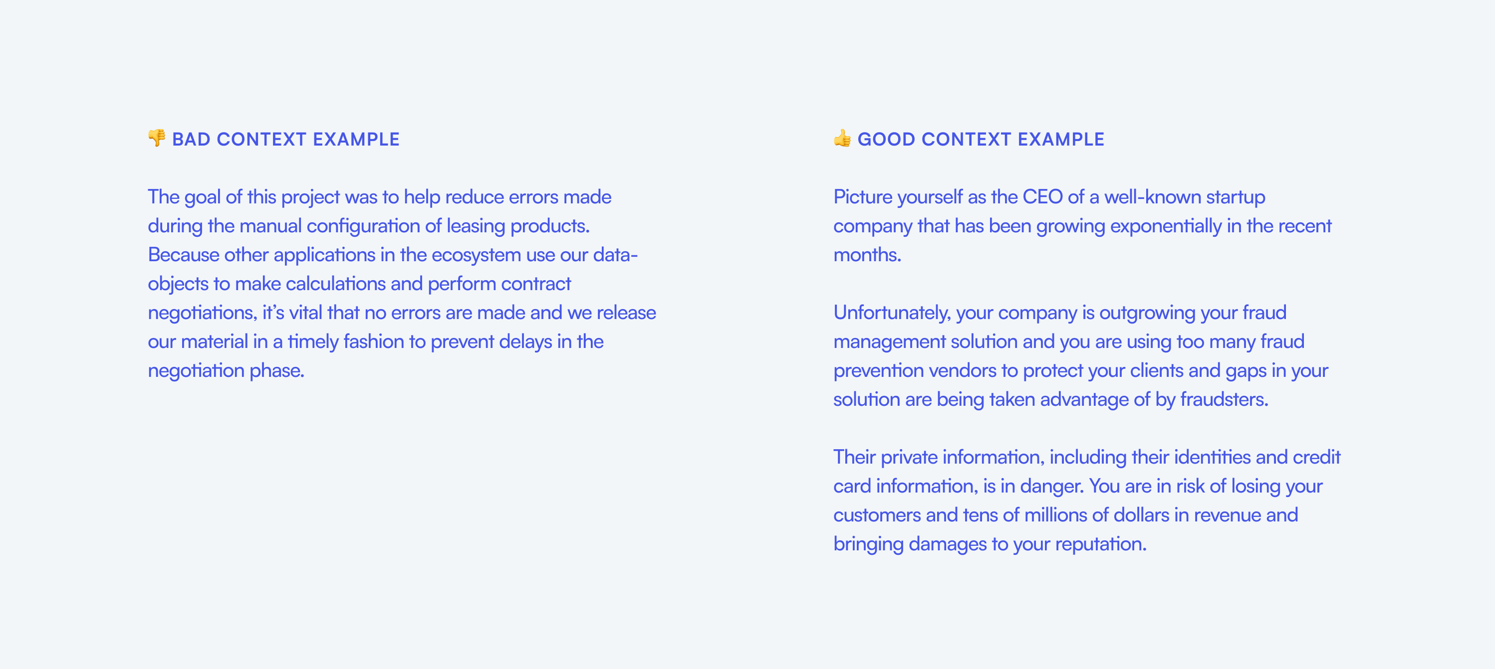
You need to tell me about your situation and your problem like you would a 5-year-old, not a coworker. I don’t have an insider’s view of your work. If you worked on some highly technical hard-to-understand stuff you need to explain it in a way that I understand it. Otherwise, I lose interest and notice a lack of skill in explaining hard things (communication) which is so important for designers.
I always recommend using the STAR (Situation, Task, Action, Result) framework for writing case studies. Explain your situation and task in the intro to establish context. You can have a perfect title and a captivating hook, but I lose interest if I don’t understand what you were doing and why.
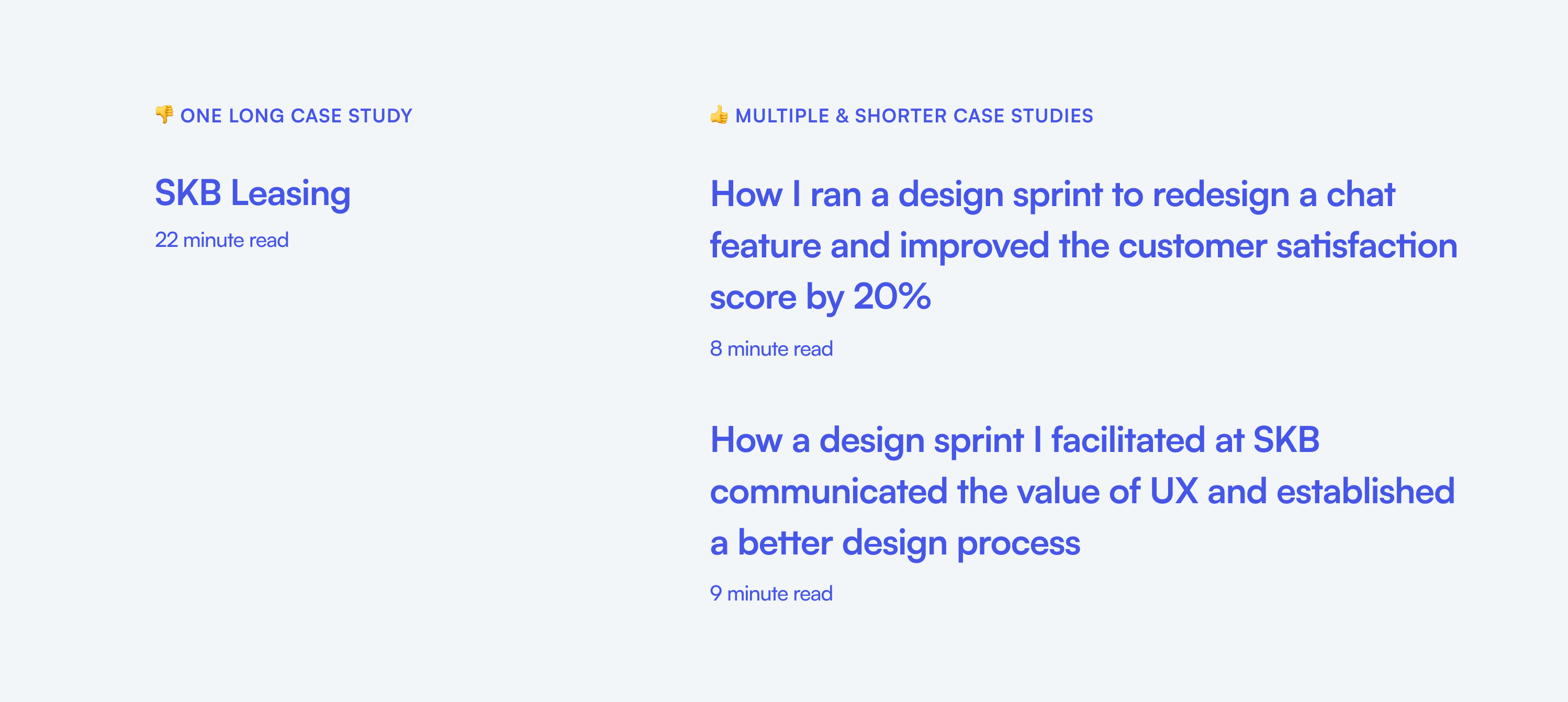
Too long case studies
Your case study is a movie trailer. In it, you need to convince me so that I want to hear the full story (watch the movie), which happens later in job interviews. So aim for case studies that are 10-minute reads and strike a good balance between text and visuals. Slava Shestopalov recommends a text-visual ratio from 50/50 to 25/75 percent. I’d say the sweet spot is somewhere around 40/60.
Well-illustrated portfolios are attractive but may not reveal your problem-solving skills; text-rich case studies tell the story but don’t expose your visual skills and may feel boring. That’s why a text-visual ratio from 50/50 to 25/75 percent works so well.
— Slava Shestopalov (Source)
If you go over that 10-minute line, break it down into multiple case studies. Focus on one key problem in each and tell the story of how you overcame it.
Generic fluff
Read the following paragraph:
Enhancing the flexibility of existing modules through inventive solutions, while creating templates for rapid webpage construction. A key insight gained was that addressing one use case can unlock numerous possibilities, offering users diverse options while minimising engineering requirements.
Do you get it? No, neither do I. I have no idea what that paragraph is trying to tell me. Avoid this type of language at all costs. I know some designers want to use big words and long sentences to sound smart.
But the reality is that this is a huge communication problem. If you can’t write 1,000 words about your work clearly and concisely, how do you communicate your design decisions to others? Especially these days when working from home is commonplace and with it, asynchronous work where written communication is fundamental.
The designer’s contributions are not clear
I’m not hiring the team you work with, I’m hiring you. So when you write your case studies, be clear about your contributions. Don’t use “we” instead of “I” all the time. You need to strike the right balance so that you don’t look like a designer with a huge ego, but also not one who is silent in meetings and does what others tell them to do. Don’t be too humble.
Here’s what a designer learned from committing this mistake:
While it’s appealing to apply the royal “we” — it does make our work sound more important than it usually is — take credit and make sure a recruiter and hiring manager knows what you did and what you’re capable of. (Source)
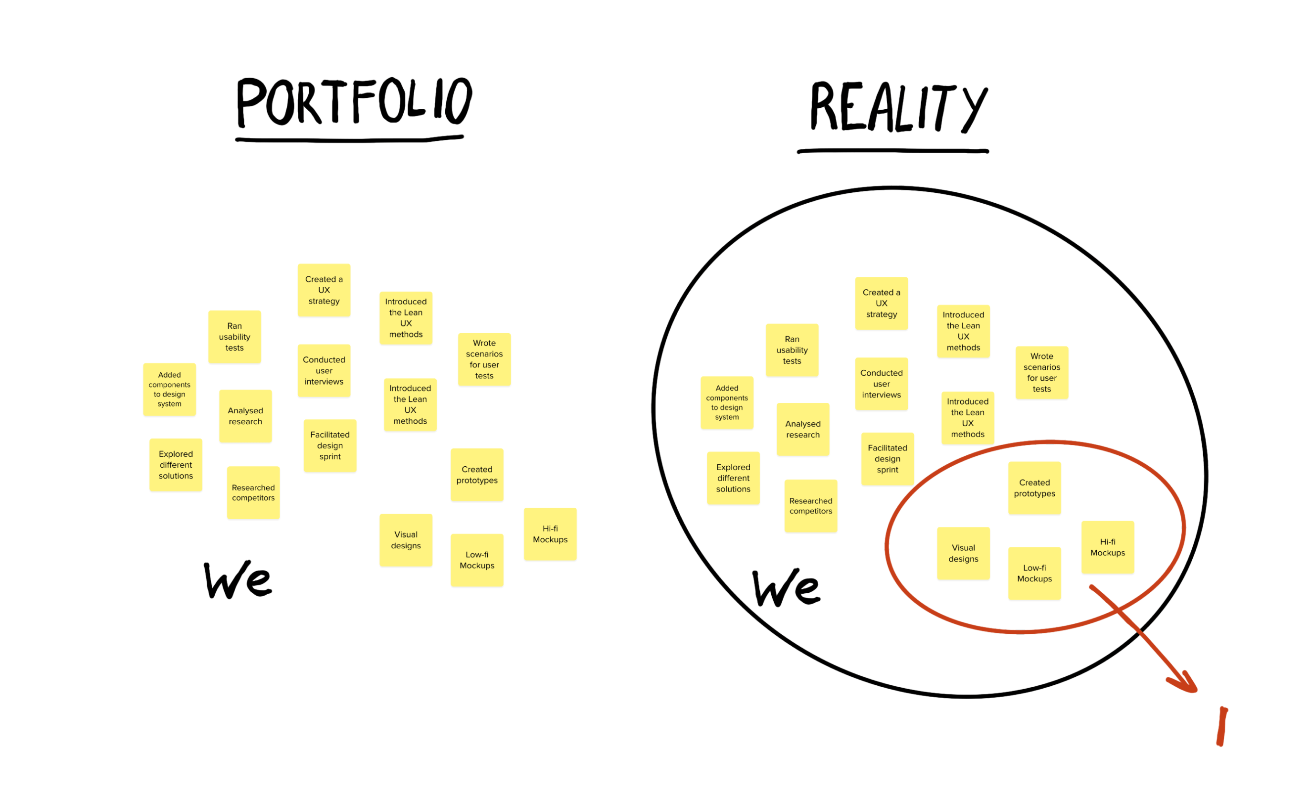
My problem with overusing “we” is that sometimes designers hide behind other people’s contributions (Fig 4). I’m not interested in what your team achieved but what you contributed that led to those team achievements.
Using a checklist template
They think their work and design process needs to be perfect so they exclude all the messy details and cram only the “good” parts into a cookie-cutter template. If the cookie-cutter template is a real depiction of their process they’re considered inexperienced and might even suggest there’s no potential for growth, adapting, and learning. The opposite of cookie-cutter templates and checklists is storytelling, which I cover next.
Not telling a story
Most designers don’t tell stories in their case studies because they use cookie-cutter templates and hide the messy details of their design processes. This is why I claimed in a recent post that 90% of designers are unhirable to design-mature companies. I go into detail about why storytelling in case studies is so important in that post, so I highly recommend you read it.
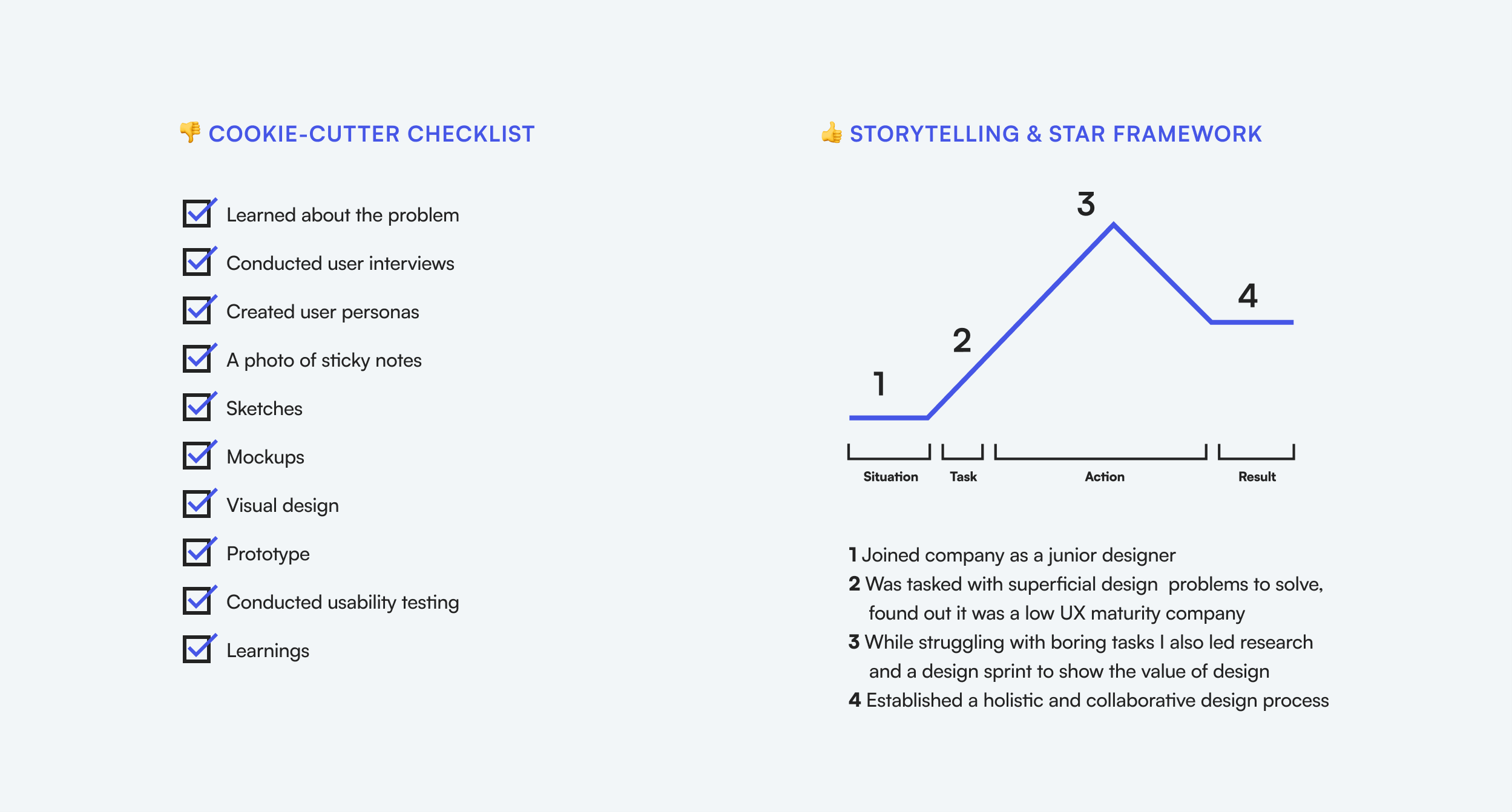
The problem with the checklist/outline approach (left side in Fig 5) to explaining your design process isn’t only that it’s boring, it also suggests that you don’t have the necessary communication skills to be a leader of design (And all designers need to be leaders of design, no matter their seniority). Garron Engstorm, a product design manager at Facebook writes (Source):
The outline format makes for somewhat uninteresting reading. Instead, tell a story, focusing on the most interesting and impactful parts of the project. Grab the reviewer’s attention and convey the major points at the beginning, in case they don’t read through to the end.
The cookie-cutter checklist says that you always use the same design process, no matter what problem you’re solving. The storytelling format combined with the STAR framework (right side in Fig 5) explains the real problems you solved and how you became a better designer through that. I have a printable one-page explanation of this framework that you can download here.
These mistakes can be symptoms of serious underlying problems
Some of these mistakes may seem trivial — a pixelated image or a grammatical mistake. Or things like not using writing hooks, crafting interesting titles, and failing to establish context. These are writing problems, right? They’re tricks to get over that 30-second cut.
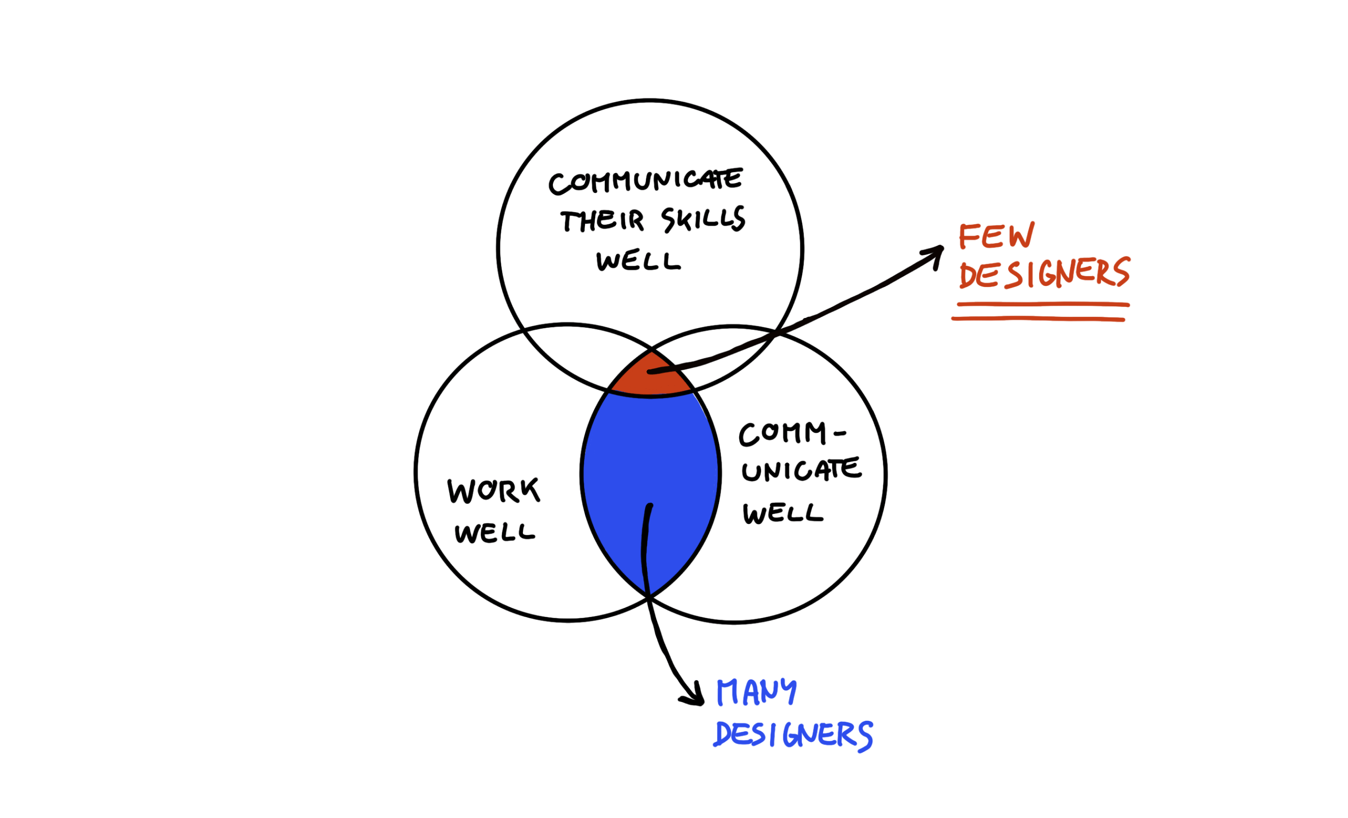
No, not at all, they can be symptoms of underlying problems. Most of these fall into three categories: Communication skills, linear design process, and no attention to detail. These are serious problems, especially communication which is the most important soft skill for designers (Fig 6).
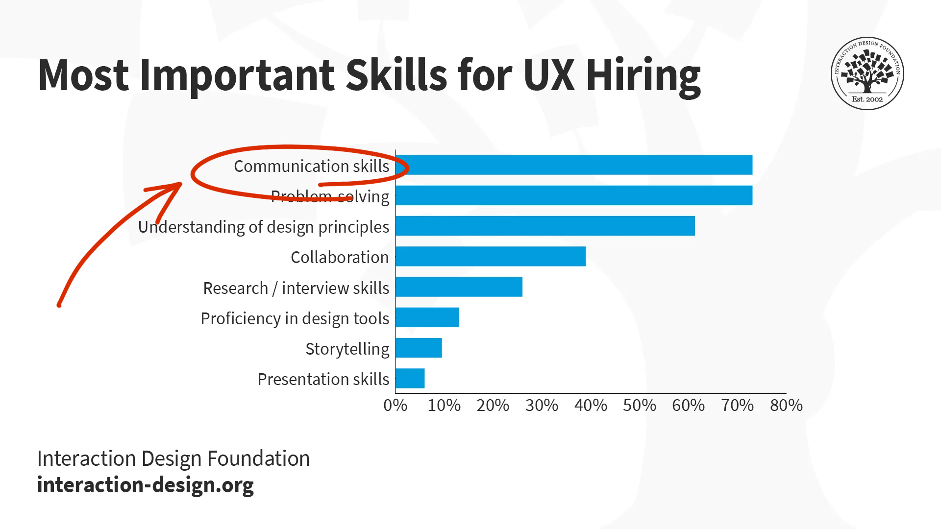
Here’s an overview of all the mistakes mentioned above, listed as symptoms of underlying problems. You can see that most of these fall under communication skills which explains the seriousness of these symptoms that you, possibly unawarely, exhibit in your portfolio.
| Symptom | Underlying problem |
| Quality issues | Lack of attention to detail or care |
| Generic and boring titles | Communication skills |
| Fail to capture reader’s attention | Communication skills |
| Fail to establish context | Communication skills |
| Too long case studies | Communication skills, lack of craftsmanship |
| Generic fluff | Communication skills |
| Unclear contributions | Communication, untransparent about their work, not involved enough as designers (collaboration and leadership) |
| Checklist tmeplate | Linear design process, lack of growth, adaptability and willingness to learn |
| No storytelling | Communication skills |
An example of a case study that would make the cut
Let’s take a look at a case study, check how many of these mistakes it makes, and why it would make the 30-second cut.
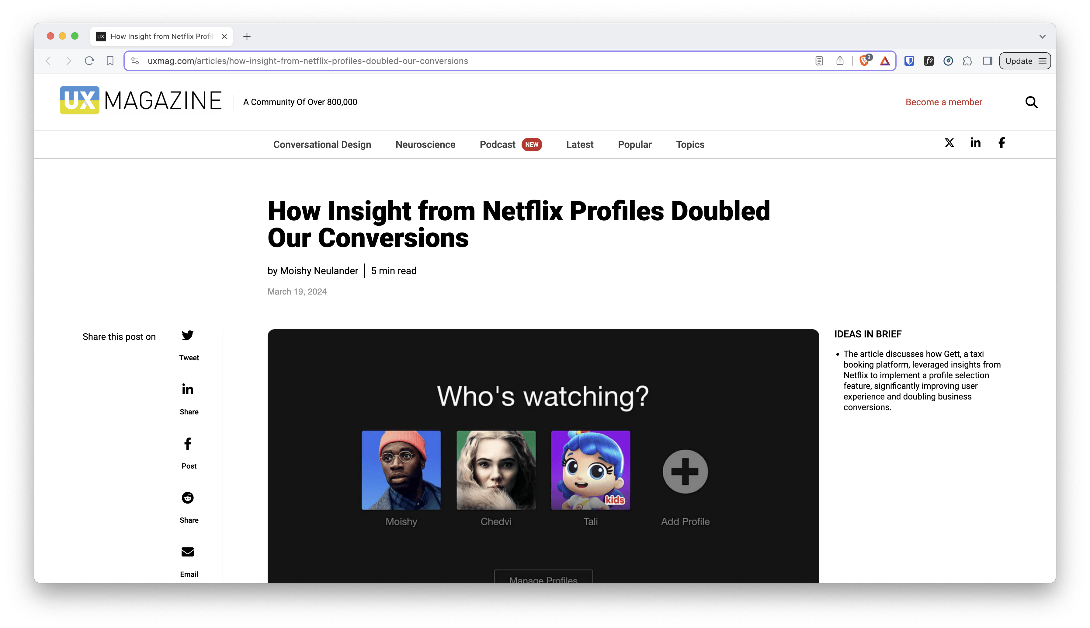
Published by UX Magazine, this case study is a 5-minute read by Moishy Neulander. We can already see that Moishy got one of the things right — the reading time is less than 10 minutes.
The title is How Insight from Netflix Profiles Doubled Our Conversions which doesn’t follow our template to the point but it doesn’t need to. It captivates you and makes you wonder how they used insight from Netflix to double their conversion.
The first sentence isn’t a hook but it doesn’t have to be because the title is a hook already. In the first paragraph, Moishy writes:
As a ride-hailing app, learning from unexpected sources, such as Netflix, helped us implement a new profile selection feature that has improved user experience and doubled business orders conversion rate. Our new “Smart Switcher” has delivered outstanding results, making the ride-hailing experience smoother, more reliable, and user-friendly.
This establishes context — even if you don’t know Gett or what they do, you get it after reading this. He got me, I want to learn more.
Moishy elaborates on the situation he and his team found themselves in and what they wanted to achieve at the beginning of the case study. Then he describes his actions. This is where the case study gets brilliant.
Moishy first took inspiration from common and somewhat similar tools but the results weren’t good enough. He explains the challenges of initially proposed solutions and why he decided to explore other options.
He found an unlikely source of inspiration, mocked up a prototype and tested it. It was promising but it introduced a new problem, so he had to come up with a solution for a solution. He concludes with concrete results of how crucial business metrics were improved and a personal learning:
My key takeaway is to not solely seek inspiration from the obvious sources but instead think outside the box, even within your everyday products that may not be directly related to your product’s natural field of activity.
Let’s benchmark Moishy’s case study against our list of common mistakes and you’ll see why it makes the 30-second cut.
- There are no quality issues, images are large and high-resolution
- The title is interesting and captivates the reader
- Succeeds in capturing the reader’s attention and establishes context well
- It’s just right in length and in visual-text balance.
- There’s no generic fluff.
- The case study features Moishy’s design process, his growth, and his willingness to adapt and learn.
- Moishy tells a story of how he found inspiration in an unlikely place
- The only fault with Moishy’s case study is that his contributions are somewhat unclear. He uses “we” a lot.
Committing only one mistake but doing all other things well takes Moishy to job interviews where he can tell the full story in detail.
Get my printable “Make the 30-second cut” guide
Download this printable guide, print it and have it on your desk. It’ll help you write awesome case studies like the one above.

Most designers can make the 30-second cut
I wrote this post and used a provocative title because most designers know how to do these things well. Most of them have good communication skills but fail to translate them into the written word, and so they make these mistakes. Casey Cline confirms that writing is a completely different beast of communication (Source):
Nearly everyone can communicate their thoughts in some non-written way. However, not everyone is capable of translating those same thoughts into writing.
I want to reach and teach all designers who constantly get rejected even though they’re good candidates for the jobs they apply for. I want to help them write case studies that are better reflections of their skills so that they make that 30-second cut. It’s not fair that their portfolios only get scanned for mere seconds, I know. Design hiring relies too heavily on portfolios, but what else can you do when there’s such a surge of job applications? It’s impossible to speak to thousands of candidates.
So if you’re a designer reading this knowing that you don’t have communication skills problems, make sure your case studies reflect that by avoiding these common mistakes.
If you’re a designer who knows they need to improve their communication skills, use this advice to do so. Craft a story based on your research findings to influence other stakeholders. Avoid writing generic fluff, learn how to establish context, and be concise, both in written and spoken communication. And most importantly, stop copying others and using checklist templates for your portfolio.
Once you polish your portfolio and correct these mistakes you make the 30-second cut. It’s a game-changer when that happens. Suddenly you stop getting instantly rejected and start receiving invitations to job interviews. You get your foot in the door and anything can happen from there.
Most designers can make the 30-second cut after all, but will they commit to polishing their portfolios and communicating their skills better? Will you?
🤫 Another gentle reminder! My new online course UX Buddy helps designers create their UX portfolio, find, and get an awesome UX design job with a UX/design-mature company. It’s now live and enrolment is open for a couple more days. Check it out!