Welcome to the 11th edition of Designer’s Digest. Today we have a typography-focused newsletter. Not by design, just a coincidence. We take a look at another cool variable font and the W3C’s new website and how disappointing its typography still is.
Do you enjoy this newsletter? Forward it to a friend or tell them to subscribe here. I’ll be forever grateful! 🙏
In this edition:
🅰 Clash Grotesk (Variable Neo-grotesque style font)
🅰 Icon transcendence: customising icons to complement fonts (12 min read)
🅰 W3C launches beta of its new website (2 min read)
What are you up to this week? I’m making good progress on the Mailchimp migration. I decided I’ll replace it with ConvertKit. Here’s why. As you probably already know, I got laid off in February. I decided to take this opportunity to try to restart my business and turn my side gig into my main gig. For now, I’m fed up with working for tech companies. The betrayal of layoff still stings.
Something else I’m fed up with is Mailchimp. They have been constantly increasing their prices for the past two years. I went from paying around 150 EUR (around $160) per month to now paying more than 300 EUR ($322). It’s absurd! With what do they justify these increases? Nothing really. They got acquired by Intuit and the prices have been climbing ever since. So I’m paying for a sub-par product, with shitty customer support, just because I’m locked in.
The layoff forced me to rethink and restructure my monthly costs. My wife and I already decreased our grocery costs by 20%. That’s a fucking miracle when you consider that inflation has been running amok. I don’t know what it’s like where you live, but here in Slovenia, it’s been way over 20%. So yes, the main reason for moving away from Mailchimp is to reduce costs. As I rebuild the business, I need it to be on a solid foundation. Speaking of that, something I could never do and has been hurting my business for the past 6 years is the lack of Mailchimp integration with Shopify. They killed it a while ago. So I’m paying a shitload of money for a CRM product that doesn’t even integrate with one of the main eCommerce providers. I’ve been sending book promotion emails to people who already bought it for years and god knows how many existing customers unsubscribed because of that.
Anyway, if all goes according to my plan, this should be the last newsletter sent from Mailchimp. Wish me luck! 🤞
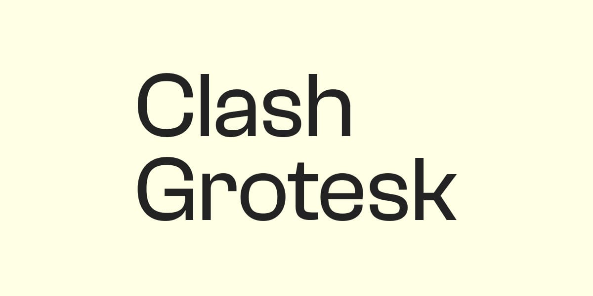
🅰 Clash Grotesk
Kinanty Desyanandini recommended this font in my new Slack community for designers. It has a bit of an industrial feel to it and looks like it’s from the Bauhaus era. That’s exactly why I love it. It has character, but not too much of it. I would recommend using this one for titles, not so much for paragraphs. At least not the long format. It may be ok for shorter paragraphs that aren’t set in really small font sizes. You can download Clash Grotesk here.

🅰 Icon transcendence: customising icons to complement fonts
A bit of a long read but a fascinating and detailed look into how icons can be modified to complement fonts. The article looks into adapting an arrow icon for different styles of font, like high contrast, fonts with low x-height, fonts with ink traps, rounded corners, open aperture, and more. Read the article by Evil Martians here.
🅰 W3C launches beta of its new website
This is something that I wanted to touch on for a while but was waiting for the right moment. Now that the W3C announced their new website, and released it as beta, is the right time. It’s sad that one of the main organisations for improving the web has such poor typography on its docs pages. Just take a look at the line length of those paragraphs. Docs are already so text-heavy, combined with such poor typography, it all seems like a huge wall of text. So unattractive for reading and impossible to scan. It’s ironic isn’t it, the main org advocating for the accessibility of the web has its content presented in such an inaccessible way.
The font size is 16 pixels, the line height is 24. The ratio between the two is 1.5, which you could argue is optimal for paragraphs. That’s true, but not at such line length. I measured it, the longest lines have more than 120 characters in them. The upper limit is 80! And in my opinion, even 80 is too much, I always recommend around 65. This is unacceptable in this day and age but this is also the reason why we still see websites with such poor typography. If organisations like W3C do it, others may think that it’s fine. It’s not!
Here’s the killer. Right on top of this page, they recommend:
For the visual presentation of blocks of text, a mechanism is available to achieve the following:
- Foreground and background colors can be selected by the user.
- Width is no more than 80 characters or glyphs (40 if CJK)…
Is this a joke? Sorry about the rant but I can’t help myself, it’s just too bad 😅
That’s it for this Monday. Have an awesome week! 👋
Cheers,
Matej
P.S. Last week 67 more people joined DESIGNR — my new Slack community for designers. You can still join for free here. I would like to keep this community small and tight-knit, so it might not remain free forever.
