Welcome to the 29th edition of Designer’s Digest — my weekly roundup of cool new stuff in design. And welcome to 143 new readers this week! 👋
How are you? I’ve been busy doing some important (and overdue) landscaping work in our backyard, writing blog posts, and maintaining two projects — Better Web Type and UX Buddy. This newsletter sometimes also feels like its own project as it takes a considerable amount of time to create each week.
I’ve been thinking if I should reduce the frequency to biweekly or even back to monthly as it once was — do you have a preference? I concluded that I’ll take a short break from it for two weeks so that I can dedicate the autumn landscaping prime time to the backyard. I really need this to be finished because our twins will learn how to walk in a couple of months!
Some news from me:
- I’ll be doing another round of UX Buddy registrations later in October. It’s my online course to help designers create their portfolios and find better jobs. I’ll announce the exact date but you can already join the waitlist to secure the early bird price.
- You can still vote on my Why Designers Quit survey and win one of the three copies of my physical book that I’m giving away to three randomly picked people who complete the survey. I’ll publish the report on October 23.
- I’ll publish at least two blog posts in October: AI vs Designer and Designer Layoff Stories.
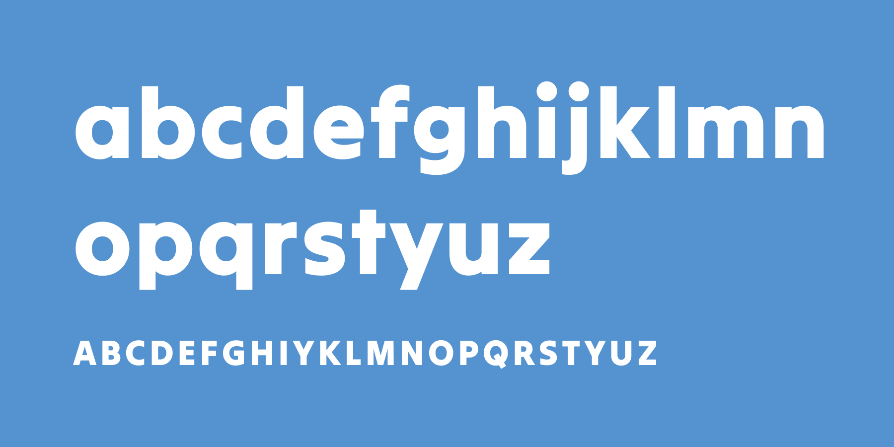
Free font: Tilt Warp
Tilt is a family of type inspired by the dimensional lettering found in storefront signage, designed by Andy Clymer. It’s comprised of three related variable font styles that you might find in a shop window. I’m featuring the Tilt Warp here but you can get all three if you follow the link below.
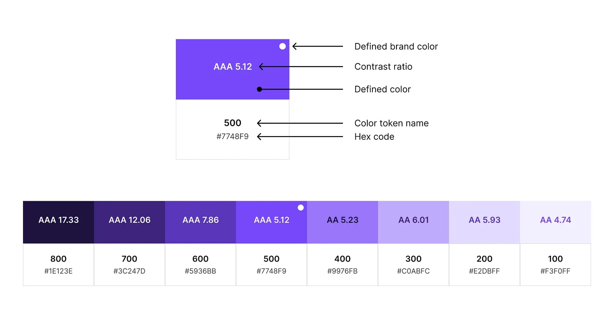
How to create a colour ramp used in design systems
A colour ramp, also known as a colour scale, is a visual representation of how colours transition from light to dark smoothly and continuously. The steps required to create a colour ramp are: start with your defined brand colours, adjust lightness at each colour stop, adjust saturation as needed, check contrast ratios, repeat for all other colours, and aim for similar lightness and saturation for each stop as the other colours.
Other cool stuff
Textareas with auto-increasing height using CSS (1 minute read)
Textareas are great when it comes to accepting a large amount of text from the user. However, the problem with them is that they have a fixed height, which has a detrimental impact on accessibility and usability. Thankfully, an experimental CSS rule with form-sizing property is coming that will allow the increase of the height of the textarea automatically based on the amount of text the user enters.
Animated backgrounds (Resource)
This is a really cool collection of animated backgrounds that you can use on your website projects. They loop and they’re 4K quality.
If someone forwarded this to you, subscribe here.
That’s it for this Monday, have a great week! 👋
Cheers,
Matej