Welcome to the 25th edition of Designer’s Digest — my weekly roundup of cool new stuff in design. And welcome to 41 new readers this week! 👋
You can subscribe to this weekly newsletter here.
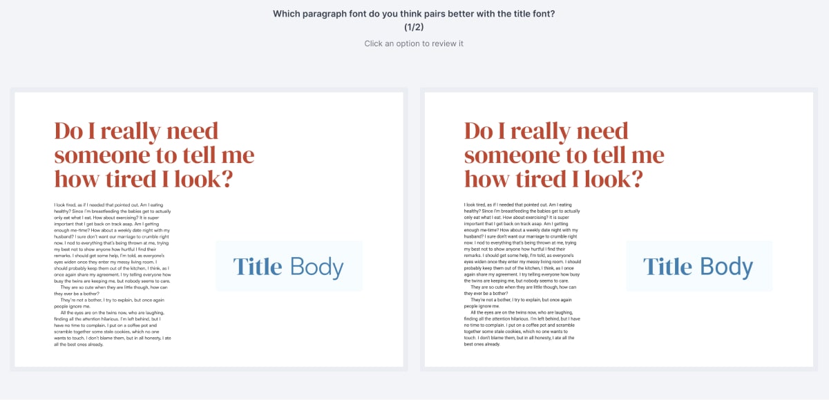
Happy Monday! With all the hype around AI lately, do you ever wonder at what level it is compared to your skills? There’s just so much (overly) positive stuff being published about AI — how great it is and how it’ll replace people for the most mundane tasks.
You could say that picking and pairing fonts is a mundane task. It takes ages to do well and it involves staring at your screen for hours looking for the perfect font and a perfect pairing combination for it. I would argue it’s only mundane if you don’t love it, which many of the best designers out there do. And those that do, take it as a challenge and enjoy it (this is why AI will never replace the top designers).
But how good is AI at this really? I’m writing a series of blog posts exploring this topic. Help me out by answering a preference test on Usability Hub. It’ll ask you which font pairings you prefer. There are four pairings in total but here’s the trick: two of them were picked by AI and the other two by designers.
Add your opinion, answer the preference test →
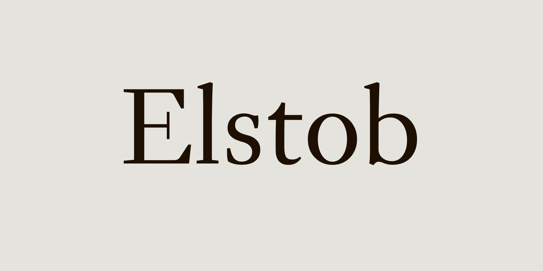
Free font: Elstob
This font is being marketed as a variable font for medievalists. I have to admit, I was put off by that description at first (when you say medieval, I think about blackletter fonts). But this is a beautiful serif font with tons of features.
It has 4 variable axes, including optical size and grade which is like Weight in that it varies the heaviness of the letters; but it does so without changing their width. This is a really cool font to use for body text, but you could also use it for headings (because of that optical size variable axis)
8 micro tips for remarkably better typography
I’m bringing back the Better Web Type blog! 🎉 The first blog post is part one of a two-part series: 8 tips in less than 8 minutes that will elevate the typography on your website to a higher level.
Other cool stuff
How I Structured My Design System Using Figma’s New Variables
Read the article →
Peer into the mind of a type designer
Read the article →
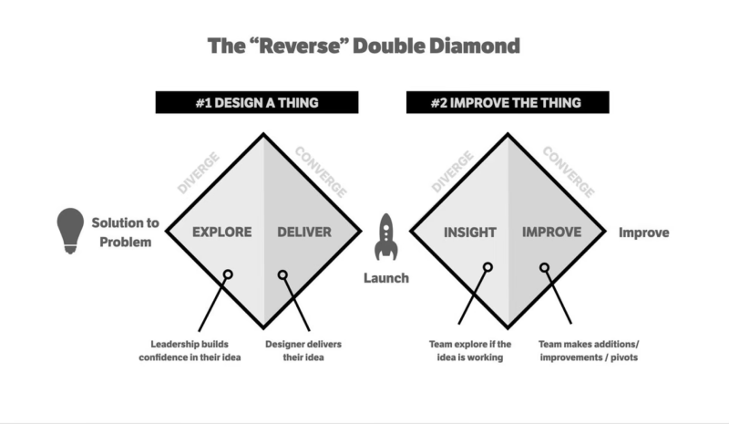
Improving The Double Diamond Design Process
Read the article →
Browse websites by fonts
Check it out →
That’s it for this Monday, have a great week! 👋
Cheers,
Matej