We’re all clueless. We don’t know how to interpret things 95% of the time, yet we act like we know it all. I’m talking about everyone that is involved in product development.
Designers don’t know why a small change to an interface results in a massive drop in a core business metric, product managers don’t know what should go into the backlog and what not, developers don’t know how to estimate the delivery time of the fancy new feature. The whole team behind the product is so clueless that they don’t even know if the new feature brings any value to the users.
We come up with our pity assumptions and hypothesis and we try to validate them. We try to show that we’re right, that’s what we’re being paid for right? Being smart and all… We’re certain we’re right… until we’re proven wrong. Time and time again. But even then, we doubt the validity of the test and we doubt the meaning of a metric if we need to. So we run another A/B test or more user testing sessions. We spend days or even weeks to get a similar result. Another result that we don’t really know how to interpret. The process feels like making tiny steps in the dark—expecting meaningful results by doing the same thing over and over again.
Certainty is the enemy of growth. Nothing is for certain until it has already happened—and even then, it’s debatable. That’s why accepting the inevitable imperfections of our values is necessary for any growth to take place. Instead of striving for certainty, we should be in constant search of doubt… Instead of looking to be right all the time, we should be looking for how we’re wrong all the time. Because we are. Being wrong opens up to the possibility of change.
—Mark Manson1
Our industry is plagued with certainty. Smartass people with thick heads who are certain in their own work because they have been doing it for 10+ years or whatever. I came across many people like that but in a way, we’re all the same. It’s our process of creating something and then proving that it’s correct that is wrong.
A real-life example
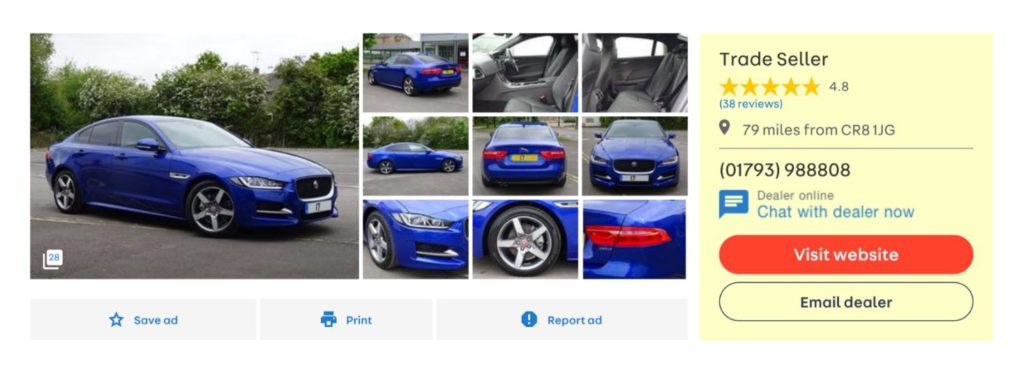
Not long ago, we had a discussion at work. If you go to a typical car ad on Auto Trader today, you’ll see that it’s being sold by a “Trade Seller”.
A certain group of people inside the company believe that it should be replaced with the actual name of the company selling the car because it would be clearer to the user. I am one of those people. We even had discussions of including that seller information (including their rating) in the search results. So I decided to prove that the “Trade Seller” bit is confusing the users. I was certain that they don’t understand what it means.
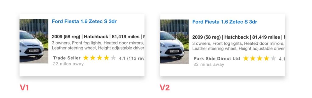
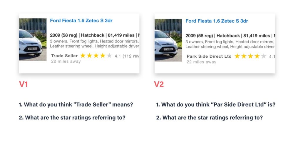
So I devised two tests with Usability Hub in a way that the results could be easily quantified. I mocked up search results with seller rating in two versions: one with “Trade Seller + rating” and another one with “Actual seller name + rating”. I was looking to answer two questions:
- Do users understand what the “Trade seller / actual seller name mean”?
- And do they understand what is the rating next to it referring to?
But in reality, I was certain to prove:
- that people don’t understand what “Trade seller” means and
- that they won’t understand that the rating is of the seller when placed next to the “Trade seller” text.
The results were surprising and humbling. I did find answers to both questions but they were the complete opposite of what I wanted to prove. The results showed that people do understand what “Trade seller” means. Actually, in the test most of them knew exactly what it meant.
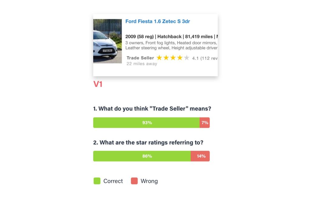
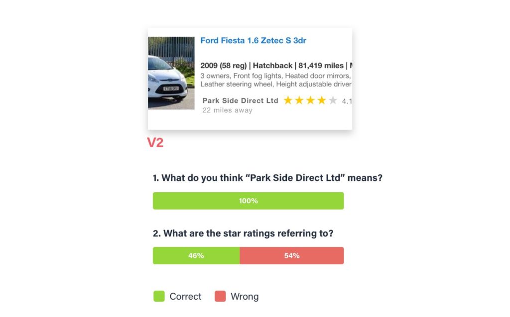
Here’s where it gets crazy. Not only did the participants understand what “Trade seller” means. They understood what the rating is of better when it was next to “Trade seller” instead of the actual name of the seller. In the v1 of the test (“Trade seller”), 86% of participants knew what it meant and 93% of them said that the rating is of the seller. In the v2, 100% of participants claimed that the names were the car dealerships that were selling the listed cars but only 46% of them said that the rating is of the seller. The rest assumed it was a rating of the car.
I proved myself wrong on both accounts. People know what “Trade seller” means and they understand that the rating next to it is of the seller and not of the car (I ran the test two times with a total of 40 participants for each version, just to be sure).
But we only found out about that because of the way the test was devised—qualitative feedback that can be quantified. The initial plan was to simply run a quantitative A/B test and see if it has an effect on our core business metrics. That would never teach us what we learned through this simple test. We couldn’t interpret the result correctly because we wouldn’t know if the users even understand the information presented. But the worst part is: we wouldn’t even know that. We would end up with an uneducated guess and we wouldn’t even realise it.
Conclusion
Always leave room for uncertainty. Not to the point where we’re paralysed by it and scared to make a choice. Decide based on the information you have at the moment but question your solution. Assume it’s wrong and try to prove it’s wrong. Failing is a better way to learn than running A/B tests to (sometimes falsely) confirm the validity of your solution. Forget your ego and forget your entitlement to be correct. Even if you have been doing this for years. Or maybe especially because of that. Things change, we need to remain humble and admit that we don’t understand everything and that we make mistakes. But if we admit it, we can learn from it.
The A/B test was already planned and ready to go. I had to stop it, so we could first see if users understand the information correctly.