I found myself using geometry while designing user interfaces quite often, so I decided to share a simple example I was working on the other day.
Aligning interface elements in Photoshop is pretty easy as it comes with the pre-defined aligning options. And for the 95% those are all you really need. What can you do in those 5% examples when you can’t use these options? Well, it actually depends a lot on what you’re working on. Let’s see a specific example.
Aligning an icon to the center of…
the quarter of a circle. This was my most recent example when I had to use geometry to get that pixel perfect UI element.
I was working on a confirmation window, which was inside a circle. Yes, we’re trying out all sorts of cool stuff at Wondermags. What we want to do is ask the user if he’s sure of the action he’s about to execute. We give him an explanation of what will happen and options to confirm or cancel. Here’s a quick sketch for this window:
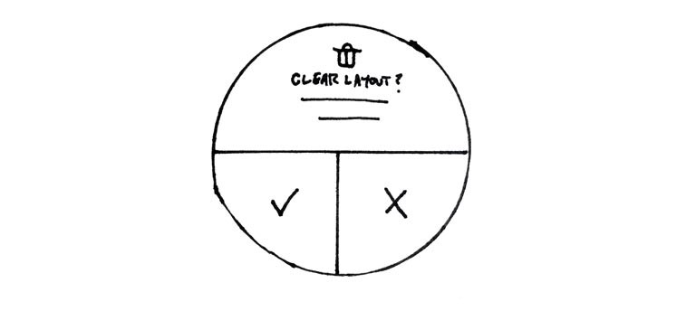
So the problem we’re trying to solve here is how to properly align the two icons to the center of each of the buttons at the bottom half (confirm and cancel). If you use the align to vertical and align to horizontal center in Photoshop, this is what you’ll get:
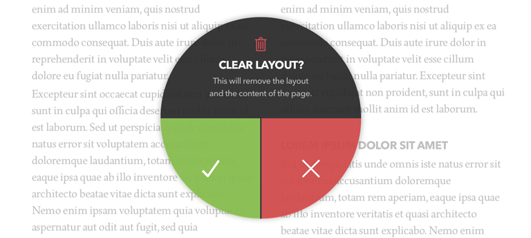
Now this doesn’t look right at all and it certainly looks very strange to say the least. Photoshop aligns it like this because it still treats it as a rectangle, not a quarter of the circle (there’s no difference for Photoshop).

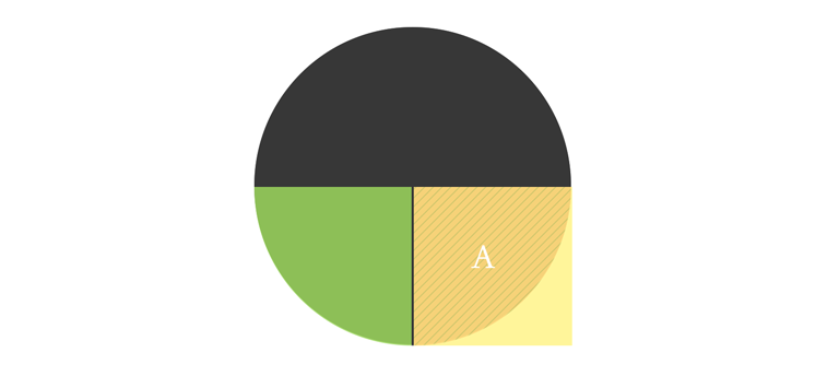
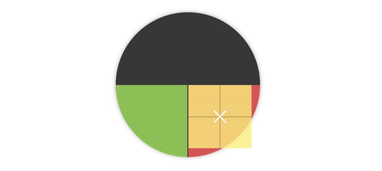
Square area is the answer
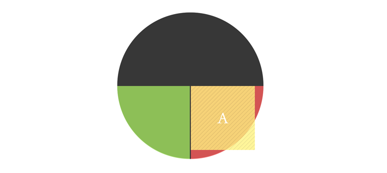
I was thinking, what would be the easiest and most precise way to align it right to the actual center. Here’s where geometry comes handy. I figured that the key here could be the square area of the quarter of the circle. All I had to do is calculate the square area of it and draw a rectangle with the same square area to use as a guide. But first, I had to find out what dimensions I had to use.
The formula for calculating square area of a circle is A=π*r^2. But in my case I was only using quarter of the circle. So my formula was:
A = π * r^2 / 4
π is a standard which is 3.1416 and r is the radius, which in my case is 145 pixels (also half of the width of the circle).
I made the calculations and the square area of the rectangle I had to draw was 16,513 pixels.
But the square area info doesn’t help me much. I can’t draw a rectangle in Photoshop so that I would set the square area of it. What I need is the width of the rectangle. And to get it, I just had to add the square root to my formula.
A = √(π * r^2 / 4)
The end result is 128.5 and lots of decimals. Now I could draw a square on top of my quarter of the circle with width set to 128 pixels and align it to the top left corner. The center of this square is the actual center of my button. This is what my icon needs to be aligned to.
I aligned the icon to the horizontal and vertical centers of the guide rectangle on top of my circle.
Applied the same process for the other button and that’s it. Pixel perfect alignment, pixel perfect user interface design.

Here’s the comparison of before and after:

Conclusion
I would like to highlight two major points of this article. One is that geometry and mathematics in general can help you a lot in pixel perfect user interface design and web design. You just have to find the right way to figure it out.
The other one is that if you do something, do it properly. If you have to design an interface, go for the pixel perfection or don’t do it at all. This is what separates average interface designers from the best ones. Put some extra work in it, even more than necessary if you can.
Try, fail, think, learn.