Welcome to the 26th edition of Designer’s Digest — my weekly roundup of cool new stuff in design. And welcome to 191 new readers this week! 👋
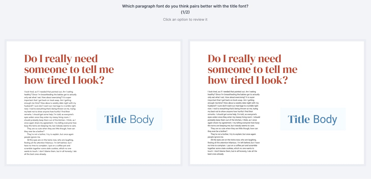
Happy Monday! I’m still collecting responses to my preference test that I’ll use for a future blog post. It’s a simple test — pick one of the two designs you prefer. There are two rounds. Here’s the trick, in each round, there’s a font combo picked by a designer versus one that was picked by AI. More than 100 people already picked their preference. This is the last call, I’ll soon close the test and write the blog post titled AI Versus Designer and publish it in a couple of weeks.
Add your opinion, answer the preference test →
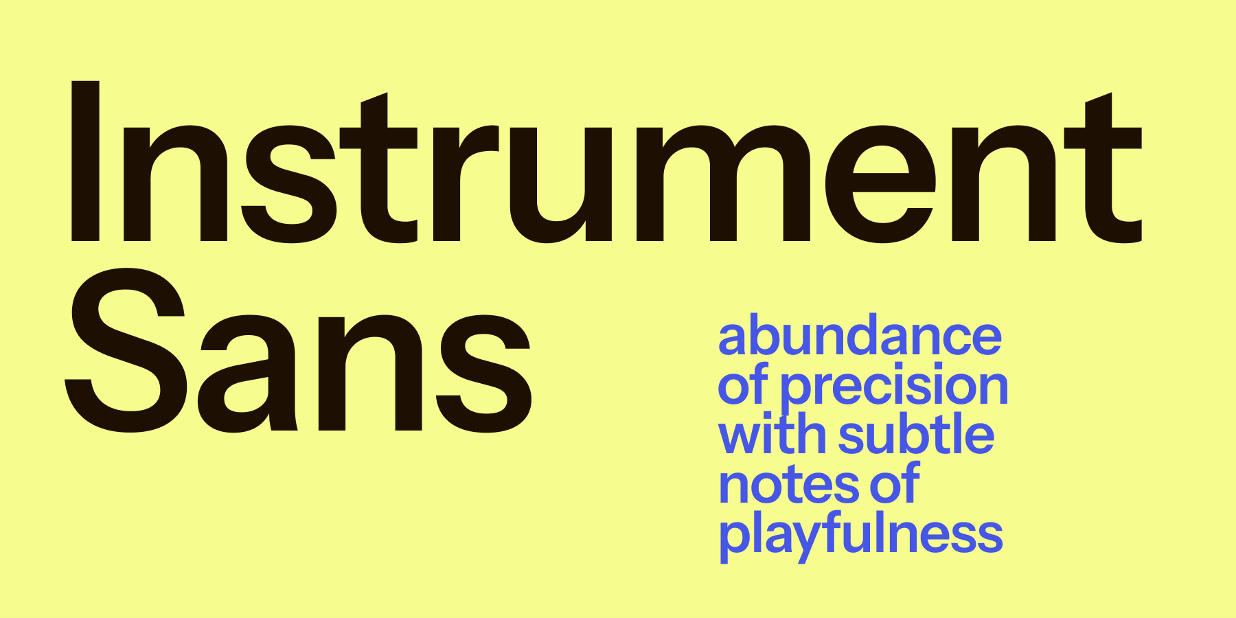
Free font: Instrument Sans
Instrument Sans is a variable sans-serif with 3 variable axes — width, weight, italic slant. It comes with many Open Type features, like stylistic alternates, ligatures, and proportional and tabular figures. This makes it highly flexible and can be used for headings or body text. It was designed for the Instrument brand but it’s open source and available on Google Fonts.
Is AI better at picking and pairing fonts than you?
How do you go about picking fonts for a project? Do you just “wing it?” Pick something that looks good and is somewhat aligned with the requirements of the project? And how do you pair fonts? Just pick two that look relatively good together? If you answered “yes” to most of these questions then AI is very likely already better than you.
Other cool stuff
Google Fonts redesigned
Check it out →

No code tools — will designers replace developers?
Read the article →

Fatigue and the Designer
Read the article →

Successful iteration requires going beyond agile
Read the article →
If someone forwarded this to you, subscribe here.
That’s it for this Monday, have a great week! 👋
Cheers,
Matej
