Welcome to the 24th edition of Designer’s Digest — my weekly roundup of cool new stuff in design. And welcome to 59 new readers this week! 👋
Happy Monday! I have some exciting news to share — I’m now a curator of TLDR Design, TLDR’s new daily design newsletter! 🎉 🥳
We’re still getting ready but the newsletter will launch very soon. With an audience of 250k subscribers before its launch, I’m thrilled to contribute to what’s going to be the best design newsletter out there!
I’m keeping my weekly Designer’s Digest newsletter for now. Let’s see how it all goes.
In other news, the seats to UX Buddy, my UX portfolio course with a focus on UX maturity, are selling out. There are a few more left and the early bird prices end tomorrow!
If you’re thinking about finding a better job and increasing your salary in the process click here and select “Get instant access” to sign up before the seats run out! The course gives you everything to make your job search and switch easy, and it now comes with 1-1 mentoring.
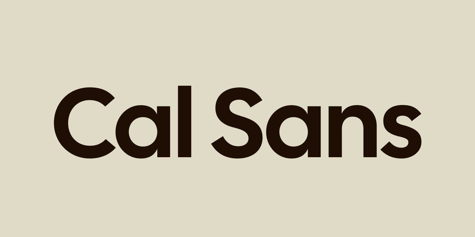
Cal Sans
This is a beautiful geometric sans-serif font optimised for larger, display sizes. The letters are spaced tightly by design, so when used at larger sizes, the font looks great by default. If used at smaller sizes the letter spacing should be increased.
It also comes with special kerning pairs for uppercase letters to keep the even texture of type and also to prevent nasty clashes between uppercase letters.

The tyranny of collaborative ideation
Do you know how everyone in design loves collaborative ideation — whiteboarding sessions and similar? Well, first of all, not everybody loves them. In fact, many dislike them. Here’s why — These workshops are great for extroverted people to stand out, get attention, and get things their way. But that also means that these workshops are terrible in terms of the quantity and quality of ideas generated. Research has proved that time and time again, so why do we still force designers and others to participate in this “collaboration theatre?”
The Eyeballing Game
A competitive game for designers — how good are your eyeballing skills?
Figma’s Dev Mode gets 200+ new features and fixes
The most notable updates are status labels, layout grids, rules and outline mode, and comparing detached components to the original one. Other updates include usability and performance improvements, improved code generation, and bug fixes.
Resources & tools
Migrating from color styles to local variables in Figma — if you’ve been using colour styles for standardising colours in Figma and got worried when they introduced local variables (because now you’ll need to learn a new way to standardise colours), this is the article for you.
Whirl — a nifty collection of ready-to-use CSS animations.
13 JavaScript animation libraries for designers — a great collection of animation libraries that do the heavy-lifting work for designers. No, or minimum coding required.
If someone forwarded this to you, subscribe here.
That’s it for this Monday, have a great week! 👋
Cheers,
Matej
