I love printed books. Most of the books that I buy are in the printed format. I always check if I can find a used copy first, sometimes I find an awesome deal where I get a $15 book for $3! “Recycling” a book like that is good for my wallet and it’s also good for the planet.
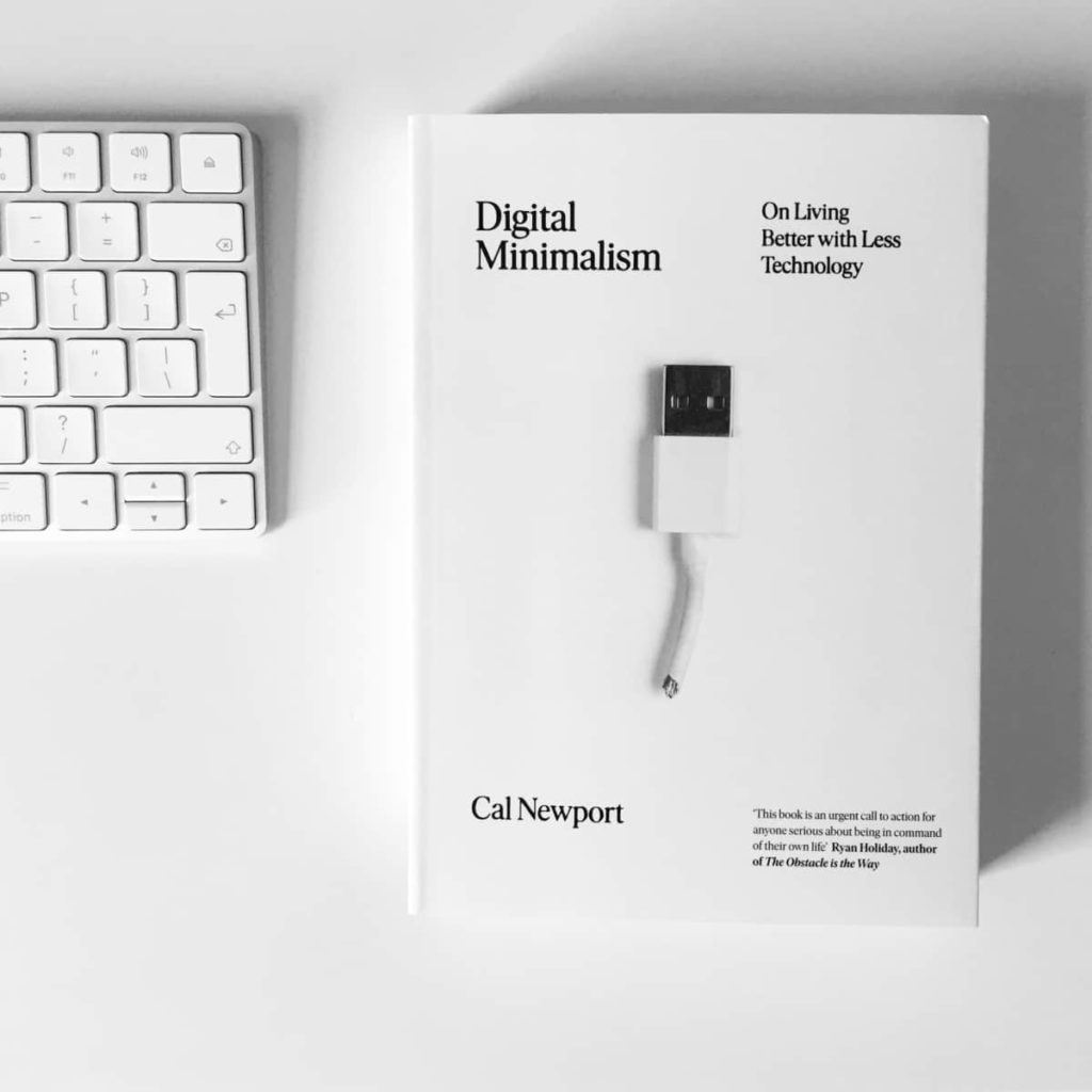
Going to a bookshop is a magical experience. Book prices are even higher there, I know, but there’s a magical feeling when you walk out with a new book in your hands. I can recollect most of such moments from the past, the one when I bought Digital Minimalism by Cal Newport in Edinburgh is the most memorable. It turned out to be the last book that I bought there before moving back to Slovenia so it’s a bittersweet memory. That’s what makes it even more special. Unlike an eBook, a physical book is an object that can be admired. It’s tangible, you open it up and it has a gentle smell no matter if it’s new or old. The smell changes as the book ages, but it’s always a lovely smell.
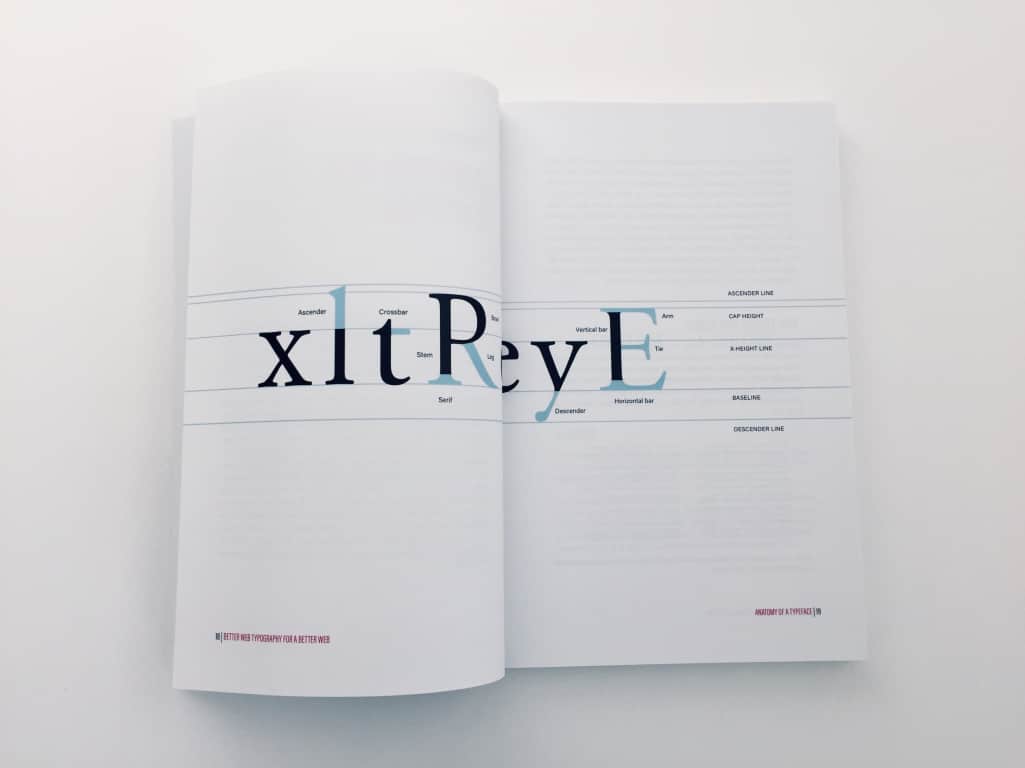
From an author’s perspective, a book feels more real when you hold it in your hand and think “I made this.” That and my love for printed books is why I always wanted to create a printed version of my book about web typography. It’s so much harder than creating an eBook where you focus on the content. For a printed book to look good you need to pick the right material and the right finish for the cover and the pages. You need to think about page numbering, and footers, and headers, how to fit illustrations on a limited size of a page and how to optimise the number of pages. My book originally had more than 250 pages and I gradually reduced it to 232. Not by taking the content away but with better illustration placement and optimising margins and font sizes. You don’t need to do any of these things for the eBook!
The quality of the materials reflects the quality of the book
I spent two whole months working on the second edition of my book at the beginning of 2018. Most of those two months went into improving the printed book. After that, I had to decide who my printer would be. I had experimented with Amazon’s print on demand, as well as Blurb’s. Both kinda sucked. Amazon’s print quality was poor. The cover looked cheap and so did the paper used for the interior pages. After investing so much time in making the book, I didn’t want it to look and feel cheap. I wanted the quality of the print to reflect the effort I put in making the book.
Blurb was a bit better, so the very first printed books that I sold were printed in batches through Blurb and distributed manually. By that, I mean that I was carrying a huge box of around 50 books to the post office every week. When I lived in Camden, this meant a 30-minute walk with a box that weighed around 25 kg! I couldn’t keep up with it, I needed a better solution.
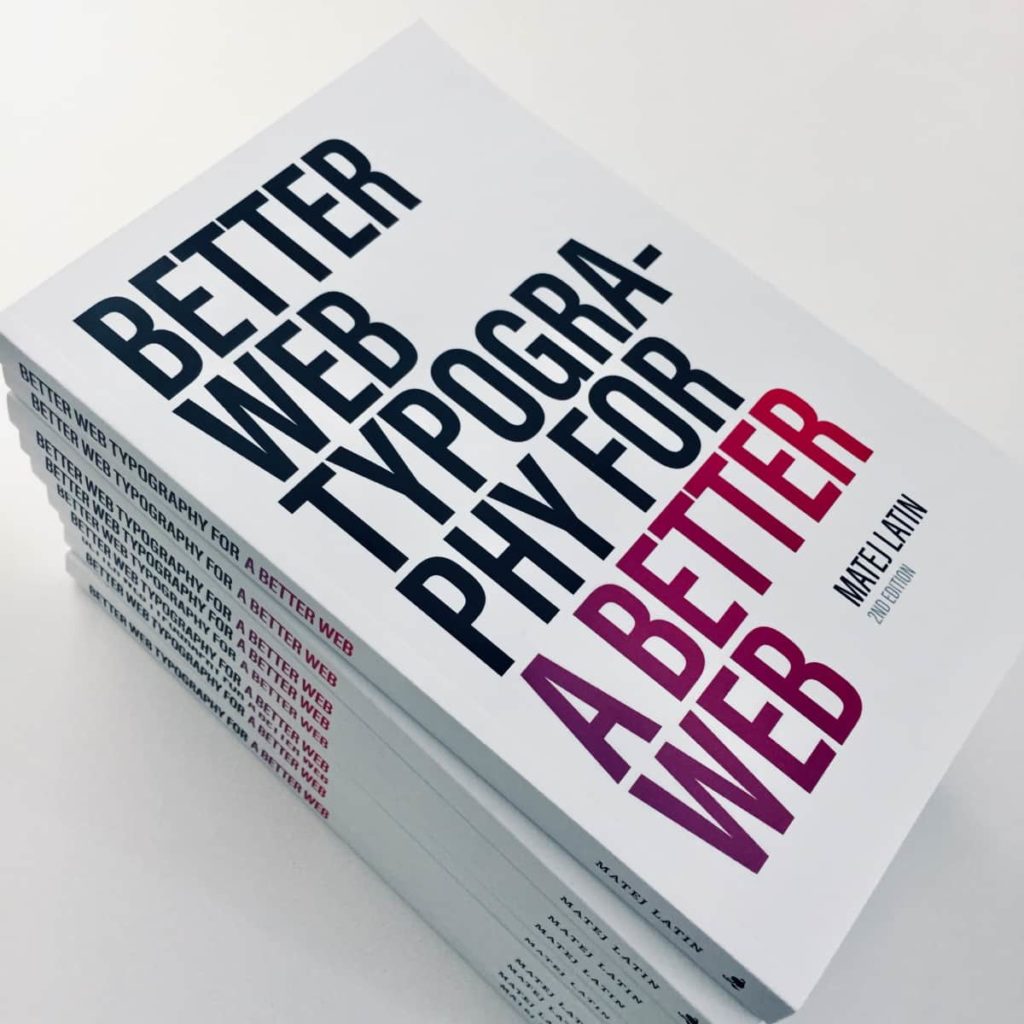
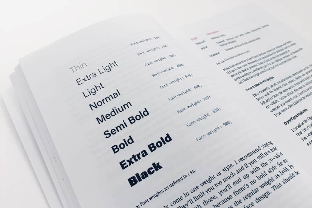
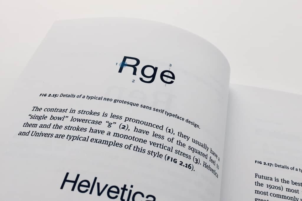
After I did more research, I discovered Lulu. There, I was able to choose between a glossy and matte finish for the book cover. I chose matte. I could also choose the finish for the interior pages and I chose the coated one. I ordered a couple of test copies and was pleasantly surprised when they arrived. The matte cover finish had a velvety feel to it. It looked and felt sophisticated. The pages were slightly glossy because of the coating and it made the colours stand out. I loved it!
The distribution
Manual distribution turned out to be a huge endeavour. I had no idea that so many people wanted to buy the printed version of my book. Even the customers who already bought the eBook were ordering the printed version. There was a huge demand for it and I couldn’t keep up. A book would sometimes get lost during the delivery and I had to arrange a replacement. Two or three out of 100 books that I sent out would get lost. It’s not a lot, but it becomes significant when you’re running your business as a side gig. So when I reintroduced the printed version of the book this autumn, I decided to sell it directly through Lulu’s web platform.
Benefits of Lulu.com
Lulu is print on demand which means that when a customer places an order, it will be directed to the print shop that is closest to that customer. They print the book and send it. The costs of shipping are lower and the delivery time shorter which results in more happy customers. If something goes wrong with the delivery the customer reaches out to Lulu and they take care of the problem. Their customer support is a bit slow but good. Now I have more time to focus on creating new things because Lulu takes care of the whole process. I can continue to offer the printed version of my book and I’m happy with the quality of the print and so were the customers that ordered the book so far.
- If you want to get the printed version of Better Web Typography for a Better Web you can do so on Lulu.com. I hope you’ll enjoy it and appreciate the quality of the print as much as I do.
- If you prefer eBooks, you can get it on the official Better Web Type website
