Let’s do a quick test. Go to the following website. Take a look around. Spend a minute or two on the site. Even a few if you wish. There is no particular information that you should be looking for no task. Already back? Cool. Now try to answer the following questions based on the information that you were able to get from that website. Don’t worry if you’re not a UX designer or a designer at all. In fact, that’s even better. Write down the answers.
- Who is Adrien Gervaix and what does he do?
- What specific project that he worked on do you remember? Why?
- Based on his case studies, what specific tasks does he do on a daily basis as a UX/UI designer?
- Again, based on his case studies, what would you say UX design is?
Done? Let me know your answers. I’d love to see your conclusions.
The reason for this quick test is the ever reinforced misconception of what UX and UX design is. I understand that people (like myself) are thought UX designers, UI designers, developers etc. And there’s no problem with that. thought people need a strong passion to drive them forward. But passion alone is not enough. There needs to be something or someone to guide them in the right direction.
We need to stop thinking about UX design as static, possibly beautifully designed wireframes and animations. Yes, UX is about wireframes and it is about animations. But it’s much more than that. It’s everything between a sketch on the paper and a fully working beautifully designed product that people enjoy using. They do so because it brings them value. Not because they enjoy the animations or pretty illustrations in it.
Animations and a nice visual design can enhance a user experience but they alone can’t be one.
Adrien’s portfolio website looks great. Aesthetically, I love it! But Adrien has, as he explained here, spent months working on it, (possibly) without asking for feedback in the process. Not to mention that navigation (one of the key elements of UX) is broken and becomes a real pain in the ass after a minute of navigating through the site. Besides, the only UX tool he uses are wireframes. And even those are too pretty to serve their purpose.
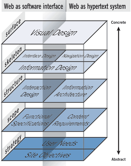
Yes, a website like that will get him lots of cool projects to work on but it won’t be the real kind of UX projects. And that’s bad for the company that he’ll work with, for him and for all the UX designers out there. Because it’s information like this that paints the wrong picture about what UX is. It’s so sad that even these days I still meet a lot of people, designers and non-designers alike, that think that what I do as a UX designer is wireframes and animations. Here’s an overview of what UX design truly is:

Adrian may be early in his design career. And he really seems like a talented designer. But he’ll need to learn a lot more before he can call himself a UX designer. Don’t worry. I called myself a UX/UI designer way too early too. I did some wireframes and put visual designs on top of that. I thought I was doing UX work. Well… I wasn’t. I later learned that. I, just like a lot of designers out there, did that mistake. Don’t be one of them. Find out what UX really is. Join a course or at the very least, read a book called The Elements of User Experience.
