Why you rarely make it past the case study presentation and how to fix it
One warm, Italian, summer day in August 1907, Vilfredo Pareto noticed something odd in his garden — some pea pods produced more peas than others, no matter what he did. Being a curious polymath, he inspected the peas closely and concluded that roughly 20% of pods produced 80% of the produce.

This finding sparked a brilliant idea: Could this “natural” distribution be observed elsewhere? He explored wealth distribution in Italy and found the same pattern. 80% of the wealth was owned by 20% of the population. “Is it just a coincidence?” he wondered. Intrigued by the simplicity of his observations, he inspected wealth distribution in other countries only to find more of the same. His findings gave birth to one of the most common laws that can be observed everywhere, for example (Source):
- In many companies, 80% of revenue comes from just 20% of customers
- In manufacturing, it is common to find that 80% of product defects are caused by 20% of the problems in the production process.
- About 80% of stress is typically caused by 20% of stressors in life.
- In productivity, 80% of your productive output can come from just 20% of your daily activities (Keep this one in mind).
Named after him, this is now known as The Pareto Principle, The 80/20 Rule, The Principle of Imbalance, or maybe most adequately named in our case The Principle of Least Effort. But why am I telling you the story about Vilfredo and his pea garden?
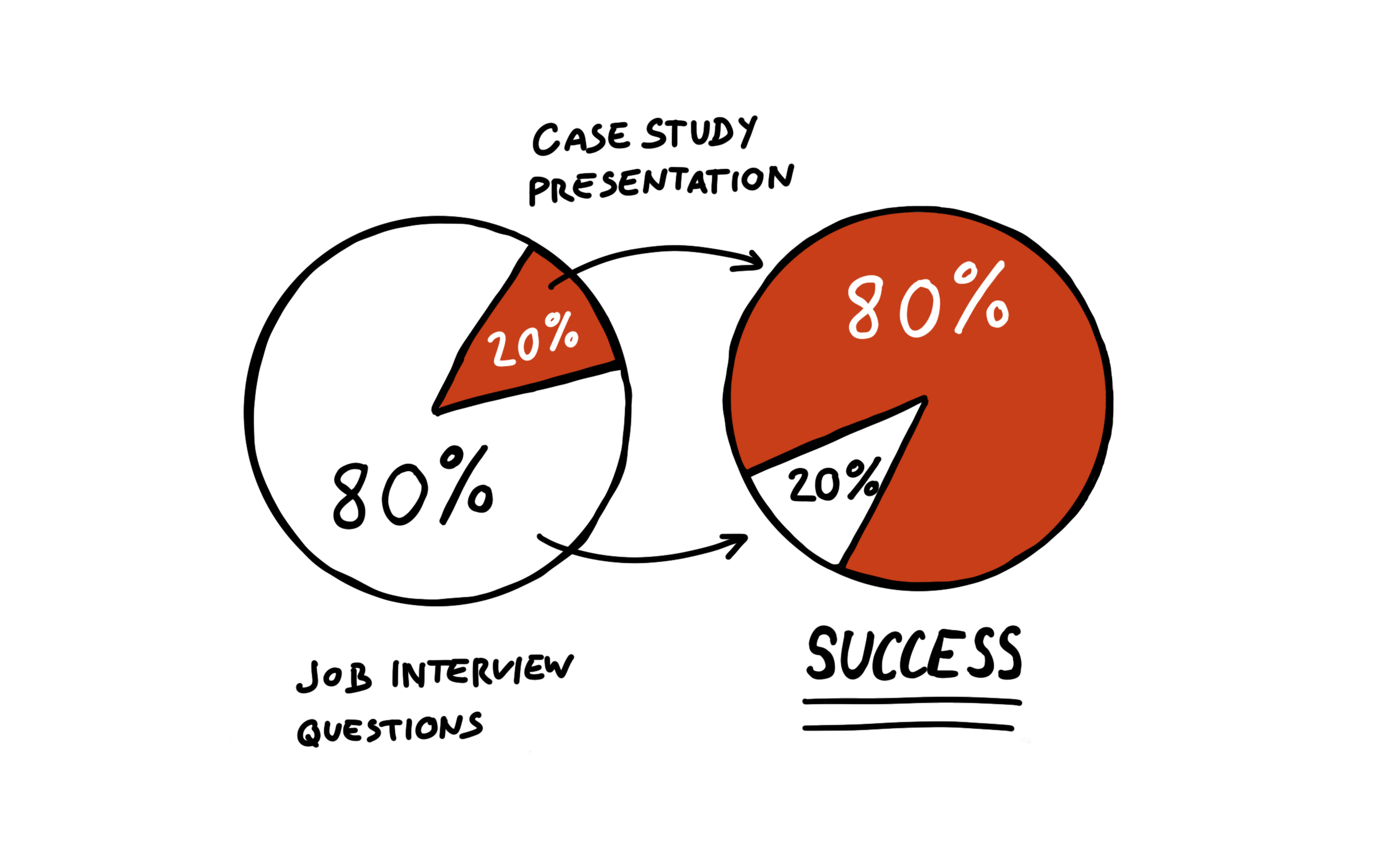
Many designers that I mentor are surprised when I tell them that 80% of their success in design job interviews comes from one key part — the case study presentation (which is roughly 20% of questions). It comes in various forms: “Can you tell us about your design process?” or “Can you share some of your recent work with us?” The expectation is always the same. The designer has to go through their work, usually in a slide format, and explain what they did, why, and what the result was.
Most designers obsess over what questions they will be asked in a job interview and scour websites like Glassdoor to research the company they’re about to interview with. They find some hints and then they practice and prepare answers to the questions they find there.
The 80/20 rule applied to design job interviews recommends that you should put 80% of your effort into preparing for and presenting your case study well and 20% in all other questions. But why is the case study presentation so important?
Why are the case studies so important?
I’ll borrow the words by Jenny B Kowalski to answer this (Source):
A case study allows you, the designer, to show off not just your designs but also your value as a designer. You get to show the whole process from start to finish. People reading the case study get to know how you approach problems and how you communicate. You have the opportunity to tell a compelling story with every project.
The case studies in your portfolio are like movie trailers. They need to make the design managers want to hear the full story. The job interview is where you get to tell that story. This is your best chance to shine and stand out as a candidate!
From an interviewer’s point of view the case study presentation is important because:
- We get to observe the designer’s communication, facilitation, and presentation skills which are tremendously important in stakeholder management (Source)
- It allows us to learn about the smallest details in their design process. When designers can speak in detail about different parts of their process, they’re well experienced in it. The opposite usually means there’s a lack of experience.
- When details are omitted, we can follow up with additional questions to find out why they were not there: is it a lack of experience or were they skipped for brevity purposes?
But why use the 80/20 rule here? Despite the importance of the case study as described above, another strong reason is this: you can be 100% certain that you’ll have to present a case study so it makes sense you prepare for it well. You can’t be certain what the other question will be, so investing too much energy and effort on those doesn’t make much sense.
How to prepare for the case study presentation
Pick a relevant case study
The most important part of preparation is picking the case study that best fits the company you’re interviewing with. This could be a case study of your work from a similar industry or a similar product. It could be relevant based on the type of work you did, compared to what the company requires. Or it could be a similar problem that you solved. Make sure you explain why you picked this case study and how it’s relevant to them before you present it. It might earn you a couple of bonus points with the interviewers.
Don’t worry if you don’t have a relevant case study. You can still perform well in the presentation, keep reading.
How to design the slides
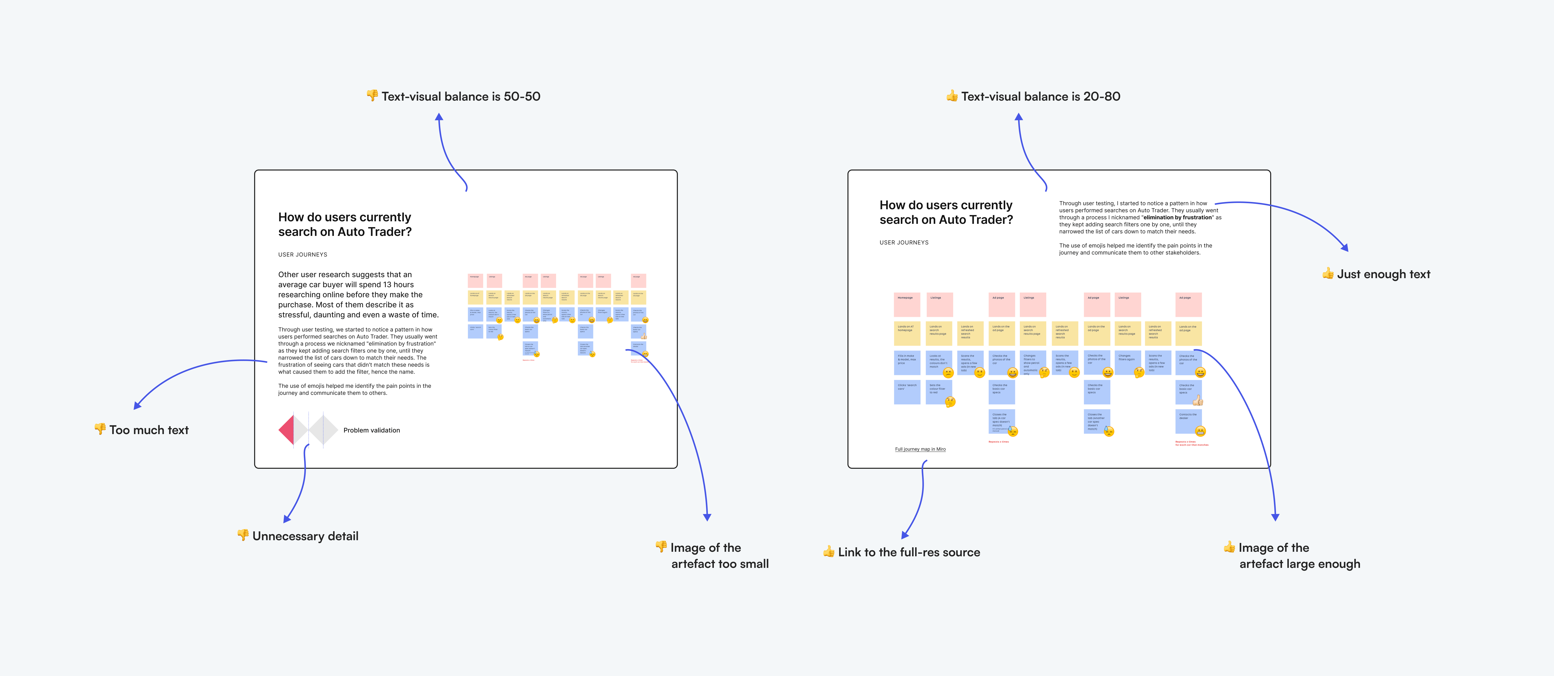
Use the 80/20 rule again and focus on the visuals as you design your slides. 80% of the content should be visuals and only 20% should be text. You can always have notes somewhere separate to refer to them during the interview. You don’t need to hide them, no interviewer will be bothered if you check your notes during a presentation.

Consider including links to the source whenever you show images of artefacts you created — created a user journey map in Miro? Add a link to it so that interviewers can inspect it in detail as they prepare for the interview.
Use the 20% of text content in your slides wisely, and focus on key information that you want your interviewers to notice. If you conducted user interviews with 5 users, use a photo of yourself performing an interview, a short explanation of why you decided to conduct these interviews, what the goal was, and what you learned. Consider showing a quote or two from the users that you found the most insightful and impactful on your design process.
I’m not the only one recommending an 80/20 visual-text balance. Slava Shestopalov recommends a 75/25 ratio, which is pretty close (Source):
Well-illustrated portfolios are attractive but may not reveal your problem-solving skills; text-rich case studies tell the story but don’t expose your visual skills and may feel boring. That’s why a text-visual ratio from 50/50 to 25/75 percent works so well.
My final recommendation for preparing the case study slide deck is to tell a story. Storytelling is also a soft skill that design managers look for (Source) and if you tell an interesting story of how you struggled with something and overcame the problem in the end, you’ll have the interviewers captivated. I won’t go into many details on this as I already wrote a full blog post on why designers who use cookie-cutter templates instead of storytelling are unhirable.
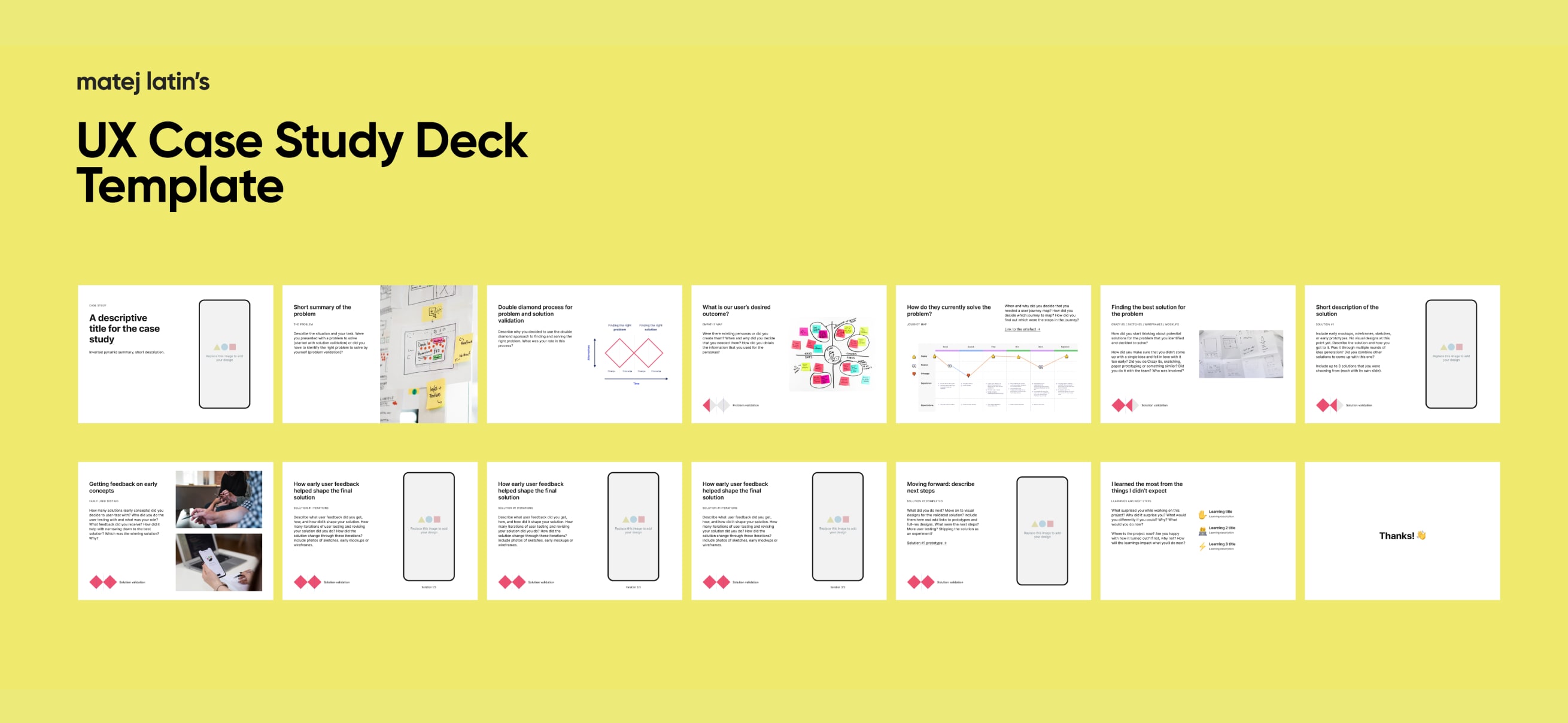
Get my UX case study Figma deck template
You can get a free version of my UX case study Figma deck template which has most of the slide layouts that you need for a good case study presentation (Fig 2).
Prepare answers to interviewers’ follow-up questions
This is the most important part of the most important part of the interview: interviewers’ follow-up questions. We love these because we can tear your design process apart and see what’s fake and what’s real. You’d be shocked by how many designers fake their case studies to fit an imaginary perfect design process.
No designer works in a designer’s heaven where they can execute a perfect design process with unlimited resources and time. So the interviewers need to learn about the details of what you did, why, and what you learned from it.
We, the interviewers, don’t care about your design process, or what methodology you use for it. What we care about is whether you can overcome struggles, collaborate, communicate, and ultimately get things done. Kai Wong elaborates on what happens when designers fail to talk about their impact (Source). The interviewers see that the designers know how to design a feature but perhaps not why it matters. In addition, the main question that they’re looking to answer, whether these skills will translate well to solving the company’s problems, remains unanswered.
No designer works in a designer’s heaven where they can execute a perfect design process with unlimited resources and time. So we need to learn about the details of what you did, why, and what you learned and how you grew from it. Here’s a list of potential follow-up questions you should prepare for:
- What was your role in this project?
- How long did it take to complete?
- What was the goal of the project? Were you involved with setting the goal? If not, who set it and why?
- Where did you start and what was the process?
- Why did you decide to do X? Why that and not something else?
- Who did you work closely with? What was your relationship with them like? Were you able to influence them and lead the design part?
- What was the expected outcome and what was the actual outcome in the end?
- How do you think is this work relevant to our company?
- What skills did you use?
- What tools did you use?
- What would you do differently today? Why?
Remember that a skilled interviewer will review your case study, find weak spots and ask questions about them. These top-level questions may lead to additional, more specific ones.
Practice until you’re fluent and confident
After more than 200 job interviews I had with designers, I also noticed an example of the 80/20 rule. 80% of them performed poorly, meaning that their presentations dragged, were boring, and sometimes incoherent. 20% of them performed really well. The difference? The 20% of them came prepared, were articulate, presented fluently, and brimmed with confidence. That’s good news because all that comes with practice.
Practice comes naturally as you go from one job interview to another — that’s why you never get the first job that you interview for. But you can and should speed this up. After you have the case study slides finished, make sure to practice your presentation. Prepare a bullet list of notes, go through the slides, and record yourself. Then review it, identify mistakes and problematic parts, take notes, and repeat until you’ve improved. Limit yourself to 15 minutes. You’re ready when you’re on time and don’t need to check your notes. Repeat until you notice yourself being confident in the video recording.
How to stand out in presenting the case study presentation exceptionally well
80% of a great presentation lies in good preparation. If you practice your presentation as described above, you’ll do better than 80% of designers out there (Do you notice all the 80/20 rules?). But there are things you still need to do to perform exceptionally well. Following this advice may put you in the top 5% of candidates.
Watch your time. Yes, you’ve practised presenting your slides in 15 minutes, but the interviewer may interrupt and ask questions. Try to keep track of how much time you spend answering their questions and stick to the 15-minute limit. This shows your awareness of limited resources and designers always have to work with those, including limited time.
Skip the least important parts if tight on time. This shows that you have awareness of the situation which is essential for designers facilitating workshops or something similar. If you skip a part, make sure you explain to the interviewer that you’re skipping it for brevity and that you can come back to it in the end if time permits.
The last part is the one where great presenters do exceptionally well and the poor ones fail completely: Pay attention to your interviewer’s facial expressions and level of interest. Even though you’ve practised your presentation, keep it flexible. If you notice a disinterest in your interviewer when you’re talking about a user journey map you created, move on to the next part quickly. Don’t go on and on about all the details and bore your interviewer to death. Spend more time instead on the parts that seem to pique their interest.
How do you know when they’re interested? They’ll be looking at what you’re showing them in the slides, paying close attention to what you’re explaining, or looking directly at you. Additionally, look for (Source):
- Strong, consistent eye contact
- Leaning forward while you speak
- Smiling and appearing upbeat
Conversely, if they look distracted and there’s a lack of signs from above, it means they’re not interested. Adjust your presentation according to these signs!
I also advise designers to tell their interviewers ahead if they should interrupt with questions or wait until the end. My recommendation is to let them interrupt. This prevents the presentation from being one-sided and it helps you learn immediately which parts the interviewers find more interesting.
Conclusion: Should designers only focus on the case study presentation?
Pareto’s principle was mainly forgotten until Dr. Joseph Juran, an American management consultant, discovered his work in 1941. After learning about it, he noticed that 80% of an issue is caused by 20% of the causes to quality issues (Source). Later, Juran rephrased the principle into “the vial few and the useful many” to highlight that the contribution of the remaining 80% shouldn’t be discarded.
So how can designers perform exceptionally well in design job interviews? The key word is “preparation.” They should use the 80/20 rule to put 80% of their effort into preparing for the case study presentation (20%), and the remaining 20% into preparing for the other 80% of questions which aren’t trivial and shouldn’t be neglected.
Don’t be one of those designers who obsess over the interview questions they might be asked and waste 80% of their energy on that. Get ahead and focus 80% of your effort on the vital 20% of the design job interview — the case study presentation.


Great read.
Small typo: “the vial few and the useful many…”
I believe you mean “vital few.”