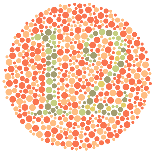
“I don’t see it”, I muttered in frustration.
“How can you not see it? It’s right here: 12…”, my schoolmate claimed comfortably.
“I don’t see a 12, I see a 17…”, I replied in a growing frustration.

Remember these tests? I don’t remember the exact numbers anymore, but I got most of them wrong anyway. We had these tests every now and then at school and I got used to failing them and listen to my schoolmates making fun of me. I think I was the only one that had this problem in my class. My schoolmates couldn’t understand how could I not se the number they were all seeing? They knew about colour blindness and they knew that I was colour blind but they still wouldn’t get it.
It turns out that colour blindness runs in our family. Mine is not a severe one—I mix colours that are very similar, like some shades of green and brown. This issue of mixing the colours became a real source of frustration trough the years. “Oh yeah, how could you see it? You’re colour blind…” was a usual response and a mockery of my disadvantage over others.
I never wanted to become a designer, I just became one. But how can a designer not see and mix colours? I drew Michael Jordan once as a kid and showed it to my grandma. “Why is he green?!”, she asked. “He’s green?!”, I replied in surprise. To me it looked ok. This memory was stuck in my head and I felt like a fraud sometimes—how can I work on design projects for clients if I can’t tell these basic colours apart?
Eventually I started to move away from graphic design and branding projects and began to focus on UX/UI. My colour blindness wasn’t such an issue while working at this kind of projects so I could “hide” my disability. I would hide it because I still felt ashamed of it. Who would hire a designer that draws a green Michael Jordan?
The Perfect Job
Years later, I was head of design at Wondermags. We were deciding on button colours and we had a few options. All of them had to work on a red background. We had a blue button and a green one for an interface of the iPad Kiosk app we were working on.
“Shit, I can’t look at that!”, I commented the green button on a red background.
“Why not?”, Kurt (another designer on my team) asked.
“The contrast, it’s killing my eyes.”, I elaborated.
“Really, I don’t see it”, he replied surprised.
Kurt then switched on the grayscale view on Skala Preview and it was immediately clear that the contrast between the button and the background was indeed bad.
“How did you know that?”, he asked me.
“I don’t know, must be because I’m colour blind…”, I replied, not knowing what to expect.
“You’re colour blind?!”, he asked surprised.
“Yeah…”, I replied as that feeling of frustration started to grow again.
“Ha… you have a perfect job!”, he replied.
That comment blew my mind. Until then, I had always looked at my colour blindness as a disability. Like I couldn’t do something everyone else was able to do. But since that conversation, it started to feel more like a superpower actually. Hey, I can spot problematic colour combinations! I can see if the UI elements provide a good enough contrast even for the colour blind people like myself. Sweet!
Addressing Colour Blindness in UX/UI Design
1 in 12 men is colour blind, according to the stats. This equals to 8% of the male population and 4.5% of overall population in Britain. That’s 2.7 million people just in UK!
Colour blindness is an accessibility issue that is probably the easiest to address. Still many designers ignore it. They don’t choose to do so, they just don’t think about it. It’s not like everyone has screwed up eyes like mine so they could spot these problems immediately. But there’s tools that can help everyone else.
As mentioned earlier, we used Skala View a lot. It comes with default filters to test the interface for different types of colour blindness. The one we used the most was the monochrome filter as we could spot contrast issues immediately.
I use Sketch and have abandoned Photoshop a while ago. Sketch comes with a built-in tool for previewing interfaces on devices. Unfortunately it doesn’t have the filters to test for colour blindness. But don’t worry, there’s a cool alternative: Sim Daltonism. It’s open source and free. Colour Oracle is another one, also available for Windows. Both have smartphone apps as well.

1 comment