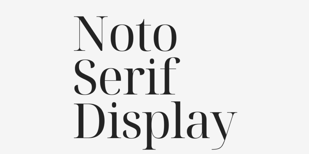
Welcome to the 10th edition of Designer’s Digest. This week we have another cool variable font which is a part of a workhorse font family and a topic that has been on my mind for a while: do design systems kill creativity in design?
Last week 123 people joined DESIGNR — my new Slack community for designers. You can still join for free here.
In this edition:
🅰 Noto Serif Display (Variable transitional style font)
🤔 Small jobs, small dreams (8 min read)
🅰 Pimp my Type free webinar
How was your weekend? I’m happy to report that I completed a refresh of my personal website last week. I have to prioritise email subscriptions because I decided that I’m not going to look for a new job but focus on my business instead. The website refresh reflects that. It’s not really a redesign, just a change of content and some minor modifications. Take a look and let me know what you think!
Why am I doing this? Why prioritise email subscriptions? It’s simple, my list of subscribers is the lifeline of my business. It gives me direct contact with around 20,000 people and I don’t have to rely on Facebook or some other shitty platform’s algorithms. Since I recently started sending out weekly newsletters, two things happened: many more subscribers are engaged, and many more people unsubscribe. It’s a fact with mailing lists: whenever you send out an email, around 1% of people unsubscribe. That’s ok, but I need new subscribers coming so that the list remains fresh. I’ll be posting more blog posts in the future which will drive traffic to my website which should then lead some of these visitors to sign up. At least that’s the plan, I hope it works out! 🤞
Next thing on my agenda: migrate from Mailchimp to ConvertKit.
🅰 Noto Serif Display
I stumbled upon this font the other day in Figma. It seems I had already installed it but never used it. I looked into it and found out that it’s a workhorse font. It comes in many styles: serif, sans-serif, mono. The one that I like the most is the serif display. I didn’t know how to categorise it at first but then I consulted my book and found out it’s a transitional style. The whole family is incredibly versatile because all font styles are variable. You could combine the sans serif for titles and the serif for body text and it would look perfect. Or maybe use the serif display style for large titles. Beautiful! 👌

🤔 Small jobs, small dreams
Now to the main topic of this edition: do design systems kill creativity in design? I read this article by Joe Alteiro and found it insightful. It’s something that I have been thinking about lately because of my mixed experience with design systems. On the one hand, they’re great because they streamline design work, but on the other hand, they’re often limiting and slow to develop.
The main problem I had with them was the dedicated team for it. It often happens that the team dedicated to building and maintaining the design system starts to feel that they and they alone own it. So they start policing other designers into doing things exactly as they want. Combine that with the inability to add or modify components and guidelines and you get a tool that is used way too strictly. That’s when design systems kill creativity in design.
Joe goes even further in his article. He thinks that digital design will become akin to a manufacturing job, there will be pressure on lowering the design salaries, and customised bespoke digital experience will become a luxury item. I think he’s right. Just take a look at what happened with graphic design. My favourite quote from the article:
If your role as an enterprise designer at a huge enterprise organization is to somehow get your hands around 10,000 slightly-off patterns, systemized templates start to seem awfully appealing. But is that…design? I’m not too sure.
— Joe Alteiro
Mick Santapaga who works on a team dedicated to the design system shared his expert opinion on the DESIGNR community on Slack:
Design systems are supposed to be boring, as Dan Mall put and I agree, so we can get to work on the cool stuff. I think there is room for work to be outside the system. I used to advocate for ‘everything must go into the system’, and now I can say that will truly stifle creativity.
— Mick Santapaga
🅰 Pimp my Type free webinar
My buddy Oliver is doing a live free webinar where he’ll talk about UI typography. He’ll tell you how to pick fonts that work for UI design work, improve visual hierarchy with font sizes and weights, and how to better use spacing — one of the trickiest parts of UI design.
That’s it for this Monday. Have an awesome week! 👋
Cheers,
Matej
P.S. You can subscribe to this weekly newsletter here.
