Have you ever faced the risk of product managers taking over, rushing forward, and in the end falling in love with a solution that you knew wasn’t optimal? I worked with several product managers in my five years at GitLab and I always faced this risk. So when I transitioned to the newly-formed Growth team, I had no idea what to expect. I had been able to avoid this problem with other product managers so far, mostly through collaboration, communication, and facilitation. But would that work with the four new product managers in Growth?
I had worked at GitLab for more than one year when the Growth team was formed. I decided to transition because I have always been fascinated by entrepreneurship and design’s impact on business outcomes. I was the only existing member on the team, everyone else was newly-hired which put me in a advantageous position and I wanted to use that. But I knew nothing about the four new product managers, would what worked in the past work with them too? I was facing two problems:
- I knew from my work before that the new user onboarding needed a lot of improvements. How can I convince the rest of the team to prioritise this?
- If I succeed in the first problem, how can I take the lead without bruising other teammates’ egos, and involve everyone in a collaborative design process?
My role:
Lead product designer
I worked with:
4 product managers
2 product designers
an engineering manager
Convincing the team that we should improve GitLab’s user onboarding
I had worked on improving GitLab’s user onboarding before the Growth team was formed. There had been indications that users had problems with getting started with GitLab and I decided to investigate them further. I reached out to the Sales department and obtained contacts of 5 new customers and 5 churned customers. I conducted user interviews with them which helped me understand why certain companies successfully adopted GitLab and others didn’t. At that moment I wanted to focus on those that didn’t convert into paying customers to identify the problems and obstacles they faced. Speaking to these people, I heard phrases like:
🤷
We don’t know where to start, it’s just too much for us, the UI is too cluttered and it’s hard to figure out what to do next
😩
It’s overwhelming, it feels like we would need to invest a lot of time into adopting GitLab
🤔
We got stuck at the very beginning: what is the difference between groups and projects? How should we structure our codebase and organisation?
🥱
There’s no guidance on what to do after registration so I ended up reading the docs but eventually gave up
The UX research team started measuring the SUS (system usability scale) around the same time and what they discovered served me well in my mission to convince others that new user onboarding should be the focus of the Growth team. They found that among the main problems users have with GitLab are discoverability and learnability. So they had problems with learning how to use GitLab, as well as discovering the GitLab features that are relevant to them. This confirmed what I had been learning by speaking to converted and churned customers. It was exactly what I needed to convince the product managers and the head of the department and the decision was finally made: after new year, the Growth team will focus on new user onboarding for indefinite time. 🎉 🙌
Being proactive, using UX research, and clearly communicating the user problems to others turned out to be the answers to my first problem: How can I convince the rest of the team to prioritise new user onboarding?
For whom are we designing the new user onboarding and why?
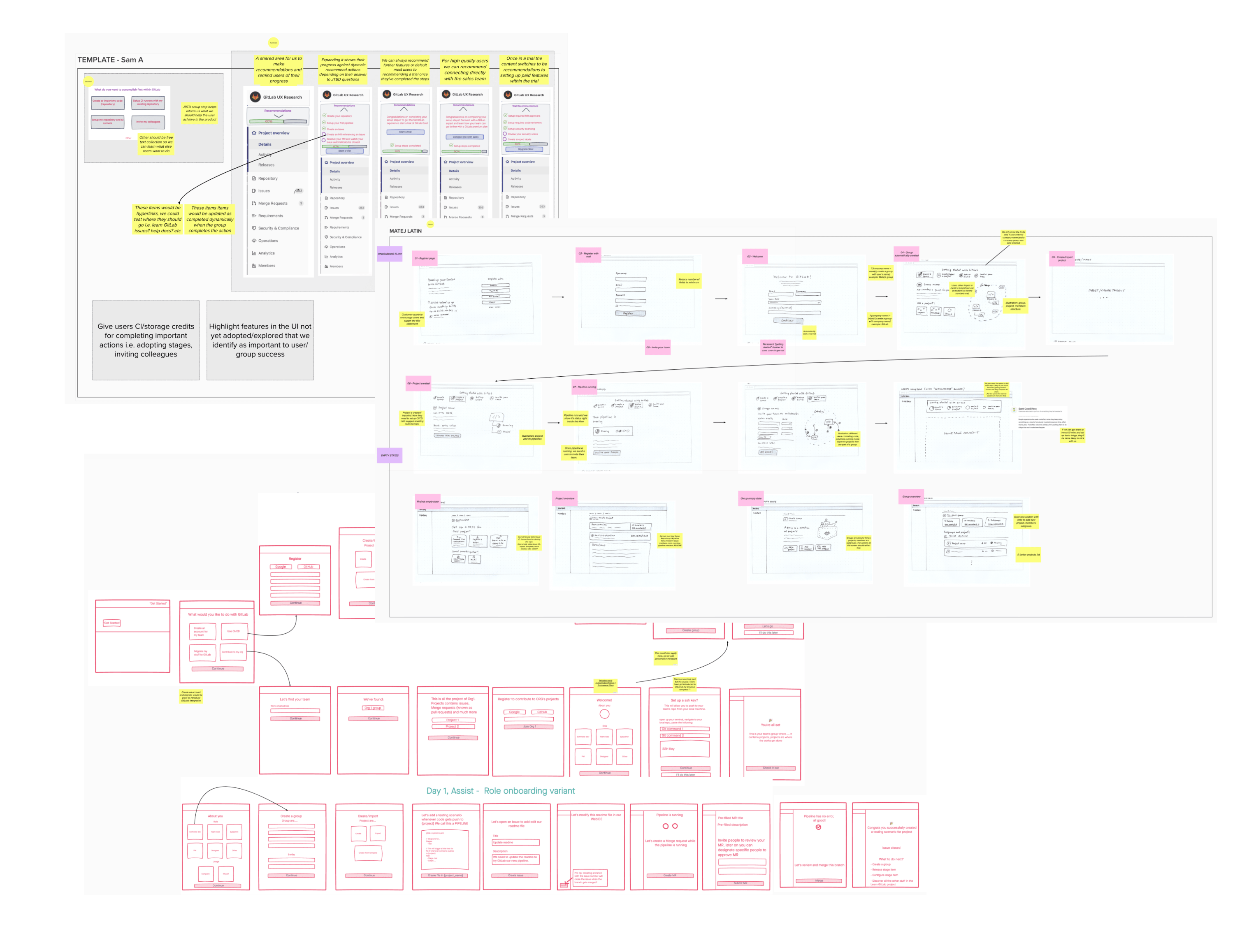
And now to the second problem: how can I take the lead and make sure we use a proper design process? The head of the department, who had made the decision to focus on the new user onboarding, scheduled a Zoom call for the kickoff workshop. She said that we should all join and come with ideas. That felt premature to me, but I went along and sketched out a few ideas. We added our ideas to a Mural and presented them on that Kickoff call (Fig 2).
I presented mine, but at the same time I warned everyone that we’re starting with solutions when we don’t know what problem we were solving. I suggested we take a few steps back and define the problem first. I volunteered to lead that. This was the opportunity to earn the somewhat leading role that I felt was needed. Other designers were more junior and they were ready to go along with what was proposed. I felt that if we did go along with it, design wouldn’t be an equal partner. So it wasn’t that I wanted the lead role for the sake of leading, I wanted it to make designers equal in deciding what to do next and why. Being proactive and taking the initiative was the best way to achieve that.
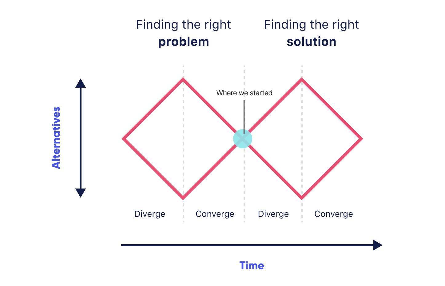
Considering the double diamond design process we started in the middle without a specific problem to solve. I worried that this would lead to Growth working aimlessly, copying what other products are doing, and achieving only limited results. I laid out the following things in Mural (Fig 4), based on my existing knowledge (mostly from speaking to customers):
- The three stages of GitLab adoption
- Which user is mot likely to perform the step? (Persona, based on existing GitLab personas)
- The likelihood of that step being completed
- User’s interest level in GitLab at each step
- User’s goal
- Our goal
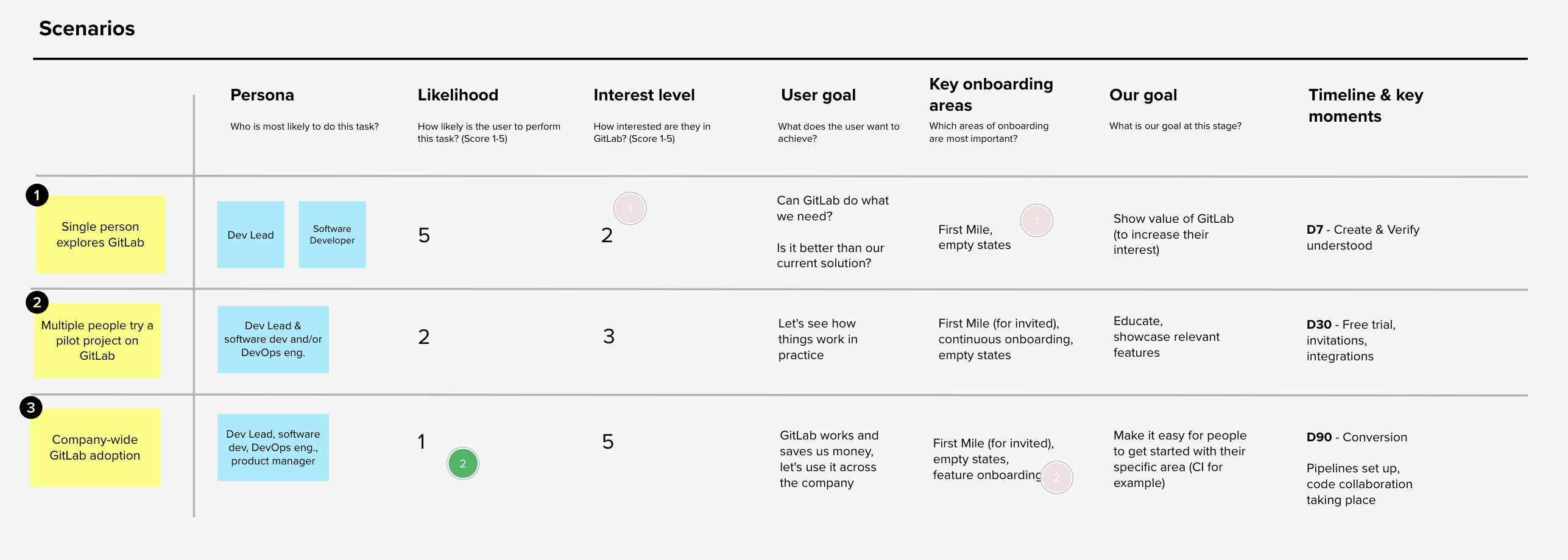
I then hopped on calls with coworkers from Support, Sales, and Account Management for feedback. They mostly agreed with my findings but told me that sometimes GitLab adoption can be reversed. It doesn’t always happen bottom-up, it often goes top-down. I hadn’t considered that until then, but it made sense. GitLab is an OpenSource tool, but it also offers a range of enterprise-level features, developed specifically for large organisations. These often have a different approach to adopting new tools.
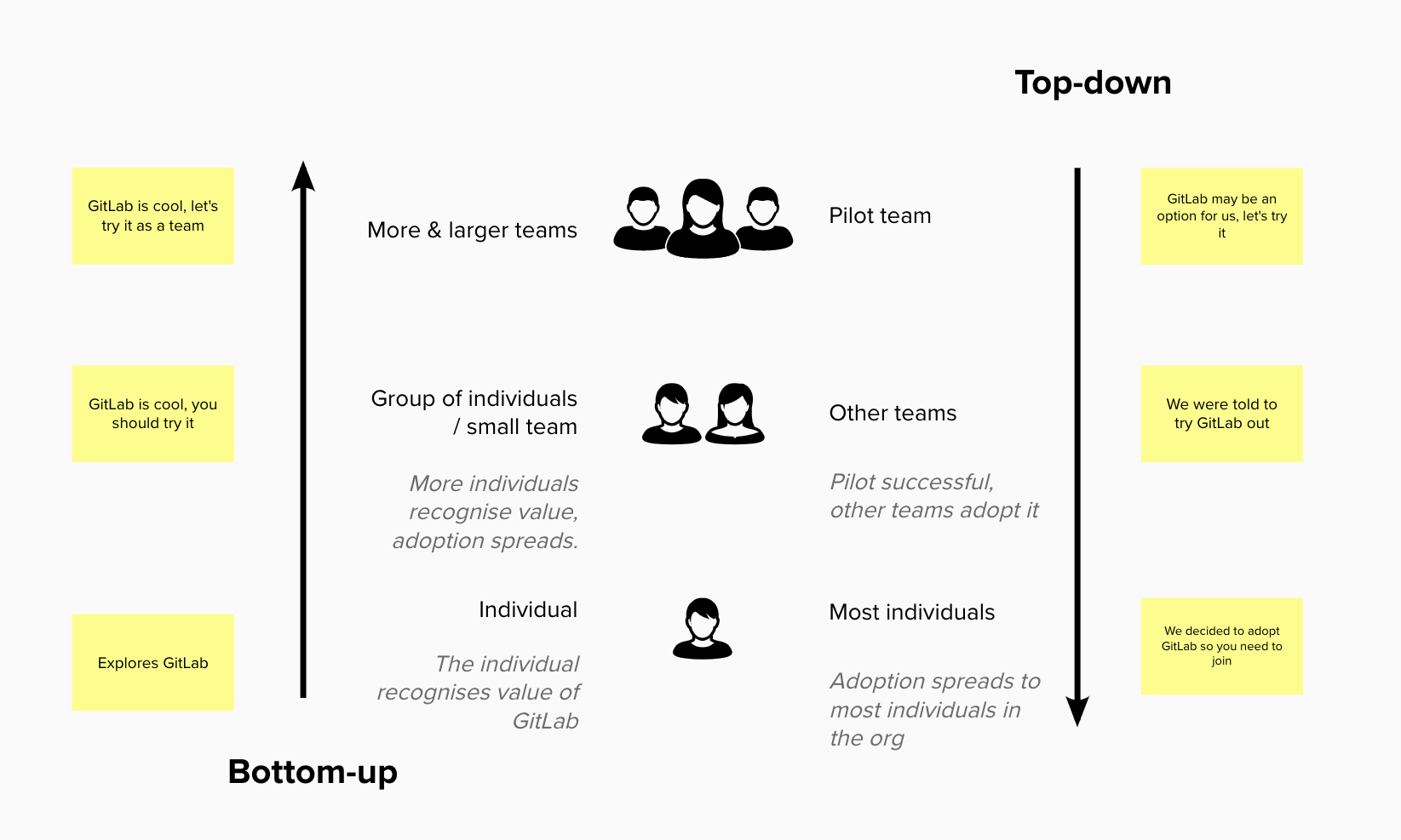
In their case, an executive decides that the company needs a new DevOps tool and they establish a pilot team. This team will trial several competing tools. If the pilot is successful (meaning they choose GitLab), other teams inside the organisation will adopt it until most individuals in the company use it (right side in Fig 5). The most important learning for me as a designer was that we’re not designing for a single user that goes through these steps but also for teams.
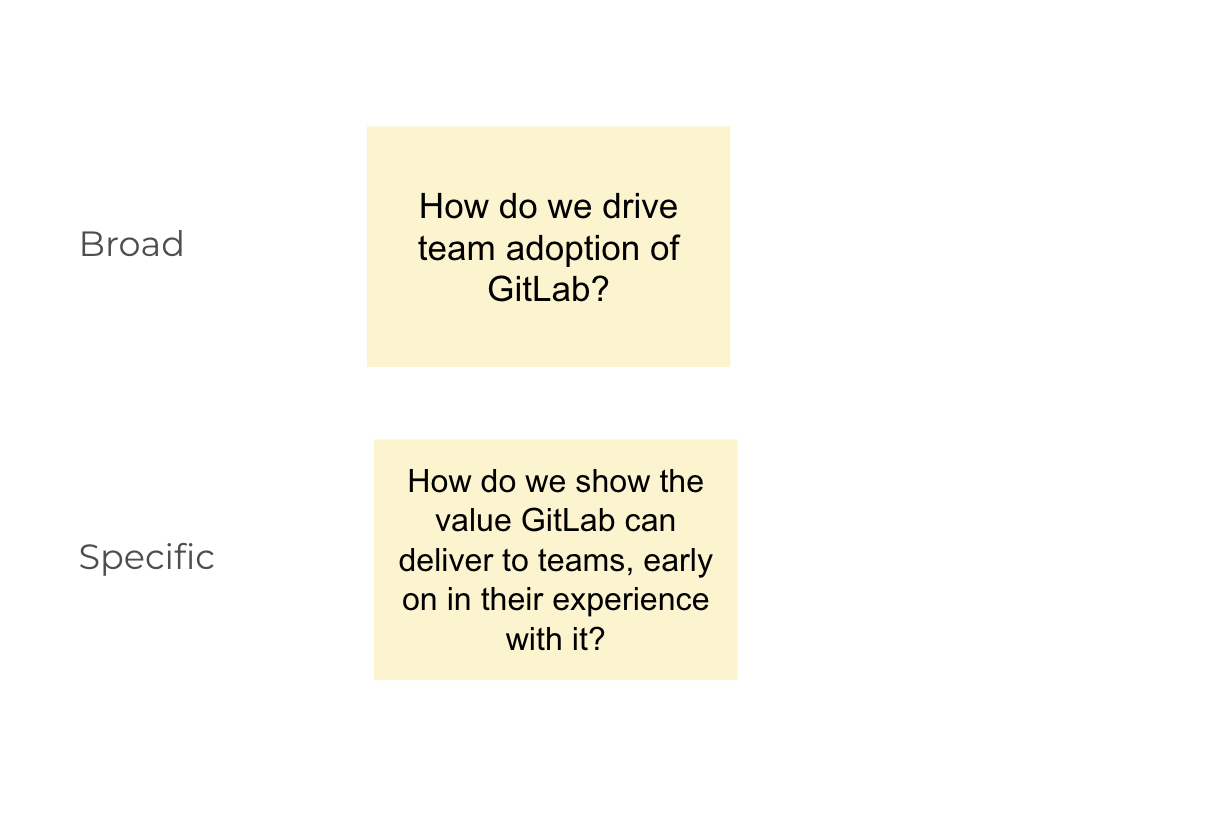
I was finally ready to present my work to the rest of the Growth team. I booked another sync session with the product managers, the designers and the engineering manager to present my findings and proposals. I felt we were ready to define the problem we wanted to solve, and with that our goals for this initiative. We first came up with an overall problem that I felt was too broad. So I pushed the team to make it a bit more specific (Fig 6). After a while we came up with: how do we show the value GitLab can deliver to teams, early on in their experience with it?
This overall problem covered well both sides: user’s goals and our goals as a growth team in a tech company:
- Users wanted to find out if GitLab is a better tool for their DevOps needs. We wrote down a JTBD: When I’m exploring GitLab for the first time, I want to see if it matches the needs of our team, so that we can improve our DevOps and software development process.
- We want to increase GitLab adoption which would lead to increasing the conversion of free to paid customers, which would increase the ARR (Annual Recurring Revenue)
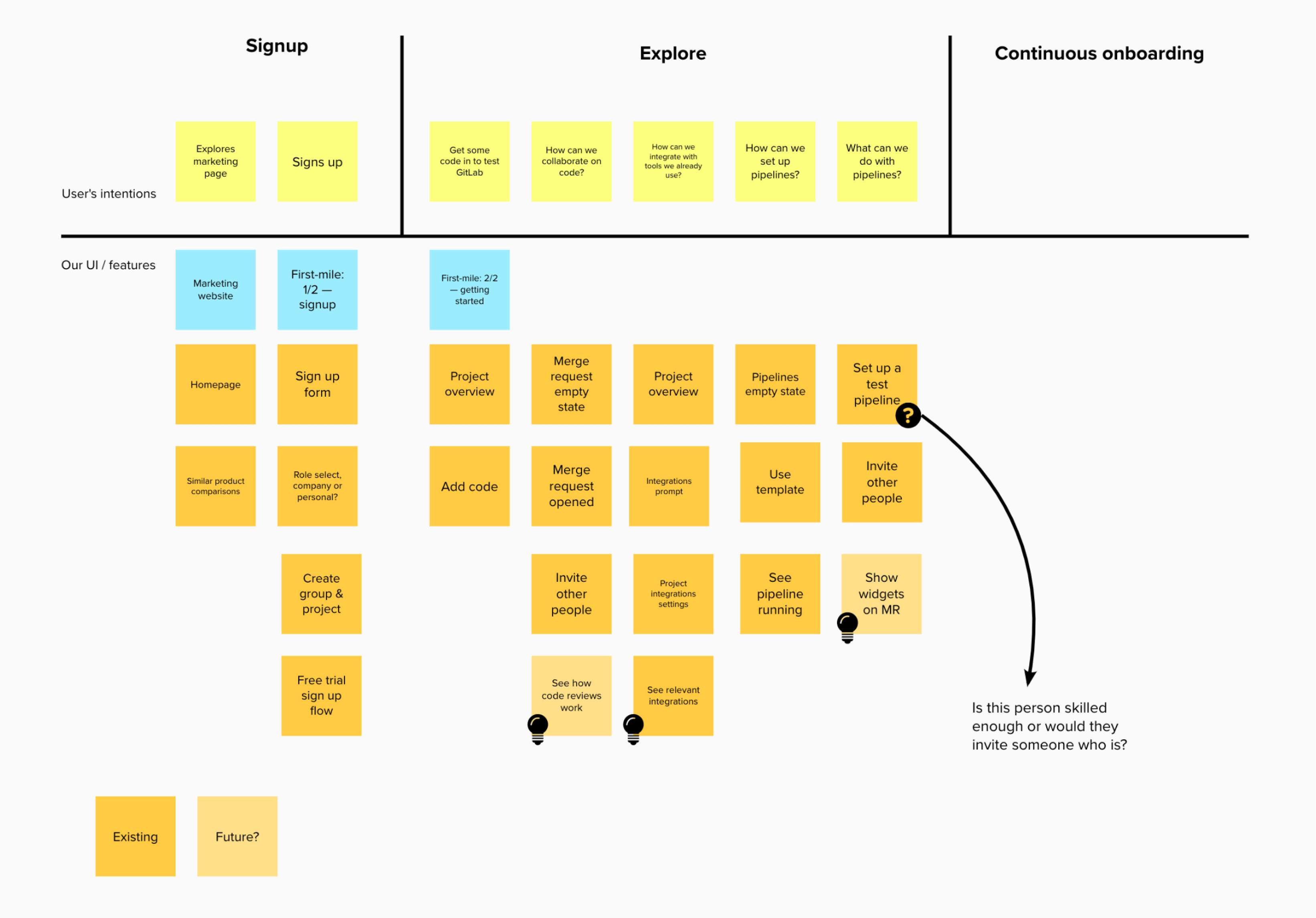
We concluded the session by creating the “onboarding model” (Fig 7) which split the user experience into three key parts:
0
Start
The marketing website, landing pages, etc.
1
First mile
Registration, guided account setup, free trial prompt
2a
Explorer’s experience
Improvements for users who want to explore the tool on their own
2b
Continuous onboarding
A systematic and guided approach to onboarding
I facilitated this call after I presented my findings and emphasised the user’s problems. I wanted to step out of the way after that and let others contribute and share their ideas. We defined the overall problem and the onboarding model together.
Creating the design strategy for the First mile
Now we had the overall design strategy that we could translate into design strategies for each of the key parts. I took over the creation of the design strategy for the First mile and mentored the other two designers to do the same for Explorer experience and Continuous onboarding. The Start stage was out of scope at the time because the Growth team was relatively small. It would be looked at later, together with the Marketing department. I worked on First Mile with one product manager, two full-stack developers, and a product analyst. It was a team dedicated to this part of the onboarding. We decided immediately that we wanted to continue our focus on two personas (based on existing GitLab personas): Sascha the software developer, and Delaney the dev lead. We knew these were the most common users of GitLab (together they presented 89% of our users) and we wanted to create a good experience for the majority of the users first and then adapt it for others.
I decided to create a mental model map for these users to better understand:
- What do they want to do, find, learn?
- What can we do to help them?
- What can we do to convince them that GitLab is something they should try out with their team (stage 2 of onboarding)?
- If they’re already trying it out as a team, how can we help them?
- How does our current UI and onboarding experience help?
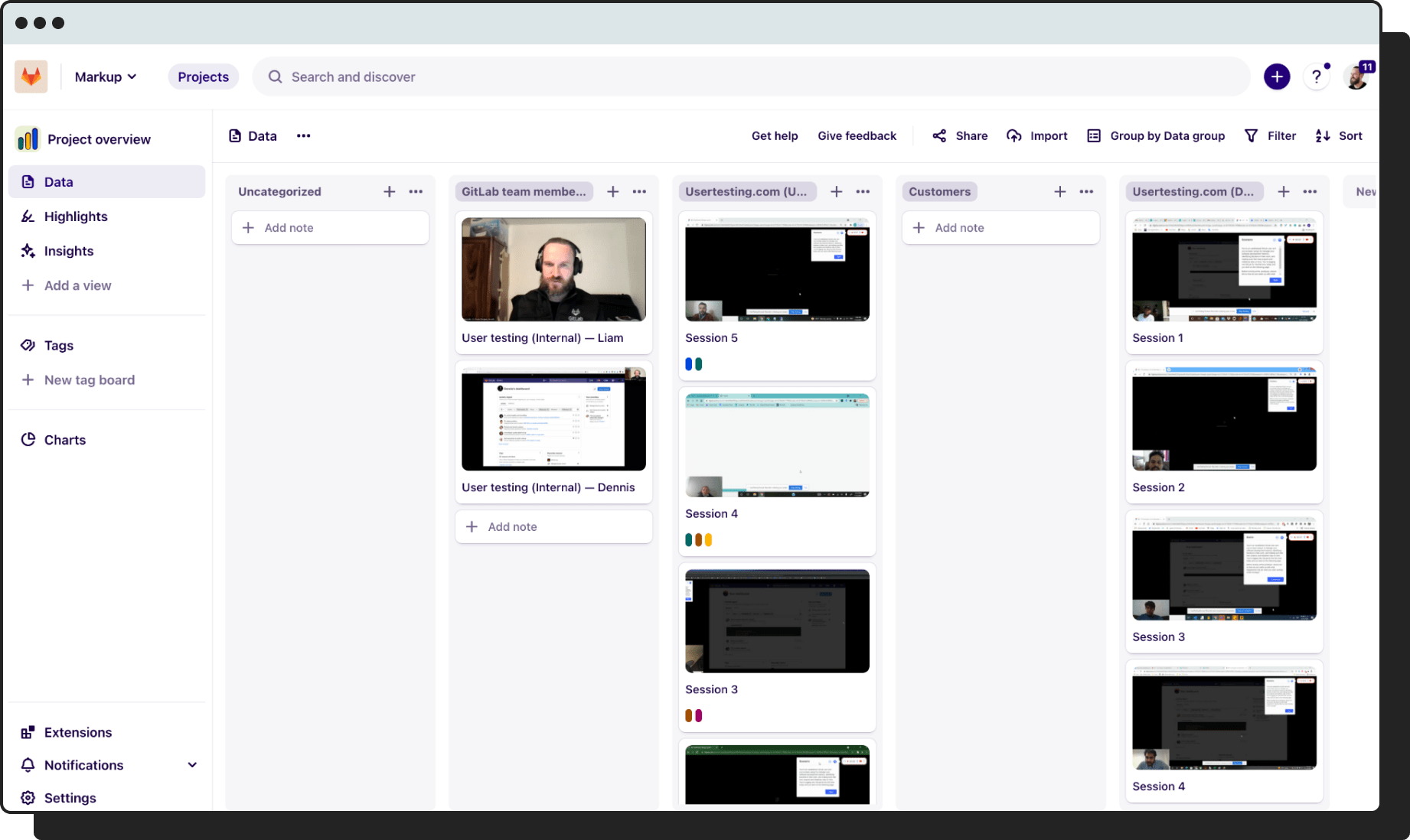
I set up additional unmoderated user testing on usertesting.com to see how users tried to adopt and explore GitLab after registration. Reviewing the video recordings, I was able to come up with the following mental model (Fig 8) which uncovered serious problems:
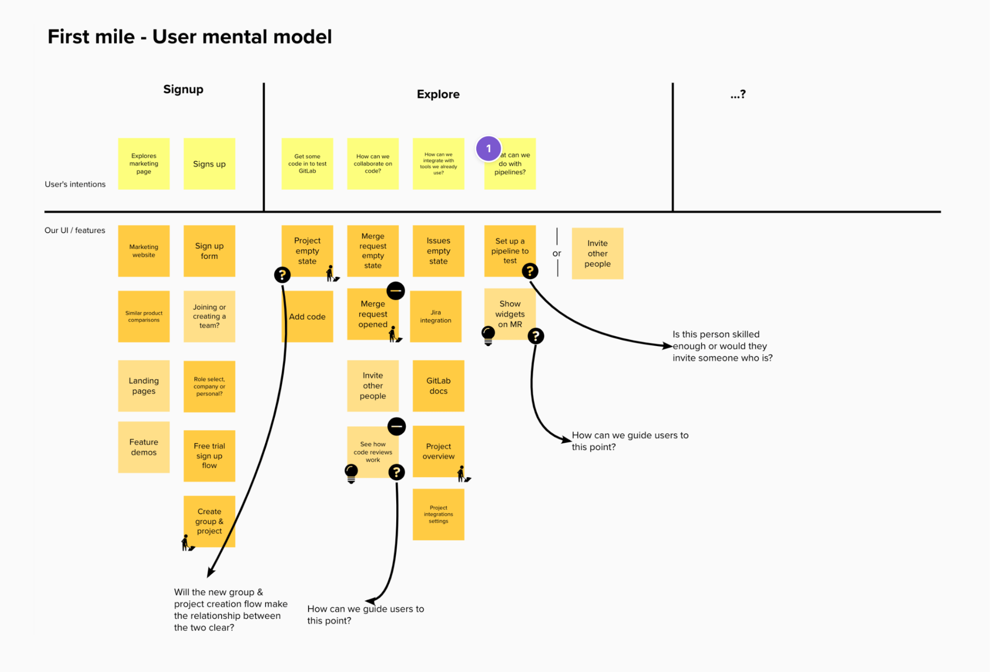
🤔 Unclear relationship between groups and projects
🤷♂️ Hard to get code into GitLab
🤦 We assumed that users signing up knew Git
🚨 Impossible to start a Merge Request
👎 All combined: users aren’t experiencing collaborative features
Some of the problems that were documented in these videos confirmed the problems I identified earlier when I spoke to customers. They didn’t understand what groups and projects were and what the relationship between them is. This is a crucial problem which I’ll get back to in a moment. It was also hard to get code into GitLab. The main feature of GitLab is to store code in a repository and collaborate with others through merge requests (GitHub calls these Pull Requests). But because it was hard to figure out how to quickly import code and because the experience for creating the first merge request had a bug that prevented users from doing that, they couldn’t even experience the most basic features.
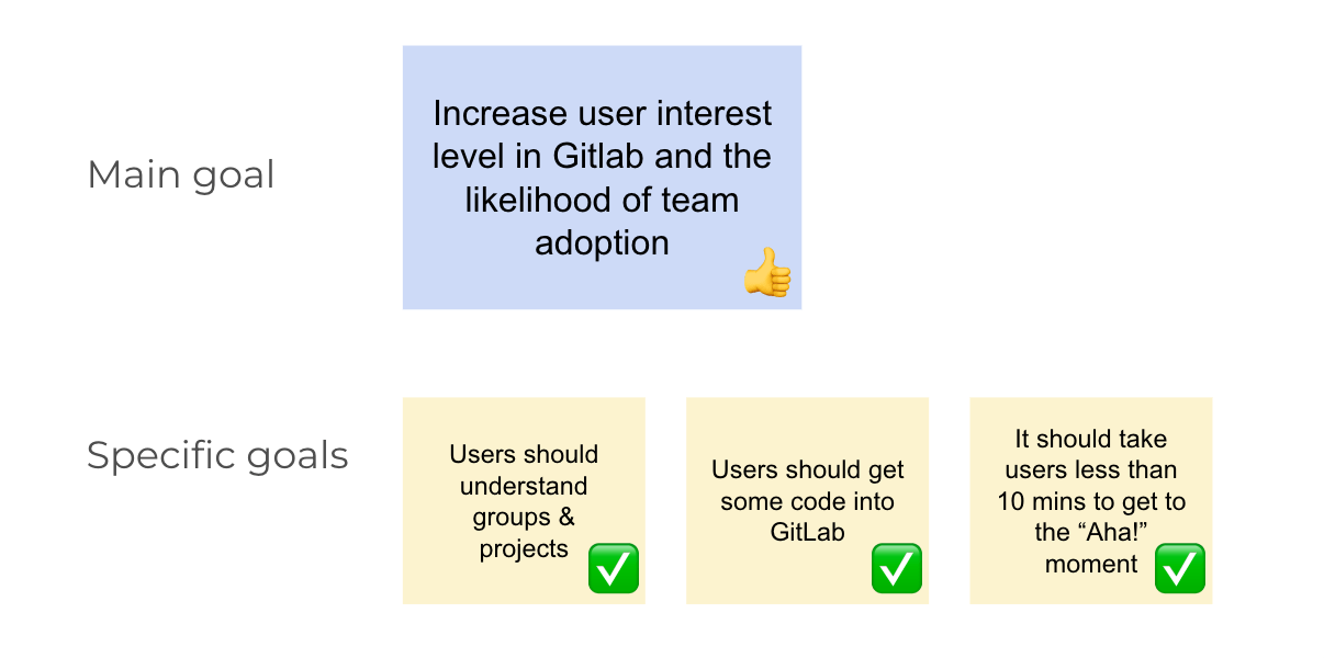
I hopped on a call with the product manager and presented my findings. It was clear almost immediately that we had to solve these problems in order to increase the user’s interest in GitLab, and with it, the likelihood of team adoption. We wrote that down as our main goal. Now it was time to translate this into more specific goals (Fig 9). We came up with five of them but decided to prioritise three. It was a small team and we couldn’t overextend ourselves.
The goals that we prioritised were:
- Users should understand group and projects
- Users should get some code into GitLab
- It should take users less than 10 mins to get to an “Aha!” moment
We would get to the other two goals later, the ones we prioritised were required steps to get to the items in the two non-prioritised goals.
Translating the First mile design strategy into actionable steps
The design strategy work was now done. It was finally time for some action.
Clarifying the groups, projects, and the relationship between them
Let’s get back to groups, why they’re so important, and why most users didn’t create them.
🗄️
Groups can have subgroups and multiple projects hosted in them which works better for teams.
🔒
Groups give access to more GitLab features (especially more advanced and collaborative ones like Epics).
💳
Groups are the entities to which billing is connected. Groups can be upgraded to a paid plan or a free trial, projects not.
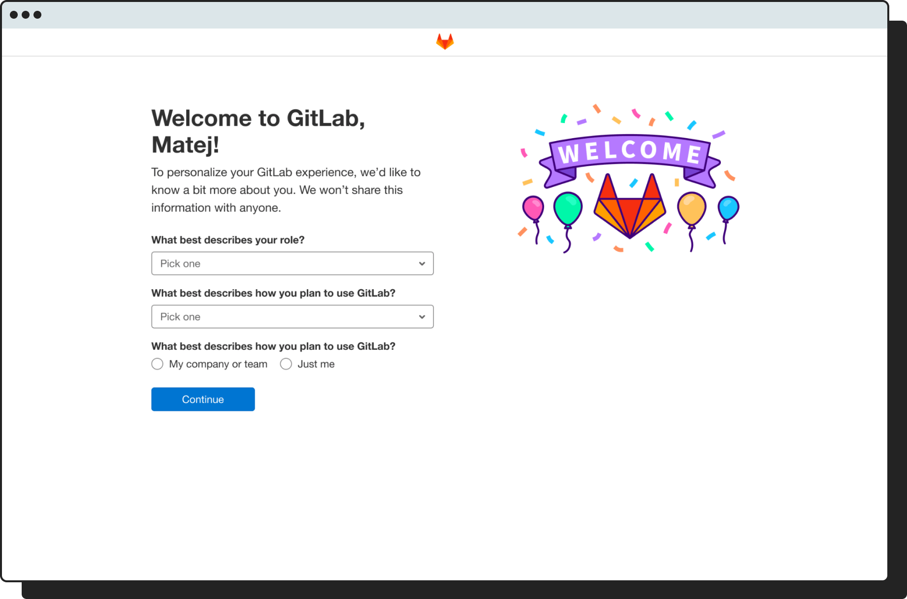
So if groups are so important, why don’t users create them? Here we come back to the problem of new user onboarding being virtually non-existent in GitLab. After registration, users would be presented with the following screen:
They were presented with four options but because they didn’t know what groups are, they’d just go with the first option. In fact, when we looked at analytics data, we found that 98% of users picked the first option to create a project. This uncovers how GitLab’s approach to onboarding new users was never holistically or strategically designed.
Ok, how can we fix that? How can we design the experience through which users create a group and a project, and understand the relationship between them? I came up with three different ideas/approaches (Fig 11):
- We could create the group automatically for them, and only ask the user to create a project
- Ask users to create each of them separately, provide explanations of what each is in the UI
- Combine both in one step, design the UI in a way that explains the relationship
We, the product manager, the engineering manager, and I, scored the three ideas with the RICE framework (Reach, Impact, Confidence, Effort) and decided that we wanted to eventually get to automatic creation (approach 1), which could be our design vision, but moved on with the manual creation as the first step (MVC, or minimal viable change). We weren’t sure if the approach 1: automatic creation would solve the problem best so we decided to validate it. As we worked on launching the manual creation (approach 2) as an experiment, I prepared a prototype for the automatic creation (Fig 12) and tested it through unmoderated tests on usertesting.com.
We had high hopes for this approach but the results of user testing were disappointing. We ran 20 quick tests on usertesting.com and realised that users didn’t even acknowledge the automatic creation of the group and just proceeded to the next step. When asked about the relationship between groups and projects, 14 out of 20 got it wrong. In one week that we spent on this, the experiment for the manual approach (number 2) was ready (Fig 13).
This approach performed better but still 11 out of 20 users got the groups and projects relationship question wrong in user testing. We also saw a small increase in group creation but because the relationship between groups and projects still wasn’t clear, most users still dropped off at the group creation step (Fig 14).
So we were making progress but haven’t had a real breakthrough yet. We still had one idea we could try, one that we haven’t paid much attention to: combined group and project creation. With our results being mediocre so far, I decided to quickly create a prototype first and test it on usertesting.com to see if we can crack the groups vs projects relationship problem. No point in investing time to launch another experiment if the solution didn’t solve that problem. The prototype was quite crude but I felt it communicated well enough how the interaction would work (Fig 15).
The user testing results were promising! Out of 20 participants, only 4 got the groups vs projects relationship question wrong. A breakthrough, finally! The product manager and I decided to proceed with the idea and launch a full experiment. It was a success.
+2.4%
Groups created
Target was 1%
+18.9%
Free to paid conversion
No target
+1187%
Free trials started
No target
There was a 2.4% increase in groups and projects created, which surpassed our target of 1% to call the experiment a success. But these weren’t the most interesting results. Comparing the users that went through this flow, to the ones that went through the old flow, we saw an 18.9% increase in free to paid customer conversion, as well as an incredible 1187% increase in free trials. These are also tied to groups and the users would only see a nudge to start a free trial if they had a group created. So we expected an impact on the amount of free trials started, just not this big.
This solved the first of our three problems that we prioritised for First Mile. It even had an impact on our main goal of increasing user interest in GitLab to increase the likelihood of team adoption (Fig 16). Now it was time to work on the remaining two goals: users should upload some code and getting them to an “Aha!” moment in 10 minutes.
Code upload and “Aha!” moments
I decided to tackle these two goals together because they’re connected. Uploading code unlocks the merge requests feature which can be an “Aha!” moment, for example. I decided to create another mental model map to track the user’s journey to potential “Aha!” moments, what their intentions are as they explore GitLab, and how does GitLab’s current UI help them with that. I was considering doing a user journey map at first but decided for the mental model map because unlike user journey maps, it also encompasses user’s intentions. I felt these were an important factor to include and communicate to other team members.
I identified three main potential “Aha!” moments with this work:
- The users should see how they can collaborate on code with others
- They can integrate GitLab with other tools they already use
- They can do elaborate CI/CD with GitLab
I also identified the main features that we should expose to users in order to achieve these “Aha!” moments, as well as the main problems that are currently preventing them from achieving these moments.
An “Aha!” moment is the moment of sudden realisation, insight, recognition, or comprehension. Often called the Eureka effect, in software tools like GitLab, it’s when the user recognises the value of the tool.
(Source)
| Potential “Aha!” moment | Key feature | Main problem(s) to solve |
|---|---|---|
| They should see how they can collaborate on code | Merge requests | No code to work with, can’t create an MR from empty state |
| Integrations with other tools | Project integrations | Project integrations nearly impossible to discover |
| They can do elaborate CI/CD with GitLab | CI/CD | They don’t know where to start |
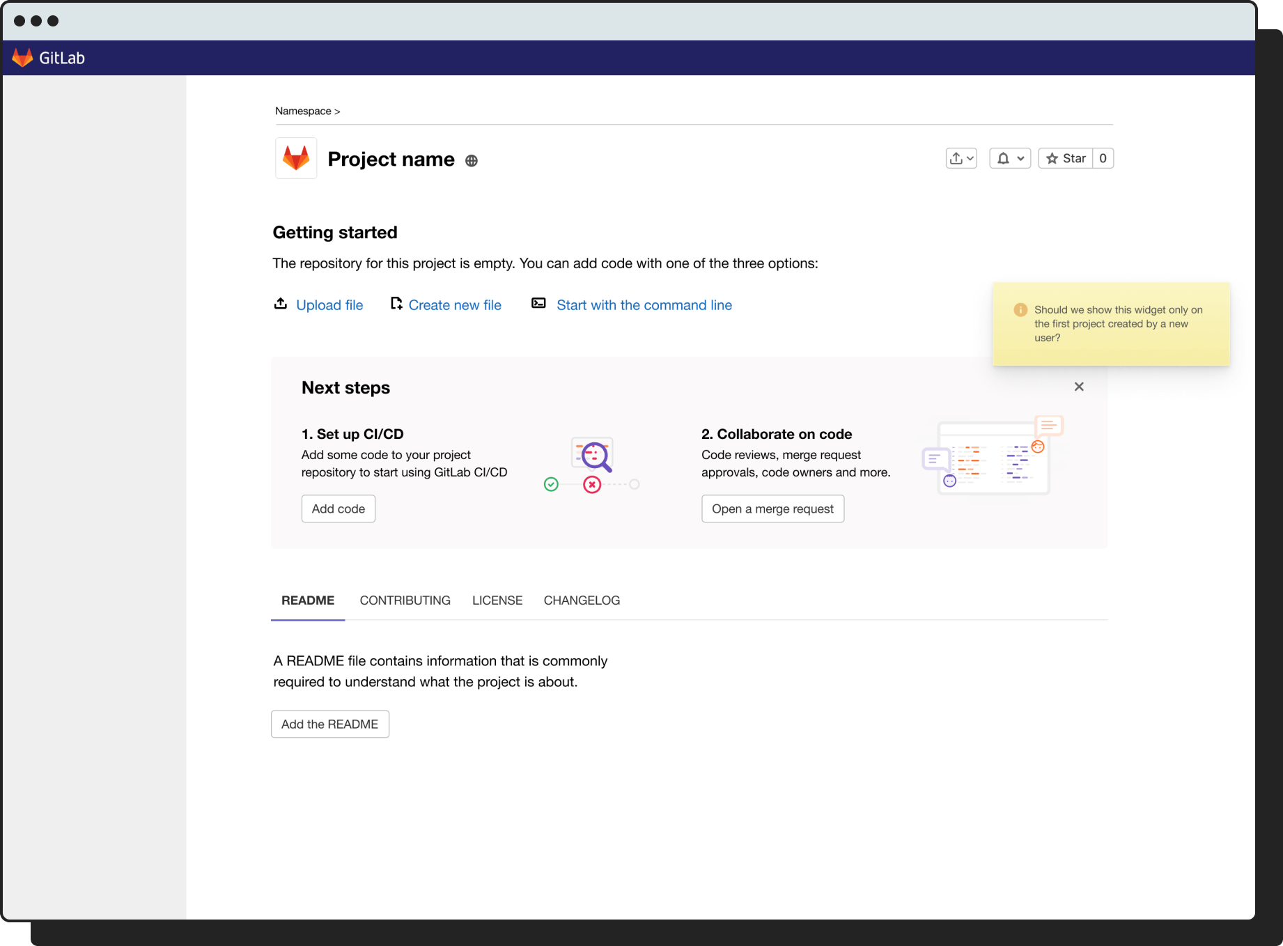
When I synced again with my product manager and presented my work, we started talking about potential solutions that would solve both problems. We almost immediately agreed that whatever we design should be on the Project Details page (Fig 18).
This was for three main reasons:
👉 It’s where the registration ends
After the users create their group and project as part of the improvements we already launched, they land on the Project Details page of the project they just created. This was the perfect moment to drive them towards the recommended actions.
🚗 This page gets a lot of traffic
The Project Details pages in GitLab are among the most visited pages overall. It makes sense, these are the summary pages for each repository of code.
👨💻 It’s where the code “lives”
GitLab is primarily a repository for code which also helps implement DevOps in organisations. The Project Details page is basically the repository overview page.
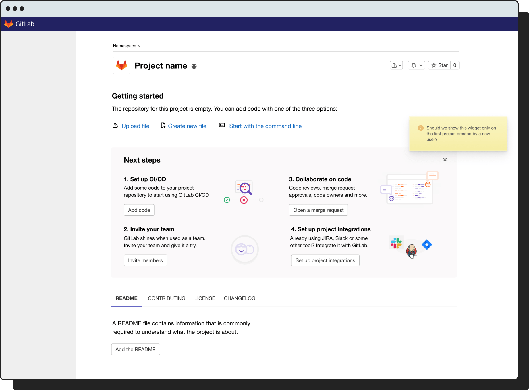
Initial explorations
My first exploration was more a revolution rather than an evolution of the Project Details page. I didn’t want to limit myself too much to what the page had already looked like. I created very crude mockups of the initial idea (Fig 19–21). It was far from polished but it was enough to present to other team members to get feedback. They felt that it was too aggressive and something that a team so small couldn’t take on. I thought they had a point so I decided to explore other solutions.
Second exploration
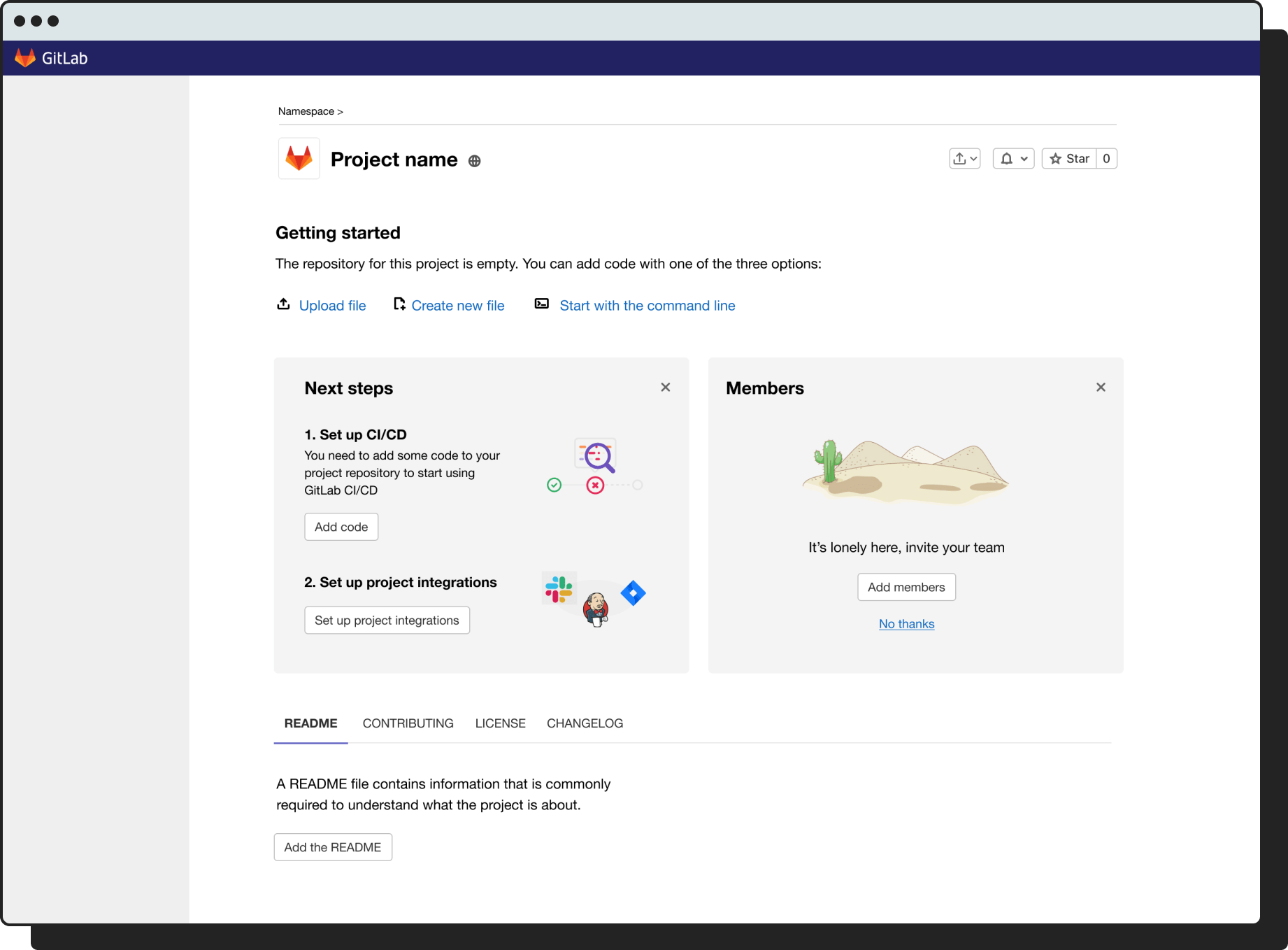
In the second exploration I wanted to explore how we could add user-guiding content to a page that is already quite busy with a lot of information. It was an interesting challenge, one that I gladly took on. I explored a couple of different approaches: one with a list of accordions, and a few different approaches to showing minimal amount of content in dedicated areas. The problem with the accordion approach was that it took up a lot of space and felt too obtrusive. It did offer more space to add detailed instructions and illustrations though (Fig 22–24).
Showing guiding content in dedicated areas (the “boxes” approach, Fig 25–27) had the opposite problem. It felt like we were adding a lot of new content to a page that was already busy.
Third exploration
I did another exploration. I tried to minimise the amount of content and the amount of new UI to be added. So far, I had four main steps, each with a title, a description, and a CTA. I felt I was getting somewhere but I felt I could do better. I tried to minimise the amount of text instructions and opted to add links to the key steps, grouped into three main groups. My mockups gradually progressed from crude to more polished as I went through these explorations. The last exploration felt balanced enough in terms of content and new UI being added to an already busy page (Fig 28 & 29). The problem now was: how would users react to it? Would they find it obtrusive? What would they want to do when they saw this?
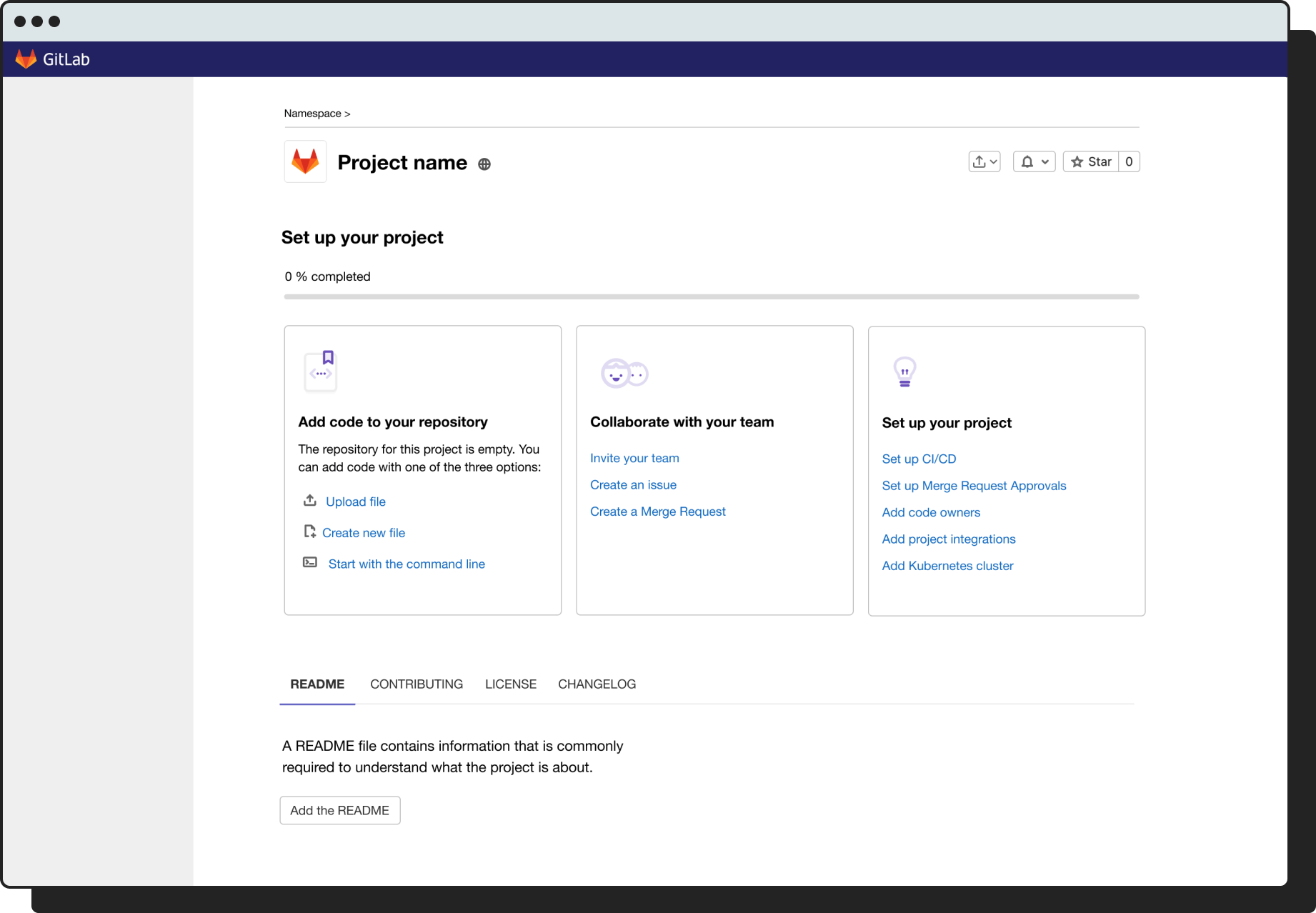
I liked this latest approach. Adding three boxes with minimal content and white background didn’t cram up the page as other solutions did. But I wanted to see if more boxes (for more steps) could be added (Fig 30).
In this solution more boxes can be added and the user could navigate to see all of them by scrolling left or right. Each recommended action in this exploration had its own box so we would need eight altogether. I felt that’s a bit much and it could overwhelm users. Visually, aesthetically, and in terms of information architecture it worked. But I liked the previous solution better. I asked the team for feedback and they shared similar thoughts. So I did one last exploration: I wanted to see if the previous solution, the one I liked best so far, could be split into two steps (Fig 31 & 32).
This solution would make sense because adding the code to the repository unlocks most of the other features. The feedback that I received from the team was that it hides a lot of the features that we want to expose the first time a user lands on this page. UX-wise it’s better because it only shows the user exactly what they need to do next. But our goal is to raise their interest in GitLab, we want them to see that they can do merge requests, invite team members, and set up project integrations. Because of that, and because it was the most minimal iteration required to start learning, we decided to proceed with the following solution (Fig 33):
Validation
I then created a prototype of the whole flow from registration all the way to the new Project Details page. I wanted to run a quick round of user tests to focus on the last part of the experience to see how participants would respond to the new content. I conducted five moderated tests and asked questions like:
- What do you want to do at this moment? (When they landed on the new Project Details page)
- What do you think about the top area of this page?
- What do you think you can do with it?
- What are you going to do next? Why?
- What do you think would happen if you clicked on one of these items?
I learned that some users wanted to dismiss the whole guiding section. I asked a follow-up question: would you like to come back to it later? Some answered that yes, when they felt ready. This gave me the idea to allow the section to be collapsed, just like an accordion. Some users expected that if they clicked on the items, they would be taken to the docs or a similar page to read more about the feature. Others thought that they would be taken directly to the part of the app where they can set that feature up. I had to find a way to make it clearer that this was an interactive list that linked straight into relevant areas of the app.
I did another round of five user testing sessions to re-test with the latest updates. Overall, the participants thought that guidance would be helpful because GitLab looked like a complex tool. They would use the newly added area but perhaps not straight-away. They realised quite quickly that they could collapse it and they liked that. I also asked them what they think will happen after they clicked on the links and their answers were mostly correct this time. We felt encouraged with this feedback and decided to proceed to experiments.
Validation with experiments
Now we had our design vision. We knew what we had to get to, now it was time to break it down into small steps and run experiments for each key change. Three experiments were key:
- Would adding an upload button increase code uploads?
- Would adding a CTA for project integrations (an “Aha!” moment) increase conversion?
- Would more guidance lead to higher GitLab adoption and higher conversion?
Adding an upload button
This was a simple and minimal change. We added a button to upload code to an existing row of buttons on this page (Fig 38).
+7.53%
First write actions in repo
Target was 2%
So a minimal change like adding the upload file button resulted in a 7.53% increase in repository creations. Code uploads increased. We were thrilled with the result. What about other actions that we want to test? We tested for integrations next.
Adding a button for project configurations
Again, a minimal experiment. We added a button for setting up project integrations to the existing row of buttons (Fig 39).
+7.41%
Integrations setup
Target was 2%
2.2%
Free to paid conversion
Original was 0.5%
Again, we saw an increase. We were hoping for a 2% increase but actually got a 7.41% increase. The most important thing about this experiment was that we also saw an increase in free to paid conversion. The original conversion was 0.5%, in this experiment we saw a 2.2% conversion, which means the increase was by 126%! 🤯
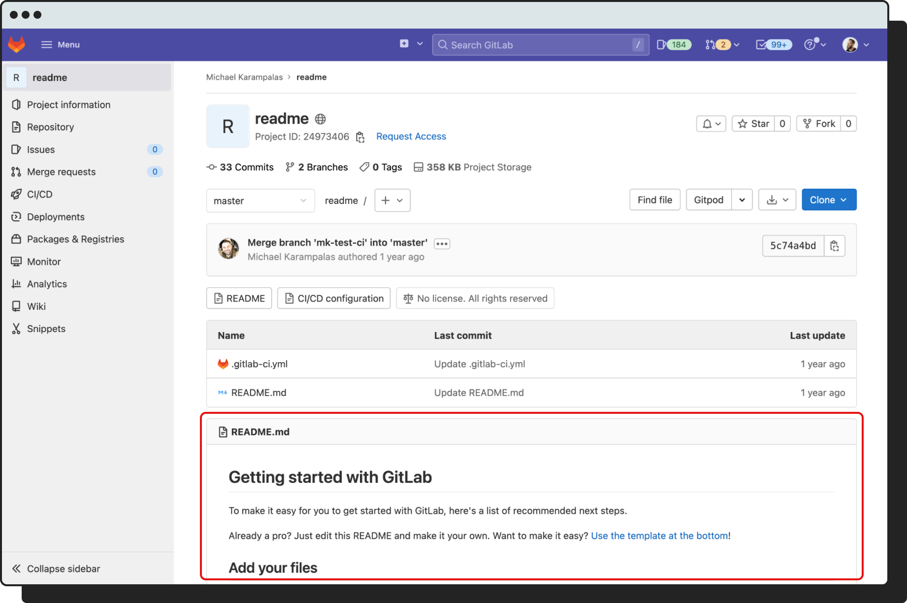
Adding more guiding content
The last experiment was the most important one. Michael, the product manager came up with an idea that would help us speed up the validation with a minimum amount of work. What if we added the content that we want to add in this new area to the default README file of the project the users created during registration? (Fig 40) This would help us validate the content that we wanted to add into the page and see it’s impact. The results were shocking.
+11.7%
Code added
Target was 4%
+6.8%
Verify stage adoption
+20%
Secure stage adoption
+7.1%
2+ stages adopted
11.8%
2+ invites accepted
We saw an even bigger increase in code added, but more importantly we saw increases in Verify and Secure stages adoption (both triggered by “Aha!” moments), a general increase in 2+ stages adoption, as well as an increase in invites accepted. Now we knew we were on the right path. I decided to prepare the final First Mile design vision—a detailed prototype of the experience (Fig 41).
If we take another look at the goals that we set in the beginning, we can see that we started accomplishing all of the specific goals and achieved significant impact on the main goal (Fig 42).
After the last experiment the head of the Growth department announced a shift in focus. All Growth teams would need to switch to work on a different initiative for a while. An initiative that the company leadership prioritised because of the upcoming IPO and decided that the Growth team would work on it. We were promised we could return to the new user onboarding after that was completed.
Relevant public issues in GitLab:
Learnings
The flexibility of the double diamond process
The double diamond design process can also be used for top-level problem and solution validation in strategic work. It was the first time I used it for such work but it was great for getting everyone else on the team onboard and to initiate team-wide collaboration.
A designer’s best chance to earn the leading role is through clear communication, collaboration, and facilitation
I had done strategic work like this before, but not on such scale. Not on a department-wide initiative with all newly-hired people. I felt I needed to earn the respect without playing the “I’ve been working on this before” card. I found a good balance between taking the initiative and doing some things on my own, and pulling people in to get feedback and facilitate collaborative sessions. I was a bit nervous at the beginning because I didn’t know how the product managers would react. Often, they like to have the leading role. Involving them early and often helped build the trust between us. I wasn’t trying to do their jobs, I was trying to facilitate a holistic and collaborative approach to solving a crucial problem.
Praise
I received a lot of positive feedback based on this work in the 360 feedback sessions afterwards. Here are two most relevant pieces of feedback from Michael, the product manager that I primarily worked with on the First Mile work, and Jacki, my design manager at the time.

What I love about Matej as a designer is his ability to go from strategic to tactical to actionable steps. It’s impressive!
— Michael Karampalas (Product Manager)

Matej creates a safe environment for everyone to participate in and collaborate on tough challenges. The user onboarding design strategy is a great example of that.
— Jacki Bauer (Product Design Manager)